| Image |
Comment |
| 05/26/2004 01:53:59 PM |
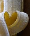
I Love Bananas by CantiqueComment: I love this shot! Very nice! A slightly looser crop on the right to balance it out just a tad more would have gotten you a 10 from me, as is a 9 |
 Photographer found comment helpful. Photographer found comment helpful. |
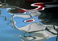
| 05/26/2004 01:53:12 PM |
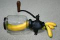
Magic Banana Reducing Machineby lwkimagesComment: LOL! I love this one! If you had a better backdrop you would have gotten a 10 from me, something more solid and up the lighting just a tad. As is a 9 |
| Photographer found comment helpful. |
| 05/26/2004 01:41:50 PM |
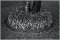
multiple trunksby undieyatchComment: I would have called this, "BIG LEAFY SHOES! " Very cool looking! Not sure about the different light sources per say but a cool shot overall. A touch less contrast and this would have gotten a 10 from me, as is a 9 |
| 05/23/2004 09:52:24 PM |
|
| Photographer found comment helpful. |
| 05/23/2004 09:47:09 PM |
|
| Photographer found comment helpful. |
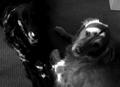
| 05/18/2004 08:58:45 AM |
Good Dog ~ Bad Dogby ladpupmoeComment: Oh, they both look like good dogs to me! ;) Nice shot but the lack of light, focus and contrast really hurt the overall feel of the shot for me. A 4 |
| Photographer found comment helpful. |
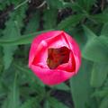
| 05/18/2004 08:57:41 AM |
Flower and Weedsby bobdaveantComment: This is a beautiful shot of a flower and the opposite of weeds is a good idea but I can't see the weeds that well. It just looks like regular greenery behind the flower to me, maybe if you had a flower that was more surrounded by weeds, the classic battle? As is I started at a 4 but am raising to a 6 |
| Photographer found comment helpful. |
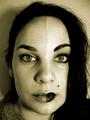
| 05/17/2004 10:27:50 AM |
Natural / UnNaturalby gpiersonComment: I like this idea but the sepia doesn't really work with this shot for me. I think either leaving it with the color or going black and white with a higher contrast would really make this shot pop out at me. Also the lighting needs to be more even, the shadow on the left is very distracting. A 4 |
| Photographer found comment helpful. |
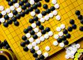
| 05/17/2004 10:26:11 AM |
The game of Goby bmatComment: Black vs. white. Classic, simple and so real. This is a good idea but the distractions of the table, cup and sides of the boards really take away from this shot for me. Also the focus seems just a tad soft overall. Maybe if you filled the shot with just the board and rotated it just a bit so the lines ran from corner to corner? Also the board seems rather dull, not sure why. A 4 as is |
| Photographer found comment helpful. |
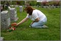
| 05/17/2004 10:23:56 AM |
A Matter of Life and Deathby LycanMoonComment: Good idea for the challenge but this comes off more as a snapshot than a portrait type shot. A different angle perhaps, come in more on the face and the stone, cutting out a lot of the background distractions and are those her keys by her knees? Using my envelopes (they are so handy) I cropped the right side up to her shoulder, just at the back hair line and it really made a big difference in the focus of the shot and the composition. If you work with this at all I would love to see the results. As is a 4 |
| Photographer found comment helpful. |
Home -
Challenges -
Community -
League -
Photos -
Cameras -
Lenses -
Learn -
Help -
Terms of Use -
Privacy -
Top ^
DPChallenge, and website content and design, Copyright © 2001-2026 Challenging Technologies, LLC.
All digital photo copyrights belong to the photographers and may not be used without permission.
Current Server Time: 06/16/2026 11:49:53 AM EDT.