| Image |
Comment |
| 07/04/2004 09:51:30 PM |
d70.by the-O-sterComment: Not sure exactly where you were headed with this shot but the mirrored sunglasses are very distracting, pulls you away from shot. The camera is also more of a distraction than a help the to shot for me. I like the pose of the person in the shot, just get rid of the glasses and the camera and you would have much cleaner, nicer shot. A 4 as is |
| 07/04/2004 09:49:54 PM |
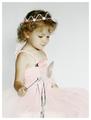
Tessby sixmacsComment: This is a very lovely shot but the cropping could have been tighter on the left to take out the lamp, it's a distraction in the end. Also the print on the wall could be removed, giving you the solid background and then you could have cropped closer in on her face. Nice expression, good lighting. Started with a 4 but going to a 6 |
 Photographer found comment helpful. Photographer found comment helpful. |
| 07/04/2004 09:48:20 PM |
Relaxing pose between two shotsby menardmamComment: A nice candid capture but the lighting and the focus seems a bit off. I would have liked to seen one of the others. A backlight to define her hair from the backdrop would help a great deal. A 4 |
| 07/04/2004 09:46:29 PM |
Glowingby lizzyc3Comment: Nice composition but the lighting seems a bit harsh on the left and the expression almost seems forced a bit. Good pose though but needs some work. A 4 |
| Photographer found comment helpful. |
| 07/04/2004 09:45:28 PM |
Princess by SonifoComment: Perfect, the lighting, the colors, the framing, all perfect, my first place pick! A 10 |
| Photographer found comment helpful. |
| 07/02/2004 12:27:05 PM |
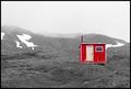
Emergency Shelterby tyrkinnComment: Greetings from the Critique Club!
Reading over the comments you already received, there's not a lot I can add to them. I too liked this during the challenge and gave it a 7 but the lack of contrast in the landscape compared to the cabim made the shot seem a bit off balance to me. Also the pink door was also a bit distracting especially since the window frame and rest of the trim seemed more white. It's a great shot and with a little more processing of the landscape it could be a fantastic shot!
Good Luck In Future Challenges!
Deannda
DNeufer@stny.rr.com if you have any questions or want to discuss this further! |
| Photographer found comment helpful. |
| 07/02/2004 12:17:57 PM |
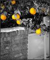
Summer Lemonsby lizzyc3Comment: Greetings from the Critique Club!
This is an interesting shot and reading your comments you wondered if people would be bothered by the stake holding the tree. From reading the comments you did receive that isn't what did bother them. I too love the idea of what you were going for, just needed some refinement. I hope you take the suggestions offered so far and try this again. Focus in on just one or two lemons, leaving the wall and gate (is that a gate?) of the shot completely.
Also reading the method you used to take the lemons out did leave a harsh line between the cut and paste area, maybe next time, if you have Photoshop, using the magic lasso to surround the lemons, then go to Select in the top line, Inverse and then desaturate the rest of the shot, then select again, inverse and you can play with the colors of the lemons a bit if you want. They have more orange in them than yellow in this shot. Your contrast and levels on the black and white are pretty good and stand out very well. Again, the idea is great and if you decide to redo this shot I would love to see the results!
Good Luck In Future Challenges!
Deannda
DNeufer@stny.rr.com if you have any questions or want to discuss this further! |
| 06/28/2004 05:01:03 PM |
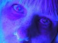
The Moon Studioby WildpurpleComment: Interesting idea but I think you might have been better off leaving it with the natural lighting. The negative image on this is really distracting and hard to look at for very long. I like the set up and the way the face fills the shot but the post processing really hurt this one for me. A 4 |
| Photographer found comment helpful. |
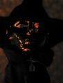
| 06/28/2004 04:59:39 PM |
The Invisible Manby GeneralEComment: You're not kidding, I can barely make out the one eye and the nose and yes, my monitor is calibrated. It's an interesting idea but the shadows and lack of light make this really hard to look at for very long for me. A 3 |
| Photographer found comment helpful. |
| 06/28/2004 04:58:38 PM |
Send in the Clownsby Prime_TimeComment: This has the potential to be a really great portrait with the right lighting and focus. I think you are going for a blue/sad mood here and while the lighting helps with that, the lack of focus and light hurts it more than helps the mood of the shot. As is a 3 |
| Photographer found comment helpful. |
Home -
Challenges -
Community -
League -
Photos -
Cameras -
Lenses -
Learn -
Help -
Terms of Use -
Privacy -
Top ^
DPChallenge, and website content and design, Copyright © 2001-2026 Challenging Technologies, LLC.
All digital photo copyrights belong to the photographers and may not be used without permission.
Current Server Time: 06/17/2026 01:07:09 PM EDT.