| Image |
Comment |
| 07/26/2004 01:36:14 PM |
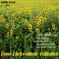
Dense Photosynthetic Colligationby RefocusedComment: This reminds me of an album cover from the late 60's, early 70's. All the writing is really distracting to me, it's more like the back of the album than the front. Usually when songs are listed on the front they are on a sticker on the plastic cover so the picture and cover is untouched.
A nice shot overall, a bit busy with so many flowers. And it comes off just a bit dull for some reason, maybe it's the lettering color that throwing me off.
As is a 5 |
 Photographer found comment helpful. Photographer found comment helpful. |
| 07/13/2004 11:34:34 PM |
sky1.jpgby AndrewWestComment: Yep, it's a sky. NOt much here to hold my attention though and the blue is so overpowering. A bit more coloration, play with the levels and curves, make it come to life.
Deannda
Hope these help :) |
| 07/13/2004 11:25:44 PM |
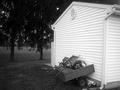
bw_shed.jpgby AndrewWestComment: This shot has a lot of potential, but here is what bothers me about it.
The right side of the shot, too much white, crop off at the corner of the garage and the focus is really lacking in this shot. Just a slight fuzziness that looks like it's under guaze or something. More clarity would really work and also just at touch more contrast. Or maybe even sepia coloration.
Deannda |
| Photographer found comment helpful. |
| 07/11/2004 10:41:24 PM |
digital_grass.jpgby AndrewWestComment: Oh I don't know about printing it off! I like the effects you have here.
The shot is well exposed and would make a great background for a print add, grabs your attention and makes you look twice!
Deannda |
| Photographer found comment helpful. |
| 07/09/2004 11:36:54 AM |
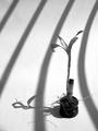
Sunbathby TiberiusComment: I gave this a 7 during the challenge.
I like the shot, the lines of the shadows but the roots ended up being a distraction for me and it lacked contrast for the black and white subject. Very few black and white shots can get away with low contrast.
Hope this helps!
Deannda |
| Photographer found comment helpful. |
| 07/05/2004 12:34:17 AM |
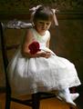
Bella Fioreby scalvertComment: I'm glad she didn't smile at you, this shot is much more emotive and perfect. She will treasure this one when she's older.
Congrats on your highest score yet!
Deannda |
| Photographer found comment helpful. |
| 07/04/2004 11:56:37 PM |
Bella Fioreby scalvertComment: A perfect, classic studio shot. The lighting, the pose, everything, perfect, a 10 |
| Photographer found comment helpful. |
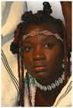
| 07/04/2004 11:56:11 PM |
Marakiby AlexysComment: This is beautiful! The light is a tad bit harsh on the face but otherwise perfect. A 10 |
| Photographer found comment helpful. |
| 07/04/2004 11:54:03 PM |
Breakfast for Twoby OneSweetSinComment: This is a nice candid shot but not really a classic studio shot. the background is so stark, it's ends being distracting. A 4 |
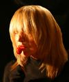
| 07/04/2004 11:49:37 PM |
MyTootsieby neilmwilsonComment: Interesting pose and take on the subject. The lighting is a bit harsh on the left and not being able to see her eyes is kind of disappointing. A 5 |
Home -
Challenges -
Community -
League -
Photos -
Cameras -
Lenses -
Learn -
Help -
Terms of Use -
Privacy -
Top ^
DPChallenge, and website content and design, Copyright © 2001-2026 Challenging Technologies, LLC.
All digital photo copyrights belong to the photographers and may not be used without permission.
Current Server Time: 06/18/2026 10:50:38 PM EDT.