| Image |
Comment |
| 07/26/2004 02:10:42 PM |
|
 Photographer found comment helpful. Photographer found comment helpful. |
| 07/26/2004 02:03:40 PM |
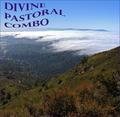
Divine Pastoral Comboby sfaliceComment: Hello 70's! :) This is so reminisant of an album cover from the 70's and I should know! ;)
Nice shot, decent coloration but nothing to really make me want to pick it up off the shelf. Just lacking that "pop" factor that would make it stand out. A 6 |
| Photographer found comment helpful. |
| 07/26/2004 02:02:24 PM |
Dead Poet's Clubby BrennanOBComment: Interesting title and very interesting shot. I like the shot, I really do but the lettering on the title really pulls me away. The way it's smeared or smudged in all directions is really distracting to me. I used to make signs that had the swept or smudged look and one thing I found that really works for me is to keep it all going in the same direction, making it look more wind swept than smudged.
The lighting is a bit harsh in just a couple of spots but otherwise a nice shot. As is an 8 |
| Photographer found comment helpful. |
| 07/26/2004 02:00:19 PM |
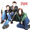
Delinquent Punks Clubby CuriousComment: Very nice. I like the fact that you didn't feel the need to spell out the entire name of the band, good choice of font and colors.
The stark white backdrop is perfect for this shot but the faces are just a little overexposed, almost matching the background, making them look transparent. If the were closer to the color of the hand this would be a perfect shot. A 9 |
| Photographer found comment helpful. |
| 07/26/2004 01:58:55 PM |
Dance Party Candidatesby geewhyComment: I love this. This is so modern, so today, so perfect. Simple, clean and the lettering size and placement is perfect. A 10 |
| Photographer found comment helpful. |
| 07/26/2004 01:58:19 PM |
Dumb Pussy Catsby darixComment: Hum, not sure it's the pussy cats who are so dumb when they aren't the ones filling the bowls! :)
Not a bad shot, the sun reflection on the liquid bow is a nice little touch but I'm not sure if that's supposed to be pop or coffee?
Clean, crisp, nice use of negative space though the lettering is a bit large to me, maybe bring the size of the font down one or two notches. As is an 8 |
| Photographer found comment helpful. |
| 07/26/2004 01:56:36 PM |
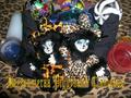
Deezuumeraa Piggybank Clanisausby frychiknComment: Not really sure what you are going for here but here's my comments. First, I have no idea what the title is with the exception of the piggybank and even then, I see no piggybank reference in the shot. Maybe I'm being to literal.
Second the shot seems very cluttered and busy. All the patterns on the materials competeing for my attention makes me look all over the place and ends up being confusing. The candles add nothing to the shot for me and the flash or light on the jigsaw ball in the upper left is also distracting. A 4 |
| Photographer found comment helpful. |
| 07/26/2004 01:54:23 PM |
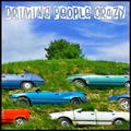
Driving People Crazy!by BassieComment: I love this! I don't know how, where or what, but I love this! Are these cars actually buried in the hill side? If not, you did an excellent post processing job. The title is perfect for this. The only thing I would chance is to bring the lighting down just a notch, just a tad bright. An 8 |
| Photographer found comment helpful. |
| 07/26/2004 01:53:10 PM |
Dangerous Personality Conditionby Faye PekasComment: Interesting title and interesing shot. I think if the lettering wasn't there or if it was smaller, leaving more negative space on the cover I would like this much more.
As is a 7 |
| Photographer found comment helpful. |
| 07/26/2004 01:40:28 PM |
Dog Pound Comboby hallswelComment: Haha, I love this. It reminds me of the old lounge records, Frank Sinatra, Dean Martin type records. The dogs are adorable but seems a bit bright on the one on the left. Just a tad blown out. I like the title of the band but the lettering is overpowering to me. Smaller size font that went all the way across the top, with the Size Doesn't Matter right under it to the left, I think would have worked better. As is a 7 |
| Photographer found comment helpful. |
Home -
Challenges -
Community -
League -
Photos -
Cameras -
Lenses -
Learn -
Help -
Terms of Use -
Privacy -
Top ^
DPChallenge, and website content and design, Copyright © 2001-2026 Challenging Technologies, LLC.
All digital photo copyrights belong to the photographers and may not be used without permission.
Current Server Time: 06/15/2026 04:08:04 AM EDT.