| Image |
Comment |
| 09/22/2004 12:32:23 AM |
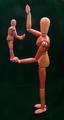
A Baby's Touch by MattBComment: My choice for Blue Ribbon, most excellent! A 10 without hesitation |
 Photographer found comment helpful. Photographer found comment helpful. |
| 09/22/2004 12:19:36 AM |
A mother's touchby ssenguptaComment: If this was in focus, sharper, I wouldn't hesitate to give it a 10 but it's not and as is I don't find it over appealing, I'm sorry. A 4 |
| Photographer found comment helpful. |
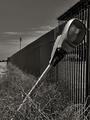
| 08/04/2004 11:16:32 PM |
Revenge of the big sister!by s2fraserComment: HAHAHAHA!!!! I love it! So cute!
This would get a 10 from me just because of the "imitation is the sincerest form of flattery" factor but alas, the focus is just slightly off so you'll have to settle for a 9 from me, LOL!
Deannda |
| Photographer found comment helpful. |
| 08/04/2004 10:57:35 PM |
Abandonedby BradComment: This shot has some real potential. I like the overall idea but the overall composition seems just a bit off to me. I placed my magic envelopes on the screen, on the top and the left, bringing the light so it was lower left corner to upper right corner and WOW, what a difference in the composition.
THe lighting is good but could also use a bit of a punch, there are no definate black or white points that I can see and this shot practically begs for higher contrast. Just some thoughts, hope they help.
Deannda |
| Photographer found comment helpful. |
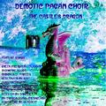
| 07/28/2004 12:17:41 AM |
Demotic Pagan Choirby hfngotphotoComment: This is very hard to look at for any length of time. The smaller lettering is very hard to read and almost blends into the background in some areas. If you had left all the song titles off I would have scored this much higher.
The shot itself is interesting but the inversion and post processing leaves me blinded if I look at it too long. It literally hurts my eyes. If I saw this in the store I would pass it up without a second glance.
As is a 4
Added after receiving a PM from shooter:
No I did not try to read the titles of the songs you put on your album cover for a couple of reasons.
First, as I said before it literally hurt my eyes to look at it the picture too long.
Second, the lettering almost blended into the background, I could not see it that well.
Third, it was rather small overall and again, difficult to see with that particular font.
There are my reasons for the vote. I'll be honest, I like the cleaner shots for the album covers. Some of the best covers I have ever seen, IMHO, are clean, crisp and grab my attention. To much writing and such is just distracting to me in any picture venue. Even on my album covers, some of my favorite covers from the 70's and 80's were the easy on the eyes ones. :)
Deannda |
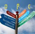
| 07/27/2004 12:56:50 AM |
Downtown Preachers Clubby charmayneComment: Man, that place is NO fun at all!
Good take on the challenge but not sure how it would really play as an album cover. The right side is overlit while the left is just about perfect. A 7 |
| 07/27/2004 12:53:32 AM |
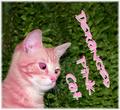
Deranged Pink Catby GalimagesComment: Annie? :)
If not, it sure looks like a kitten I know named Annie!
I love the look on her face, the crossed eyes, almost like a bug on her nose type look. I like the capture overall but the coloration leaves my wanting. The pink hue, while working with the title doesn't blend well with the green background. for me. Maybe if the background was desaturated just a bit. Also the lettering is well done, good choice of font and nice size, but the angle is a bit wanting. Maybe if it was cornered just a bit more instead of so horizontal. As is a 6 |
| 07/27/2004 12:21:28 AM |
deep pierced cutby theodor38Comment: Hello theo. Nice shot, interesting take on the challenge with the name. But you can't hide behind the knife, you have very distinct eyes.
The light on the knife is a bit blown out and I'm not really sure I like the halo created by the light around the edges of the knife, it really doesn't add to the shot for me. I'm a basically peaceful person so this particular album cover wouldn't appeal to me on an overal sense. A 7 |
| 07/26/2004 02:14:05 PM |
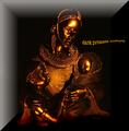
Dark Primate Cultureby biggood53Comment: This has great potential to grab my attention but it's just shy of it. The size in one thing, it seems a bit small. And that makes me miss some of the details of the covor. Also the crisp lines coming in and out of the upper right and lower left corner are a nice touch but then the rest is so soft and undefined it leaves me a bit off balance.
As is a 6 |
| Photographer found comment helpful. |
| 07/26/2004 02:12:02 PM |
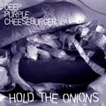
Deep Purple Cheeseburgerby JesuispeureComment: Okay, where's the beef? I can't even see the burger part, I know, being literal but the main part of the shot is the tomato. The lettering is good but a bit big to me. And the purple is okay but not a lot of contrast, nothing to make it jump out at me on the shelf. A 7 |
| Photographer found comment helpful. |
Home -
Challenges -
Community -
League -
Photos -
Cameras -
Lenses -
Learn -
Help -
Terms of Use -
Privacy -
Top ^
DPChallenge, and website content and design, Copyright © 2001-2026 Challenging Technologies, LLC.
All digital photo copyrights belong to the photographers and may not be used without permission.
Current Server Time: 06/15/2026 04:08:17 AM EDT.