| Image |
Comment |
| 10/08/2003 08:22:34 PM |
Reflectionby ktritoComment: This almost looks like a double exposure shot can't wait to see what you are reflecting off of or how this was done. As for the shot itself, it really loses a lot in the reflection for me, to undefined and gritty. |
 Photographer found comment helpful. Photographer found comment helpful. |
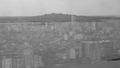
| 10/08/2003 08:20:11 PM |
Where will urban end?by Lee31Comment: Good question! As for the shot itself, overall a nice shot, could have cropped up a bit more to lose some of the black on the bottom and I would have scored a bit higher |
| Photographer found comment helpful. |
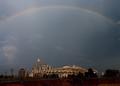
| 10/08/2003 08:19:05 PM |
Panther Statiumby jbolingComment: Nice shot of the rainbow but it draws too much away from the stadium to me. I get no real sense of urban from this shot and the shot itself could have been sharpened just a bit more. |
| 10/08/2003 08:13:51 PM |
chicagoby tomzinhoComment: The urban part got lost in the photo, could have been a larger part of the picture and more defined. |
| Photographer found comment helpful. |
| 10/08/2003 08:12:45 PM |
|
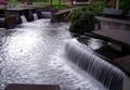
| 10/08/2003 08:05:09 PM |
Resting Groundsby Ricky CleaveComment: What a lovely fountain, very peaceful and quiet. The shot itself seems a bit dark to me, could have been lightened just a bit for my taste and maybe the colors played with a little bit. |
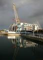
| 10/08/2003 08:03:18 PM |
Another ship? No, a buildingby johnmkComment: And what an interesting building. If you had focused more on that, maybe a bit tighter cropping I would have liked this one much better. Also the size of the picture itself really doesn't convey the size of the building even though you have the other ship to the left. |
| 10/08/2003 08:02:00 PM |
Budapest by nightby PetyuskaComment: Too much, too busy and to blurry. If you had possibly focused more on one block or building I could have scored much higher |
| Photographer found comment helpful. |
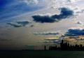
| 10/08/2003 07:57:30 PM |
Urban Blueby DufusComment: Overall a very nice shot, great use of negative space but as far a meeting the challenge, the building are lost in the landscape and I think if they were more defined or visable instead of outlined I could have scored much higher on this. |
| Photographer found comment helpful. |
| 10/08/2003 07:51:09 PM |
The house of Godby oskarComment: Nice church, almost looks like a mirror image, if the clouds weren't different I would wonder, LOL! As for meeting the challange, it doesn't convey a sense of urban to me, as for the picture itself, the church seems a bit out of focus and the sky is so forbidding and the top of the church almost gets lost in it. |
| Photographer found comment helpful. |
Home -
Challenges -
Community -
League -
Photos -
Cameras -
Lenses -
Learn -
Help -
Terms of Use -
Privacy -
Top ^
DPChallenge, and website content and design, Copyright © 2001-2026 Challenging Technologies, LLC.
All digital photo copyrights belong to the photographers and may not be used without permission.
Current Server Time: 06/11/2026 02:52:44 AM EDT.