| Image |
Comment |
| 10/09/2003 10:17:43 AM |
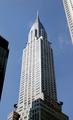
The Chrysler Buildingby JMSComment: I love this shot except for the buildings on the side, I know it must be next to impossible to get a clean, clear shot of this building considering it's location, maybe if you had gotten closer to the base and shot even further up? |
| 10/09/2003 10:15:38 AM |
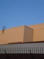
Urban Skyby richyComment: The angle and colors in this picture really throw me off. If you had focused more on the lower part of the picture, the fence and building and less sky and worked on the angle a bit more I would have probably felt much better about you meeting the challenge and the picture itself would have been more appealing to me personally. |
| 10/09/2003 10:05:47 AM |
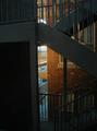
Urban Causewaysby SportyGirlComment: This shot fits the challenge very well, really conveys that sense urban to me very well. The only thing that would have made this shot better for me would be the lighting, the left side is too dark for my taste but otherwise, good job! |
| 10/09/2003 10:03:09 AM |
Like Lego Towersby pixelflakeComment: This would be a great postcard shot! I love the overall sense of urban conveyed and the angle the shot was taken from. The only thing that would have made it better for me was if the cropping was just a bit tighter, less sky and background. |
| 10/09/2003 09:48:36 AM |
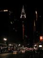
Chrysler Building in NYCby SchmalComment: Overall a good concept and does convey a sense of urban but all the darkness in the middle (and my monitor has been readjusted so the darkest pictures are much better) really throws me off. It's almost as if the picture got cut in half. Maybe if you had focused more in ont he NAiLS/McDonalds building to the right I would have found this much more interesting. |
 Photographer found comment helpful. Photographer found comment helpful. |
| 10/09/2003 09:46:01 AM |
Federal Buildingsby GeneralEComment: I do get the sense of urban but don't really like the effects you did to the picture. And possibly if you had focused more on the buildings instead of the street I could have scored much higher. |
| Photographer found comment helpful. |
| 10/09/2003 09:44:30 AM |
Tallinnby zummerComment: Nice use of negative space but too much for my taste for this challenge. If you had focused more on the buildings I think the sense of urban would have come through much better. Otherwise it's a lovely shot, good color, crisp, clear and appealing. |
| Photographer found comment helpful. |
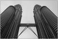
| 10/09/2003 09:39:32 AM |
The Two Towersby Adrian TungComment: Nice perspective of the towers. Looks like they are about to tumble on top of you! This does meet the challenge very well in my book but the overall shading, contrast of the picture seems just slightly off to me. |
| Photographer found comment helpful. |
| 10/09/2003 09:38:10 AM |
The Webby RockComment: WOW! This would have been great for the repitition contest! The sun reflecting off the glass is a great effect and I really like the way it draws you up but it also throws me off balance which can be a good thing! |
| Photographer found comment helpful. |
| 10/09/2003 09:35:27 AM |
DUCK!by solarysComment: ???? Not sure where the title come from, and after closer examination I see the buildings in the reflection but they are unclear and does not really convey a sense of urban or interest.
Ammendment: If the object you took the reflection from was sharper I would have probably scored much higher on this. It's fuzziness cost you a point or two for me. |
Home -
Challenges -
Community -
League -
Photos -
Cameras -
Lenses -
Learn -
Help -
Terms of Use -
Privacy -
Top ^
DPChallenge, and website content and design, Copyright © 2001-2026 Challenging Technologies, LLC.
All digital photo copyrights belong to the photographers and may not be used without permission.
Current Server Time: 06/11/2026 12:48:07 PM EDT.