| Image |
Comment |
| 10/12/2003 09:24:03 PM |
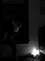
A Mother's Worst Nightmareby ShannonComment: What am I missing? I've looked at this for several minutes but the left side is so dark I'm not sure what I'm looking at.
Ammendmum: I readjusted my monitor's brightness and contrast settings and WOW! What a difference! I can now see the picture much more clearly and you are right, this is a REAL NIGHTMARE! Your score just went WAY UP!
Another addition, after going back through these again, I again bumped your score, this is really a frightening thought, having a small baby myself, 16 months old, the thought of losing him in the middle of the night, you captures that perfectly. It's not a perfect picture but darn close in my book. |
 Photographer found comment helpful. Photographer found comment helpful. |
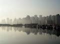
| 10/12/2003 07:00:49 PM |
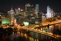
Colors of the Nightby alanfreedComment: This shot originally scored very low on my first pass, the angle threw me off and the bridge on the bottom was more distracting than inviting the first time around. Upon a second look, a closer look the bridge actually helps draw you in from the corner of the shot, excellent cropping and the lights are crisp and clear, the reflections in the river are muted enough that they don't pull you away from the skyline. It's a bit more busy than I personally like but the overall quality is very good. Score going up at least 5 points. |
| Photographer found comment helpful. |
| 10/12/2003 06:58:17 PM |
manila/early morningby imagesloyolaComment: While I like the concept of the shot, the overall quality leaves me wanting. It's out of focus and the coloring really seems washed out. |
| 10/12/2003 06:31:17 PM |
City Centerby bobgaitherComment: What a lovely building. The off center of the fountain and the building (the tree on the left makes the building look off center) are a bit distracting, maybe a slightly different angle or different cropping. Also the coloring, I can see a bit of blue sky peeking through the clouds in the sky but the building looks a bit too yellow,. |
| Photographer found comment helpful. |
| 10/12/2003 06:27:26 PM |
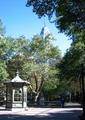
Gazeboby BRIANNIXON2003Comment: The colors and shadows on this shot work fairly well for you though the left side looks rather washed out and a bit too bright to the right. The building in the center back is very distracting and keeps drawing you away from the subject set forth in your title. Focus is slightly off and the whole image could have been sharpened just a tad. |
| Photographer found comment helpful. |
| 10/12/2003 06:25:33 PM |
Riverwalk and Downtown San Antonioby paganiniComment: Upon first glance and score run I score this one very low and upon coming back and looking again I think I know why. The dark center of the shot where the row of buildings run up was too much darkness for me along with the upper right corner. But now that I've come back and looked again I see it really adds to the shot and helps with the overall balance and concept. A bit more sharpness would have scored you much higher with me but for now the score will go up at least 3 points. |
| 10/12/2003 06:21:39 PM |
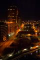
City Canyonby kyrielleComment: This looks so familier to me but seeing the Saks Fifth Aveneu on the left I know I've never been there. I origininally score this shot low because the roof top on the left was distracting and the shot itself was extremely busy, too much to absorb in a short time span. But coming back and taking more time with it, the roof top actually adds to the shot, reminds me of a giraffe, don't ask me why! The busy feel of the shot helps add to the challenge meeting aspect of the area. The only thing that could have made this better for me was a bit more brightness. Score going up at least 5 points. |
| Photographer found comment helpful. |
| 10/12/2003 06:15:42 PM |
Progression by zeuszenComment: Talk about a busy harbor area! You captured the challenge very well to me but the balance of light from the left to the right is just a bit to much, to bright on the left. I like the way the line of boats draw your eye all around the shot but the masts are so empty, adds a sense of sadness, too bad you couldn't get them all to raise their sails for your shot! :) |
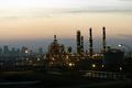
| 10/12/2003 06:13:03 PM |
Urban Refinery Rowby C-FoxComment: Look at that smog! Or is that evening mist? I'm guessing smog since it's refineries. :) I love the concept that you were going for but the shot itself leaves me wanting, the lights are a bit too fuzzy and the total darkness at the bottom of the shot is a bit distracting to me. |
| Photographer found comment helpful. |
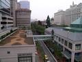
| 10/12/2003 06:10:04 PM |
Roof Top Viewby WildflowerJoyComment: Without a doubt meets the challenge to me and the contrast of nature to man made is very nice, colors are bright and clear but the center of the shot is a bit much, maybe if it was more to the side and the bottom was cropped just a bit higher |
| Photographer found comment helpful. |
Home -
Challenges -
Community -
League -
Photos -
Cameras -
Lenses -
Learn -
Help -
Terms of Use -
Privacy -
Top ^
DPChallenge, and website content and design, Copyright © 2001-2026 Challenging Technologies, LLC.
All digital photo copyrights belong to the photographers and may not be used without permission.
Current Server Time: 06/12/2026 01:26:46 AM EDT.