| Image |
Comment |
| 10/14/2003 10:55:57 AM |
Shoreline Silhouetteby moodvilleComment: This is such a peaceful shot, it would have worked great for the At Rest Challenge as well, LOL! I like the way the sun is just disappearing behind the building and the colors in the sky are so balanced. Nice job, the only thing I found personally distracting was the building in the front, I don't know if it's the shape or the darkness and I'm not sure what you could to to make it better for me but that's not what this is about. :) Raising my original score much higher! |
| 10/14/2003 10:53:20 AM |
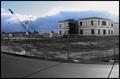
They Paved Heaven...by irockstarsComment: This has met the challenge on both levels, a very good balance of urban and landscape but the colorization doesn't really work for me personally, maybe if you had played with the contrast a tad more? I like the cropping and the way the fence leads you across the shot. Raising the score by 4 points from original. |
 Photographer found comment helpful. Photographer found comment helpful. |
| 10/14/2003 10:50:58 AM |
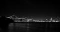
San Francisco Skylineby k3rmi7Comment: I love San Francisco, only been there once and loved it. This is a nice shot but for me it's too dark and the cropping could be tighter so there isn't as much darkness on the left. The focus is a bit too soft for my taste but otherwise this has the potential to be a great shot. |
| 10/14/2003 10:48:54 AM |
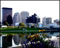
Across the Great Miamiby MarjoComment: This is a great shot, could be used for a postcard for the city. The only thing that jumps out at me though is the sharpness of the shot and the coloring almost looks too rich but for a tourism shot that is great. If the sky was a deep blue the shot would be close to perfect, darn mother nature! |
| Photographer found comment helpful. |
| 10/14/2003 10:44:44 AM |
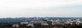
urban landscapeby katiedid270Comment: A nice shot overall but for me personally it conveys more landscape than urban, not a balance of both. If the cropping was a little tighter maybe and a bit less sky? Also ithe horizon looks very washed out on my monitor but the right lower half side is very clear and crisp compared to the rest of the shot. |
| Photographer found comment helpful. |
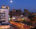
| 10/14/2003 10:42:33 AM |
Downtown Kalamazooby Spork99Comment: I've been through here! Been many a year but this looks very familer to me, from a different angle of course! :) I like the overall shot, really fills the challenge nicely but the exposure was a bit long, the moon in the sky is a bit too bright and looks almost like a muted sun. The star effect on the street lights works very well, but not on the moon for me personally. I'm raising the score on this by at least 5 points. |
| Photographer found comment helpful. |
| 10/14/2003 10:40:16 AM |
Urban Floraby friscaComment: This really does convey a sense of urban to me but something about the shot kept putting me off, couldn't quite place my finger on it until I took a little more time to really examine it. I think it the balance of light to the bottom marque. Maybe if the cropping was just slightly different, less of the bottom marque it would be so distracting. I like the shot, a tad more sharpness would score you another point, but it's going up 4 points now. |
| Photographer found comment helpful. |
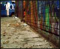
| 10/14/2003 10:34:41 AM |
Human Glaciersby melongrindComment: This shot has brought me back to look at least 6 times before leaving a comment. When I first saw it the T.O. in the back was extremely distracting, completely took me away from the wall colors. But as I came back each time it became less and less because I was expecting it I guess. It almost looks like it was added in after the shot but again, looking closer you can tell it's not. As for the shot itself, I like the cropping, the way the shot rises from bottom to top, drawing you in and taking you along the wall. The colors are wonderful though the overall shot is just a tad dark for my taste. Score is going up at least 5 points on this one, well done. |
| Photographer found comment helpful. |
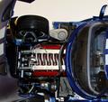
| 10/13/2003 10:43:40 PM |
Viperby rll07Comment: What a detailed model! I like this concept on the challenge very much! The colors are vibrant and jump out at you and the clarity of the engine, wheels and inside of the car is close to perfect. The only thing that throws me is the cropping, the white across the top is a bit distracting but the hood on the left helps balance it out. I'm starting this one at an 8 and will be back. |
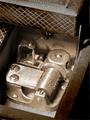
| 10/13/2003 10:42:01 PM |
No battery, no speaker, Dad!by kenboComment: Inside a music box, excellent take on the challenge! I love it! The colors are great but the cropping leaves me just a tad off balance. Maybe a little off the top and a slight rotation to cut a little of the lower right corner off would have worked better for me. Also the light on the left looks just a tad harsh. I'm starting this one at a 6 but I will be back to raise it I'm sure. |
| Photographer found comment helpful. |
Home -
Challenges -
Community -
League -
Photos -
Cameras -
Lenses -
Learn -
Help -
Terms of Use -
Privacy -
Top ^
DPChallenge, and website content and design, Copyright © 2001-2026 Challenging Technologies, LLC.
All digital photo copyrights belong to the photographers and may not be used without permission.
Current Server Time: 06/16/2026 09:41:24 PM EDT.