| Image |
Comment |
| 10/14/2003 10:32:38 PM |
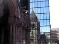
Old and newby carinaComment: I really like this shot, the reflection of the old in the new building really lends that sense of urban and you have the landscape down for me. The darkness of the building in the front is slightly distracting and the building on the right side also pulls me away. But other than that a wonderful shot overall. |
| 10/14/2003 10:30:50 PM |
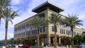
Urban Shoppingby backslashComment: I've come back to this so many times and there is something that kept bothering me about the shot. I love the building, the angle the shot was taken at, the three palm trees in front and then it finally hit me like a brick, the palm trees on the left kept distracting me everytime I came to look at this. The colors are wonderful and the clarity of the shot, the DOF are fantastic but those dang trees kept you from getting a 10 from me, sorry :( |
 Photographer found comment helpful. Photographer found comment helpful. |
| 10/14/2003 10:28:51 PM |
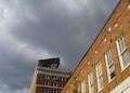
Toronto skyline at duskby HRoxasComment: I love the colors on this one, the burnt oranges are wonderful, the balance is also very nice and the cropping top to bottom is close to perfect. But the overall shot is too much out of focus for my personal taste, a bit sharper and this would have gotten an 8 or 9 from me. |
| Photographer found comment helpful. |
| 10/14/2003 10:26:45 PM |
Alone in Toledoby vonautschComment: WOW! Is that fairly new? I have been to Toledo and I sure don't remember that, but then again it's been a few years :) That guilding almost looks pasted in, the lines are so crisp and clear, I love it! The balance is just slightly off for me, maybe just a tad more cropping off either side but not both? |
| Photographer found comment helpful. |
| 10/14/2003 10:24:24 PM |
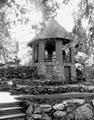
Afternoon Retreatby darrenComment: What a lovely, peaceful area, a very rural urban with the landscape, well done! I wonder though if this might look better either in it's original color or even sepia to indicate another era. The lighting is very good except for the one spot on the left on the landing, dang sun! ;) |
| 10/14/2003 06:26:04 PM |
a view from downtownby perkygothComment: I love the idea you were going with but the cropping left me hanging. If you could have cut the shot diagonally, from upper right to lower left I think it would have been much better. The empty space on the left pulls me out. The cloudy sky, the colors are are great, just a tad more contrast would make them perfect. |
| Photographer found comment helpful. |
| 10/14/2003 06:20:44 PM |
Hopeby adw03Comment: Very urban AND you have the plants for your landscape, PERFECT! :)
The cropping on this is close to perfect for me, I think I would have liked to seen the top of the windows though and the top is a little blown out as they say, in the center, a touch of contrast and brightness adjustment would have really made this shot pop. |
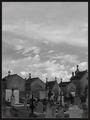
| 10/14/2003 06:19:01 PM |
Necropolisby jjbeguinComment: Dead urban ;( Very interesting take on the challenge, I like it. The different heights of the crosses really brings you into the shot, building up to the back, very nice. A tad too much sky for my taste but an overall good use of space. And the black and white work very well with this shot, a touch more contrast and you would have 9 or 10 from me ;) |
| Photographer found comment helpful. |
| 10/14/2003 06:17:02 PM |
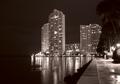
Seafrontby ewebComment: These buildings are beautiful and the cropping from top to bottom is very good but the sides are a bit distracting, the darkeness on the left and the trees on the right keep pulling me out of the main shot. I would really like to see this shot in color too, the black and white is nice but I think you lost some of the punch by going b&w. |
| Photographer found comment helpful. |
| 10/14/2003 06:15:13 PM |
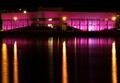
Pink Hospitalby birgirComment: Is this hospital really lighted like this at night? That is awesome! The reflection really adds to the shot and the lines from the street lights on the water draw you in, the only thing I would have changed is the cropping, just a tad more off the bottom and this would have gotten a 9 or 10 from me. |
| Photographer found comment helpful. |
Home -
Challenges -
Community -
League -
Photos -
Cameras -
Lenses -
Learn -
Help -
Terms of Use -
Privacy -
Top ^
DPChallenge, and website content and design, Copyright © 2001-2026 Challenging Technologies, LLC.
All digital photo copyrights belong to the photographers and may not be used without permission.
Current Server Time: 06/14/2026 11:26:32 PM EDT.