| Image |
Comment |
| 10/14/2003 11:47:30 PM |
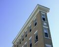
in betweenby a_i27Comment: I like the idea behind this but the negative space on this shot hurts you, if the buildings were more defined, a bit clearer. The colors in this shot also throw me off a bit, maybe a tad more brightness? |
| 10/14/2003 11:19:22 PM |
For Rent , 2 Bedroom Flat.....by medic391Comment: I have to comment on this one. The angle of the shot really got to me or the cropping, I'm not really sure which it is. If the building had filled half of the shot going from one lower corner to the opposite higher corner I would like this much more. The lighting seems to work well though the building seems a tad dark to me. |
 Photographer found comment helpful. Photographer found comment helpful. |
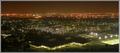
| 10/14/2003 11:17:36 PM |
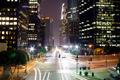
Los Angeles At Nightby Ram21Comment: Wow, so busy! But then again, not really for the LA area, it's been a few years since I've been there. I like the time exposure and the car lights and street lights came out about as close to perfect as you could ask, but the building lights, especially on the right of the shot just really didn't seem to come out right to me. I love the colors and the cropping is wonderful, the street brings you in on the right and takes you right through the shot. |
| Photographer found comment helpful. |
| 10/14/2003 11:15:07 PM |
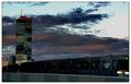
sunset metroby miss parkerComment: I love the colors in the clouds, very dramatic. But the shot overall is a bit too dark for me and the train and rail draw my attention out of the shot because of the direction it's heading. The building to the right is a good balance to help draw you back in but that train just keeps taking me out! ;) |
| 10/14/2003 11:14:28 PM |
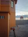
Sorrow Castleby sotsotComment: This shot leaves me wanting somehow. I like the colors, the lighting is well done but the cropping and the angle of the shot seems off to me personally. Maybe if you had more of the building and less of the right side, the sign is very distracting to me. |
| Photographer found comment helpful. |
| 10/14/2003 11:12:52 PM |
Al-Khobarby KhalidComment: I like the lines in this shot, they draw you in and take you around the entire picture and taking pictures at night can be so difficult getting that clear, crisp shot, I know, I've been trying all night long tonight. The shot just seems to go on forever and the colors in the back are wonderful. The bright patch in the lower right is a bit distracting, a slightly tighter crop might have helped with this? |
| Photographer found comment helpful. |
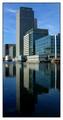
| 10/14/2003 11:10:17 PM |
docklandsby deceptiveComment: I really like this overall shot, the reflections in the water, the cropping, the balance and the color. The border doesn't quite seem to work with the shot itself, maybe a different color or a tad smaller? |
| Photographer found comment helpful. |
| 10/14/2003 10:53:19 PM |
Tueborby TooCoolComment: I like the idea, you have the urban with the landscape but the lighting seems blown out on the building, maybe played with the brightness and contrast or hues a little too much? If that is natural lighting from them someone needs to talk to them! Also the building have the tip cut off a little more open cropping on the top. I like the overall balance between the tree and the building. |
| Photographer found comment helpful. |
| 10/14/2003 10:40:00 PM |
View of Downtown Kitchener over Parkby rgordonComment: The idea was great but the actual shot leaves much to my imagination, which isn't always a bad thing but on this one it is, too much darkness across the bottom, a tighter crop and the lights in the center left could have lead you into the shot to the landscape across the back. |
| Photographer found comment helpful. |
| 10/14/2003 10:37:40 PM |
In Flightby mariomelComment: This is such a beautiful church and capturing the birds in flight was such a nice touch. If only that darn building wasn't in the background but then again it lends a sense of the present to the shot. The only other thing that throws me just a bit is the angle of shot, can't quite put my finger on it because the building brings you in from the left and takes you all around the shot, I think it's the patch of grass in the front, the shape or something, I know, nit picky. I'm raising my score on this one by at least 5 points :) |
| Photographer found comment helpful. |
Home -
Challenges -
Community -
League -
Photos -
Cameras -
Lenses -
Learn -
Help -
Terms of Use -
Privacy -
Top ^
DPChallenge, and website content and design, Copyright © 2001-2026 Challenging Technologies, LLC.
All digital photo copyrights belong to the photographers and may not be used without permission.
Current Server Time: 06/17/2026 01:08:04 PM EDT.