| Image |
Comment |
| 10/15/2003 10:41:04 AM |
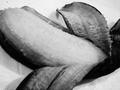
Obvious Un-(a)peeling Bananaby GeneralEComment: BANANA BREAD Banana! Or Banana Cake so it's not to Un (a) peeling, hehehe! ;)
I like the idea you have here and going to black and white did not hurt this shot but the cropping is just off to me. If you had been able to keep the top of the banana in the shot and not cut off that would raise my score and a bit more sharpness on the overall shot. Starting with a 7 on this one. |
 Photographer found comment helpful. Photographer found comment helpful. |
| 10/15/2003 10:39:18 AM |
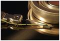
Accessing my databy agwrightComment: Another harddrive! But again, done so differently from the others that I can't complain. The clairty on this shot if fanstastic, the colors are muted so they don't overpower you and the light reflection is perfect, the iny bit of glare really adds to the shot and the drive is actually moving, WONDERFUL! Another 10 for this one! |
| Photographer found comment helpful. |
| 10/15/2003 10:37:37 AM |
Putnam County, NY exposedby shutterflyComment: Wow, this scene looks familier! I'm in Elmira, NY and out hills look much the same right now! I like the idea that you were going for here but the cropping of the shot is a bit too much for me, too much sky, a bit too balanced if that's possible. Also the tree on the left keeps trying to take me out of the shot, BAD TREE! ;) Starting with a 5 on this but I'll be back :) |
| Photographer found comment helpful. |
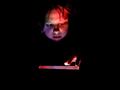
| 10/15/2003 10:33:58 AM |
Exposing A New Dimensionby ColeyComment: Wonderful idea on this challenge! The colors and negative space work very well on this shot. But something is just off to me and I'm trying to decide if it's the expression on the child's face or the imbalance because of only one had being seen. I'll have to think about this and try to get back to you on that. I'm starting with a 7 but I will be back. |
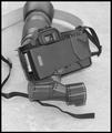
| 10/15/2003 10:31:59 AM |
Exposedby JasonComment: Deja Vue! This has happened to me and man is it fustrating! LOL! Good idea on the challenge and the black and white works well but the contrast seems off a bit and the strap running out of the shot is a bit distracting. The DOF is well done though, starting with a 7 on this one. |
| Photographer found comment helpful. |
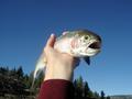
| 10/15/2003 10:30:41 AM |
Fish Out of Waterby smfsnowindComment: Ooooooooooo, Poor fishy! I will say though that the expression is priceless, rainbow trout isn't it?
I like the concept you went for and the colors are wonderful, the clarity of the shot is also wonderful but only if there was some other way to set him up, the hand is very distracting, especially the sleeve on the top. Maybe a different angle, because I see you couldn't crop out the sleeve without losing the fish's tail. I'm starting with a 7 on this one. |
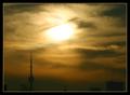
| 10/15/2003 10:28:46 AM |
CN Tower Exposedby zadoreComment: A nice idea but without the title to tell me what you were going for I would be guessing that it was the sun that was being exposed from behind the clouds. The colors are lovely, very muted, not overpowering. The skyline actually detracts from this shot for me in the end. I'm starting this one with a 6 but I'll be back to look again. :)
|
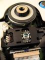
| 10/15/2003 10:26:51 AM |
CD-Rom Driveby ExcelsiorComment: So that is what it looks like! ;) Nice shot, good idea and the lighting is very well done. The only thing to me is the DOF or the lack of focus on the bottom of the shot and the eye looks a tad fuzzy. Starting with a 7 but I will come back and look again! |
| Photographer found comment helpful. |
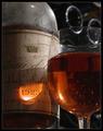
| 10/15/2003 10:25:39 AM |
A rare privilege by jjbeguinComment: Wonderful idea for this challenge! If I'm reading this correctly, the old wine is now exposed to the light and to the taste buds? I love the colors on this, the light reflecting on the date on the bottle, the curved bottles through the glass, so well done! The only thing I would have done differently if I were able to take shots like this is crop the top to just above the top of the wine glass. Then you can still see the dust on the top of the bottle and the bottoms of the other bottles in the upper right are quite as distracting. A 9 for this one! |
| Photographer found comment helpful. |
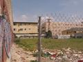
| 10/14/2003 11:51:43 PM |
trash and urban calligraphyby takethatComment: This really conveys urban to me, the underside if you will. The fence is very distracting though, maybe if you had been able to shot it from the other side so it was background instead of in your face. The lighting is wonderful and I like the cropping overall |
Home -
Challenges -
Community -
League -
Photos -
Cameras -
Lenses -
Learn -
Help -
Terms of Use -
Privacy -
Top ^
DPChallenge, and website content and design, Copyright © 2001-2026 Challenging Technologies, LLC.
All digital photo copyrights belong to the photographers and may not be used without permission.
Current Server Time: 06/16/2026 04:05:30 AM EDT.