| Image |
Comment |
| 11/02/2003 11:19:33 AM |
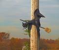
Quidditch Team Rejectby coolharComment: LOL! Wonder why? I'm sure Slytherin could use her! ;)
Nice idea but the shot seems overly hazy, the cropping is well done, good balance and I like the pole being "just" off center. A 6 to start |
 Photographer found comment helpful. Photographer found comment helpful. |
| 11/02/2003 11:18:23 AM |
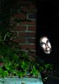
Evil and Ivyby jbruno1397Comment: Is that a real person? Very eerie! The effects are very good. But it reminds me more of the tin man than evil :) A 7 to start |
| 11/02/2003 12:47:24 AM |
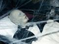
Portrait of the Deadby OneSweetSinComment: Ewwwwww! Someone had a fun display! The shot is overall well lit but the cropping seems off and the shadow of the webs is distracting. An 8 to start |
| Photographer found comment helpful. |
| 11/02/2003 12:46:30 AM |
Terribly spooky!by AlexysComment: He would be if he didn't have pink feathers sticking out of hise headband, LOL! The cutting off of the feathers and the hair detracts from the overall picture. A 6 to start |
| 11/02/2003 12:45:48 AM |
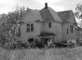
A real haunted houseby christyrackComment: Had to look twice to see what you were talking about! It looks like the house down the street from me only without the man in the window. The sharpness is wanting and contrast is low. A 5 to start |
| Photographer found comment helpful. |
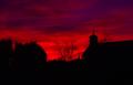
| 11/02/2003 12:45:05 AM |
Enemy Forcesby karmatComment: What a red sky! Kinda spooky! The clarity or sharpness is really wanting in this shot, just too fuzzy for my personal taste but the balance between the ground and sky is close to perfect for me. A 5 to start |
| Photographer found comment helpful. |
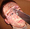
| 11/02/2003 12:44:05 AM |
AHHHHHHHH!!!!!!!by timboydwhiteComment: This is just nasty! And it took me a second to figure this one out but overall it does fit the challenge! A different background would have really helped and more red for blood would have also scored a point or two. A 7 to start |
| Photographer found comment helpful. |
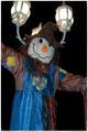
| 11/02/2003 12:42:55 AM |
Just hangin' around.by NukktaComment: How cute! To bad he grew a light out of his head! Maybe if this was from a different angle? The colors and clarity are perfect and the arms being cut off really help the picture by drawing you from one side to the other. A 7 to start |
| Photographer found comment helpful. |
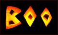
| 11/02/2003 12:41:53 AM |
BOO!by JasperComment: Cute! I like the toothpicks holding up the middle of the B and O's. A bit more clarity and sharpness would have gotten this an 8 or higher, starting with a 7 |
| Photographer found comment helpful. |
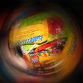
| 11/02/2003 12:41:05 AM |
Too Much Candyby Spork99Comment: You can always send some my way, LOL! Great idea but the blurred edge, while trying to evoke a possible sense of nasuea or mystic is a bit large or too small, it's just not quite right for some reason. A 7 to start |
| Photographer found comment helpful. |
Home -
Challenges -
Community -
League -
Photos -
Cameras -
Lenses -
Learn -
Help -
Terms of Use -
Privacy -
Top ^
DPChallenge, and website content and design, Copyright © 2001-2026 Challenging Technologies, LLC.
All digital photo copyrights belong to the photographers and may not be used without permission.
Current Server Time: 06/18/2026 06:50:43 PM EDT.