| Image |
Comment |
| 11/06/2003 12:01:41 PM |
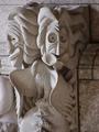
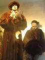
Hmmm & Boooo!by slavaComment: Interesting shot the two faces with different expressions. To bad the eagle is there ruining the shot, it's distracting from the faces, maybe a slightly tighter crop on the bottom? The lighting seems a bit dark and nothing in the shot really pops out at me. A 4 |
 Photographer found comment helpful. Photographer found comment helpful. |
| 11/06/2003 11:55:44 AM |
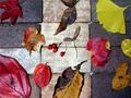
autumn color arrangementsby kenboComment: A very nice idea but it seems the staging seems off. The space between the different types of leaves and the way they go out on the edges is really distracting to me. I like the berries in the middle but they are so small you almost miss them. Maybe if the leaves were closer together? A 4 |
| Photographer found comment helpful. |
| 11/06/2003 11:51:02 AM |
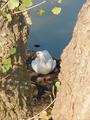
Please, don't move!by GREENMEMComment: Looks like she stayed put for you. A nice idea and not a bad overall shot but the trees in the front are more of a distraction to me than a fram, there is no top per say, if the branch had come all the way across the top......... The shadows on the goose are nice but the focus is a bit soft for me. A 4 |
| 11/06/2003 11:45:55 AM |
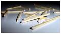
Name in Lightby faidoiComment: Different idea, unique. I like that but it really doesn't grab my attention and hold it there. You say name in light which made me look if you had spelled something out with the matchsticks. But I couldn't find anything, you tease! ;) The lighting is well done and the DOF is also well doen. I started this at a 4 but am moving it to the 8 |
| Photographer found comment helpful. |
| 11/06/2003 11:20:36 AM |
mannequin lifeby utopian mangComment: A nice idea and if you could have gotten them without the glass it would have worked much better. The shadows and reflections caused by the glass are just too distracting. A 4 |
| Photographer found comment helpful. |
| 11/06/2003 11:16:54 AM |
still searchby pfaff31Comment: Ah, unique idea but doesn't really work for me. The shot of a screen doesn't really peek my interest and it's so hard to make sure these come out sharp and clear. A 4 |
| Photographer found comment helpful. |
| 11/06/2003 11:15:34 AM |
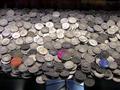
Coinsby laheffComment: Tokens! Lots of tokens! Or are they actuall quarters? hard to tell. The shot is rather small and hard to see exactly what effect you were going for here. I can see the chute at the bottom and how they are barely hanging on the edge but it really just doesn't capture my attention or make me anticipate the falling of the coins. The lighting isn't bad but I'm wondering if this shot might work better as a portrait shape instead of a landscape shape. A 4 |
| 11/06/2003 11:09:09 AM |
A Carpetby GPComment: Yes it is, a carpet of light. I hope you didn't set this up just for the shot! LOL! I like the unique approach to the challenge but the shot is wanting. There is not focal point, nothing to really draw me in and keep me here. I find myself wandering and wandering and losing interest trying to figure out just what I was looking for. The focus is off and despite the number of lights in the shot it still seems a bit dark. A 4 |
| Photographer found comment helpful. |
| 11/06/2003 11:01:53 AM |
Pleasure ...by smr78Comment: This is an interesting take, away from the classic, points for that. As for the shot, the feeling is there, you can tell this is a woman feeling pleasure but the colors are so muted, the object to background blend too well, I"m thinking it should be either darker or lighter, the lighting seems just off. The DOF doesn't really work for this shot unless this is one really big statue, seems it should all be in focus. I started at a 4 with this but going to a 6 |
| Photographer found comment helpful. |
| 11/06/2003 08:42:55 AM |
Oil on Canvasby muckpondComment: Classic flowers and fruit, very nice. I like the curly thing in the front, a nice touch. The lighting isn't bad but seems just a tad bright on one side and didn't seem to fade quite enough to the left. The curly thing is cut off on the left but space is open on the right, maybe tighter cropping or pulling it so it comes clear across the shot? I like the backdrop, the soft folds in the material on the table area. As for the subject, the soft focus is just a tad to soft for me, borders on blurry to my eye. The handle on the right really is distracting me a bit, can't really explain why. I started at 4 but am going to a 6 |
| Photographer found comment helpful. |
Home -
Challenges -
Community -
League -
Photos -
Cameras -
Lenses -
Learn -
Help -
Terms of Use -
Privacy -
Top ^
DPChallenge, and website content and design, Copyright © 2001-2026 Challenging Technologies, LLC.
All digital photo copyrights belong to the photographers and may not be used without permission.
Current Server Time: 06/19/2026 05:24:23 AM EDT.