| Image |
Comment |
| 01/03/2004 10:03:31 PM |
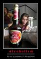
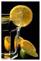
Alcoholismby rooComment: First of all, not quite sure just how motivational this is, especially to people who have the problem of alcoholism, I almost married one. So big points off for that, I know you probably meant it as a bit of joke (I sure hope you were) but to some it's really not funny. As for the shot, the second person in the back to the left is distracting and really adds nothing to the shot. The person by the mixer has the perfect expression and the DOF is well done. But because of the nature of the shot, you get a 4 for the shot only and the rest of the points are lost on me. |
| 01/03/2004 09:51:41 PM |
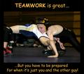
Teamwork is great but you have to be prepared for when it's just you and the other guy!by DiamondPeteComment: This is not a bad shot overall, the cropping seems a bit tight on the sides to me, would like to see the entire legs of both boys and perhaps a slightly tighter crop on the top.
THe border is perfect but the font just doesn't work for me. I love Comic Sans Script but it really doesn't work for this type of poster, a bolder font would really jump out at you. Started with a 4 am raising to a 6 |
 Photographer found comment helpful. Photographer found comment helpful. |
| 01/03/2004 09:49:31 PM |
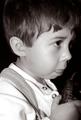
Concentrate !by soupComment: A very cute shot, though I could barely see the game control in his hands so I was left wondering at first what he was biting his tongue for.
The lack of a border hurts this shot on this for the particular challenge. Also the really tight crop leaves me wanting on the top around his head. And the title, concentration doesn't quite fit for me, I'm thinking more along the line of FOCUS is the key type thing. I started with a 4 for the reasons stated above but am raising the score to a 6 because the shot itself is well done. Nice capture. |
| Photographer found comment helpful. |
| 01/03/2004 09:39:58 PM |
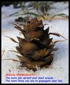
Sexual Promiscuityby drgsoellComment: Not quite sure how motivational this is, more of a preaching poster that would work well for Family Clinics? The shot isn't that bad but the font used is wanting, and the colors also leave me wanting. As for the shot, a tighter crop on the top, a larger border, change the font and color to white? A 4 |
| Photographer found comment helpful. |
| 01/03/2004 09:38:32 PM |
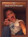
Break Outby GraciousComment: Not a bad idea but the actual execution of the idea leaves me a bit wanting. I realize you are trying to create the image of the leg breaking through the border but it just doesn't work for me, the lines don't quite match. THe child is blurred a bit and the expression isn't quite right. I'm thinking if you had a shot of the child actually coming through the top of a box or something to that effect? A 3 |
| Photographer found comment helpful. |
| 01/03/2004 09:35:41 PM |
|
| Photographer found comment helpful. |
| 01/03/2004 09:33:45 PM |
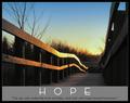
hopeby ursulaComment: I love this shot, the way the walkway leads to the unknown which is wha hope is all about, being positive about the unknown. ;) a 10 |
| Photographer found comment helpful. |
| 01/03/2004 09:28:12 PM |
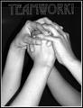
There's No "I" in TEAM!by RoosterComment: I love this shot, the black and white works very well and it so reminds me of teams that join hands right before going out to kick som but! Well done, a 10 |
| Photographer found comment helpful. |
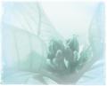
| 01/01/2004 12:37:51 AM |
Pureby nathaliedooComment: Greetings from the Critique Club!
Hi! This is a lovely overall shot and I originally gave it a 7 during the challenge.
What threw me off initially in the challange and still does now is the cropping to start. I'm guessing you were going for the rules of 1/3 with the off center crop and I think it would work very well if the center of the flower was more to the right and down just a hair.
You said you only adjusted the brightness but I wonder if you did anything with the coloration also because of the blue tint that is coming across on my monitor. Or was that the lighting that you used? I like the tint, it's very surreal which really works with this shot.
The border is unique but also a bit distracting to me personally. Also while the shot is sharp, it's coming across with a very soft focus and the white area above the bud is a bit overbright to me. Perhaps a different angle so it's a leave behind the buds?
I hope this helps and should you decide to do any of the changes I offered I would love to see the redone work! But it is a great shot as is!
Good Luck In Future Challenges!
Deannda
DNeufer@stny.rr.com if you have any questions or want to discuss this further! |
| Photographer found comment helpful. |
| 12/31/2003 10:55:01 AM |
|
Home -
Challenges -
Community -
League -
Photos -
Cameras -
Lenses -
Learn -
Help -
Terms of Use -
Privacy -
Top ^
DPChallenge, and website content and design, Copyright © 2001-2026 Challenging Technologies, LLC.
All digital photo copyrights belong to the photographers and may not be used without permission.
Current Server Time: 06/20/2026 04:46:01 AM EDT.