|
|
|
Showing 1001 - 1010 of ~2077 |
| Image |
Comment |
| 01/12/2004 12:02:21 AM | |
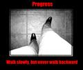
| 01/08/2004 09:51:20 PM | Progressby kncoughlinComment: Greetings from the Critique Club!
Hi! Here to do the indepth critique you requested and I hope I can help.
I really liked this shot during the challenge, gave it an 8 as a matter of fact, now let me try to explain why it didn't get a 10, though it has that potential for me.
First the aspect ratio of the size of the thighs to the shoes is really distracting, the feet look so tiny compared to the thighs in the shot, it's a bit disorienting and hard to look at for any length of time. For a poster to work for me I want to be able to look at all day long if needed or at least want to look at without causing a bit of eye strain. The washed out look on the thighs is also a bit distracting yet works for this shot overall. It grabs your attention and brings you into the shot. If we could get those feet to look just a bit bigger! :)
Also the cropping or angle on the floor is also off a bit and makes me a bit dizzy to look at it for too long. Maybe a slight rotation to balance it a bit would also help with the foot/thigh equation.
I like the lettering and the font but the side borders seem very heavy on this shot. Maybe if you brought them in a bit, left the top font as is and made the lower font a bit smaller (not the same size as the top) so it would fit it would work just a bit better.
Hope all this helps, if you decide to play with this image and take any of my suggestions, I would love to see it!
Good Luck In Future Challenges!
Deannda
DNeufer@stny.rr.com if you have any questions or want to discuss this further! |
| 01/07/2004 10:34:30 AM | Dreams are like rainbows. Only idiots chase them.by johnmComment: Greetings from the Critique Club!
Hello! Well, I made some comments during the challenge, now to get more nitty gritty.
Like I said before, I love this shot overall but the balance seems off because of the bottom rail cutting across the way it does. Maybe if it was slightly rotated to straighten it up but then that would make the upper part off balance, wouldn't it? It's a tough call on that one.
I wish there were comments so I could figure out just how you got this shot so maybe I could offer another idea on how to straighten it up or balance it out more. Are you on the level below the man looking out. Is this a posed shot on his part or a lucky shot on your part? If posed maybe you could be more directly under him so you could get the rail to be a little straighter while still having the tower going up the center?
I like the way the tower also fades into the fog, very nice effect and capture. The lighting is very well done on this shot.
As for meeting the challenge I'm betting you lost some points there with some voters because the title wasn't very motivational in the traditional sense of the word and the lack of border on the shot. I know I felt confused by the title compared to the shot and if it has to do with the person who designed and built the Eiffel Tower I'm not that familier with them so it wouldn't make sense to me.
I hope this helps.
Good Luck In Future Challenges!
Deannda
DNeufer@stny.rr.com if you have any questions or want to discuss this further! |  Photographer found comment helpful. Photographer found comment helpful. |
| 01/06/2004 11:41:45 PM | hurtby imagesloyolaComment: Greetings from the Critique Club!
Hi! This was one of those shots that really made me think during the challenge trying to figure out just how it met the challenge and still not sure if I get the true meaning but I'm guessing from the title that you are talking about the edge of pain that can be inflicted?
Anyway about the shot. I like the overall shot, the simplicity of it but the composition left me wanting a bit. I'm thinking the imbalance of the stem of the cherry cutting up the negative space across the top is what is throwing me off. Maybe if you had removed the stem and left that area clear? The focus also seems off just a tad on the cherry itself but very clear on the wire and while DOF is usually a good thing, to me on a close up shot like this, everything should be in focus. Also, if the wire coming in on the left came out of the corner instead of just above it.
I hope all this helps.
Good Luck In Future Challenges!
Deannda
DNeufer@stny.rr.com if you have any questions or want to discuss this further! |
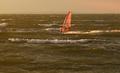
| 01/06/2004 11:34:38 PM | Vapor Trailby OlyuziComment: Greetings from the Critique Club!
Hi! I like the idea behind this shot and I think I understand where the "edge" part is coming in on a couple of different levels, the edge of the water, the edge of the board, the edge of danger and it almost looks like on the edge of a storm!
The color of the water threw me off at first when I voted on this originally, guess I'm thinking all water should be blue but if nothing else we must think outside the norms on a lot of our shots. While the horizon looks very hazy indicating it might have been an overcast the day the light on the wind board and reflection of the water to the right makes me think the sun was peeking through at some point.
If you were going for the rule of thirds on this shot the board could be a little more to the right and maybe a slightly tighter crop on the bottom, bringing the board more into focus and better utilizing the negative space of water and sky around it. If you decide to recrop this shot I would love to see the new version. It's a wonderful overall shot and with a slight tweak to the brightness (just a touch) and the recropping I think this would make a fantastic shot.
Good Luck In Future Challenges!
Deannda
DNeufer@stny.rr.com if you have any questions or want to discuss this further! | | Photographer found comment helpful. |
| 01/06/2004 11:26:27 PM | Candy stealer Ghostby vadviragComment: This is an interesting idea but the ghost seems off to me. Not sure if she moved during her time in the frame because while she has the see through effect it seems blurrier than others that I've seen, seems it should be slightly more defined. The cropping of the shot also leaves me off just a bit, that branch that goes out of the shot in the upper left doesn't sit quite right for some reason. And she's almost in the tree it seems, really, really close. Maybe is she was back a little further, reaching for the candy? A 4 to start, going to a 6 | | Photographer found comment helpful. |
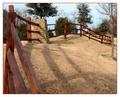
| 01/06/2004 11:23:36 PM | Winter In Texasby RHoldenSrComment: Gosh, my grass in upstate NY is greener than yours! :)
This is a nice idea but it doesn't quite set right with me for some reason. The fence I'm guessing is meant to draw you in and take you around the shot? I'm thinking because of the uneven ground and the way the fence comes around it what is throwing me off. Maybe if you cropped on the right so the fence takes you out without seeing where it comes back on itself? And even though it seems to be a bright sunny day the shot still seems to be lacking in some contrast and shadow lights, if that makes sense. Started with a 4, going to a 6 | | Photographer found comment helpful. |
| 01/06/2004 11:20:23 PM | The Snowmanby tragicharpyComment: How cute and fuzzy! But the angle is off to me, maybe if it was more head on and the cropping, taking the top of the hat off and the not being able to see the bottom, maybe if you rotated it just a bit to the left and cropped it a little tighter on the left and less on the top and bottom? A 4 |
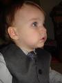
| 01/06/2004 11:18:50 PM | Please, leave me alone!by lmatrangaComment: Ooooo, what a cutie and he does look like he's about to cry ;(
This is an adorable snapshot but leaves me wanting for a more portrait type shot. The cropping seems tight on his head, if the whole head was visible and the way the one arm on the right gets cut off is also a bit distracting, if you could crop that out completely. The background on the right keeps pulling my eyes over there, not sure what it is and it's almost demanding me to figure it out, taking me away from that sweet face. A 4 | | Photographer found comment helpful. |
| 01/06/2004 11:16:35 PM | make a wishby shutterflyComment: Happy Belated Birthday to the person in the shot!
THis is a wonderful idea but the shot leaves me wanting. Taking shots of candles can be so hard, I know, I've been trying without much success yet. If the shot was turned around so you could see the persons face being lighted by the candles would have so much more impact on this shot to me. As is a 4 | | Photographer found comment helpful. |
|
Showing 1001 - 1010 of ~2077 |
Home -
Challenges -
Community -
League -
Photos -
Cameras -
Lenses -
Learn -
Help -
Terms of Use -
Privacy -
Top ^
DPChallenge, and website content and design, Copyright © 2001-2026 Challenging Technologies, LLC.
All digital photo copyrights belong to the photographers and may not be used without permission.
Current Server Time: 06/19/2026 05:57:18 PM EDT.
|