| Image |
Comment |
| 01/20/2004 11:11:48 AM |
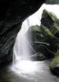
The Waterfallby robbiehComment: This is beautiful! I love the action and motion of the water, the lush green on the rocks and the composition is well done. The only distracting thing to me is the rock poking in on the right side bottom, putting my paper up there to crop it out and the shot really comes alive for me. Well done! A 9 |
 Photographer found comment helpful. Photographer found comment helpful. |
| 01/20/2004 11:10:19 AM |
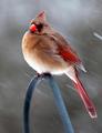
Cardinal Bracing Against The Snow Storm by DrakeComment: Brrrrr, I get cold looking at this, excellent shot. The motion of the snow, the resolute look of the bird, very well done. I would have cropped just a tad tighter on the bottom so there is a little less of the bar he's holding onto in the shot. Just below the tail feathers :) A 9 |
| Photographer found comment helpful. |
| 01/15/2004 07:13:22 PM |
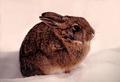
One Cold Morningby vtruanComment: Greetings from the Critique Club!
What a beautiful little rabbit. We have them around here once in a while and I just love them.
I loved this shot during the challenge and I still love it now. The composition, the cropping, the lighting are as close to perfect as you can get. But for some reason the coloration of the rabbit itself seemed just a bit off to me, don't know exactly why but it seemed a bit orange to me. Also the shadow behind the rabbit is almost too perfect, not sure if that is where you removed the vegetation but it looks off just a hair.
Otherwise this is a wonderful shot and I had given it a 9 during the challenge.
Good Luck In Future Challenges!
Deannda
DNeufer@stny.rr.com if you have any questions or want to discuss this further! |
| Photographer found comment helpful. |
| 01/15/2004 06:58:48 PM |
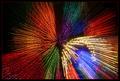
Illuminationsby KonadorComment: Greetings from the Critique Club.
Oy, why me? LOL! I love this shot, I was trying to figure out during the challenge how you caught all those different colored fireworks!
Now that I see how it was done it makes much better sense.
Now to critique. It's perfect of course! ;) Okay, not really, there is one little thing that bothers me a bit, it's off balance or appears to be off balance. The cropping on the right has the lights running out of the shot while on the left there is black space, a slightly tighter crop on the left would balance this out for me. Also the white lights are a bit distracting but you couldn't very well ask them to turn them off, could you? I just took my ruler out and the center is just about in the center of the shot but because of that space on the left it still looks off to me.
The colors are fantastic and the dots along the lines are I'm assuming where the camera was making it's adjustments while zooming and really add to the shot. The border is perfect for this shot, the black edge holding it all in.
You really should do a "How did they do that" tutorial on this one, it's a great effect overall!
Hope this helps!
Good Luck In Future Challenges!
Deannda
DNeufer@stny.rr.com if you have any questions or want to discuss this further! |
| Photographer found comment helpful. |
| 01/15/2004 12:17:05 AM |
|
| Photographer found comment helpful. |
| 01/15/2004 12:16:09 AM |
|
| Photographer found comment helpful. |
| 01/14/2004 09:05:58 PM |
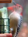
Headache In The Makin'by DrakeComment: Greetings from the Critique Club!
This is a wonderful overall image, I love just about any animal shots though :)
The motion of the bird is excellent, capturing it in both positions, in and out of the food dish. Really shows the "action" of the shot.
To me the angle of the shot and the cropping seem just a bit off. Capturing birds on film is hard enough so not sure if you could have gotten another angle or not but I'm thinking more of a side view would have really made this picture pop for me. Also the cropping on the bottom seems to high, cutting his tail off hurts this shot to me and the top crop seems just a tad tight also while you could have come in just a touch more on the right.
Hope this helps!
Good Luck In Future Challenges!
Deannda
DNeufer@stny.rr.com if you have any questions or want to discuss this further! |
| Photographer found comment helpful. |
| 01/14/2004 03:59:10 PM |
All that Glittersby NeuferlandComment: Originally posted by Frankie_Lv:
.......The shadows in the picture just do not match the lighting. No matter how you use the light (angles/strenght) or even fill flash the shadows just do not match. There has been a lot more image editing and enhancing here then the photographer states and it is all bad. I could go on here and type for another hour but it would prove useless. The photographer of this photograph knows what was done and clearly understated it in there comment box. How this got the score it did is beyond me. I would have to rate it a 1 or 2 |
No there was not any more imaging editing than what is stated. As for the shadows, that is how they came out. I admit I went to far on the color adjustment, too much red adjustment.
Here is the original shot, resized only:

Deannda
Thanks for your critique |
| 01/13/2004 09:29:07 AM |
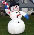
Inflated Plastic Frosty - ususally deflated and flat on the ground!by SamaraComment: Greetings from the Critique Club!
Hi! Ah, the inflatable icons of Christmas this year. They drove me nuts! :)
This is a decent shot overall but doesn't really jump out and stand out from the rest. The title tells me that this is a rare occasion that it's actually inflated and for the tacky side the deflated version might have worked much better. Having a flat snowman in your yard type thing.
You have a very wide crop on the sides yet very tight on the top and bottom. Maybe a more balanced crop would work with this, taking a bit more off the sides, especially the right side, cutting down on the distracting background.
The lighting is also a bit dark it seems seeing the bright patch of blue sky in the upper right corner.
The house is distracting in the background. I know you can't move it, LOL but maybe trying a different angle to shot from to still get your main subject but have a less distracting background? Or even at night, after the house lights are off and the snowman is still lit up?
I hope this helps.
Good Luck In Future Challenges!
Deannda
DNeufer@stny.rr.com if you have any questions or want to discuss this further! |
| Photographer found comment helpful. |
| 01/13/2004 09:19:28 AM |
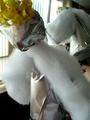
The "strangels"by cristiano79Comment: Greetings from the Critique Club!
Hi! This image is without a doubt a tacky Christmas decoration when you really look at it but sadly nothing about the image makes me want to really spend time looking at it and trying to figure it out. The title does help some but not a lot.
The shot is from behind one of the angels and that is where the confusion comes in, you can see the wings on the one in the background but the one in the foreground really has no definition. A hard subject to shoot overall I'm sure. It's also a very busy shot, if you could have just had one angel in the shot to simplify it?
The cropping is a bit tight on the angel in the front perhaps lending to the confusion of what they might be. A bit looser crop to include the whole angel might help. Also the focus seems off on part of the angel. When this close to the subject I would expect to see the entire subject in focus, the head and hair seem a bit fuzzy.
The lighting is good, natural light from the window works very well with this shot but would work even better if you came from a different angle and was able to block the windows out. The colors are also very well done.
I hope this helps.
Good Luck In Future Challenges!
Deannda
DNeufer@stny.rr.com if you have any questions or want to discuss this further! Message edited by author 2004-01-13 09:20:48. |
| Photographer found comment helpful. |
Home -
Challenges -
Community -
League -
Photos -
Cameras -
Lenses -
Learn -
Help -
Terms of Use -
Privacy -
Top ^
DPChallenge, and website content and design, Copyright © 2001-2026 Challenging Technologies, LLC.
All digital photo copyrights belong to the photographers and may not be used without permission.
Current Server Time: 06/19/2026 12:57:15 PM EDT.