| Image |
Comment |
| 05/19/2005 11:17:27 AM |
|
 Photographer found comment helpful. Photographer found comment helpful. |
| 05/09/2005 09:39:18 AM |
|
| Photographer found comment helpful. |
| 04/26/2005 12:05:32 AM |
|
| Photographer found comment helpful. |
| 02/14/2005 12:07:48 AM |
|
| Photographer found comment helpful. |
| 02/07/2005 02:53:44 PM |
|
| Photographer found comment helpful. |
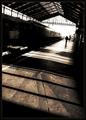
| 01/10/2005 04:32:43 PM |
Alone in a Crowdby sgauriaComment: Thats what I call Bokeh!
I dont know if this was done in camera or PP but its still very effective.
Maybe bump up the contrast a bit?
7 |
| Photographer found comment helpful. |
| 01/10/2005 04:31:46 PM |
Coffee in Venice?by blancericComment: Nice job in using Bokeh, it compliments the foreground. The coffee cup looks a bit out of focus. The pole does remind me of Venice, 7 |
| Photographer found comment helpful. |
| 01/10/2005 04:29:44 PM |
Winter Roseby AranchaComment: VERY NICE foreground, very sharp and great colors.
But (to me) it falls short in the Bokeh challenge, the bokeh background does not really compliment the foreground, it is just a color. Maybe a whole field of these flowers in the background would be more effective? I would have given it a 9 with better Bokeh, 7 |
| Photographer found comment helpful. |
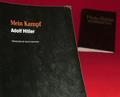
| 01/10/2005 04:28:03 PM |
Lest We Forgetby tgordonComment: Nice idea about the two contrasting...
I dont like the red tho, maybe a white would look better with more light on the Bible? |
| Photographer found comment helpful. |
| 01/10/2005 04:26:16 PM |
XXby SunnieeComment: Nice, very nice, looks like a commercial on tv or in a magazine. |
| Photographer found comment helpful. |
Home -
Challenges -
Community -
League -
Photos -
Cameras -
Lenses -
Learn -
Help -
Terms of Use -
Privacy -
Top ^
DPChallenge, and website content and design, Copyright © 2001-2026 Challenging Technologies, LLC.
All digital photo copyrights belong to the photographers and may not be used without permission.
Current Server Time: 07/15/2026 07:49:34 PM EDT.