| Image |
Comment |
| 11/12/2003 12:22:47 PM |
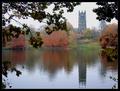
Reflecting Upon Religionby michael_pComment: Nice composition; This would be helped by a more interesting sky. Even as is, I think a haze filter and maybe polarizer would have helped. |
 Photographer found comment helpful. Photographer found comment helpful. |
| 11/12/2003 10:35:28 AM |
I swear, he didn't move!by SoulHunter74Comment: I think the background is interesting, and I can accept the effect you tried with the overexposure. I think it's pretty obvious it was intentional.
It's a decent photo, but think about it: your background effect draws attention to it. But does the moose? The lighting on the moose is pretty flat, and he's even positioned outside of the "glow". (Note if you put him in the glow, you would probably need to change the crop so its not the center.)
One other thing, the perspective distortion is obvious on the left because of the tile lines. It might also have been interesting to have a square perspective here. |
| Photographer found comment helpful. |
| 11/12/2003 01:52:55 AM |
Dating For Dummiesby RegoComment: Too bad the editing rules prohibit red-eye correction (though you might have been able to do that without spot editing by adjusting colors globally. Or maybe B&W would have been a better choice. |
| 11/12/2003 01:51:37 AM |
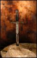
The Sword in the Stoneby moodvilleComment: Niice capture, good DOF, but the composition could be more interesting (this one's centered, and the rock in front of the sword takes away from sword being the focal point. |
| Photographer found comment helpful. |
| 11/12/2003 01:50:12 AM |
|
| Photographer found comment helpful. |
| 11/12/2003 01:49:48 AM |
By the Bayby Johanna00Comment: Might be a nice photo, but it has too many jpeg artifacts here to tell if it's sharp, and has good color. |
| 11/12/2003 01:19:46 AM |
Queen's Gambitby Adrian TungComment: I like the light, and the effect works in general. However, I think this is not the most interesting arrangement of pieces, interest wise. Perhaps fewer pieces, and using some of the more interesting ones in the "clear piece" position might have been more interesting. I think the use of DOF is good here, but perhaps the foreground objects should be closer into the focus range (not as blurry) |
| Photographer found comment helpful. |
| 11/12/2003 12:24:07 AM |
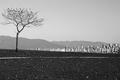
The Thirteenth Moonby zeuszenComment: Nice shot. Good comp, though perhaps getting the tree in whole would have been good. Also, it would have helped to run NeatImage on this. |
| Photographer found comment helpful. |
| 11/12/2003 12:21:47 AM |
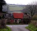
Great Expectationsby adeywilliamsComment: Interesting subkect; I think a closer view, or maybe a tighter crop, would have suited it better, as well as getting better light on it. |
| Photographer found comment helpful. |
| 11/12/2003 12:20:46 AM |
Shoot Don't Shootby kellymcgComment: Never heard of the book, but I like the way you've captured this interesting and multifaceted sign. |
Home -
Challenges -
Community -
League -
Photos -
Cameras -
Lenses -
Learn -
Help -
Terms of Use -
Privacy -
Top ^
DPChallenge, and website content and design, Copyright © 2001-2026 Challenging Technologies, LLC.
All digital photo copyrights belong to the photographers and may not be used without permission.
Current Server Time: 09/26/2026 08:59:19 PM EDT.