|
|
|
Showing 3641 - 3650 of ~3845 |
| Image |
Comment |
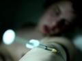
| 11/25/2003 05:00:18 PM | Worth it?by arnitComment: Powerful image. Well done. Without the challenge rules it might be nice to have a little less brightness on the end of the syringe. Good luck! |
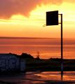
| 11/25/2003 12:44:23 AM | When we used to playby oskarComment: Greetings from the Critique Club:
A very nice image! I love the colors, and the concept.
Suggestions: From this position of the shoot, it would have been nice to have enough shadow detail to make out the net (ring) and its attachment to the backboard. Right now we only see part of the net (ring). Similarly, a bit more shadow detail on the wall with the graphiti. Perhaps if you have the new Adobe CS you can try the new shadow detail took on it.
I also would have liked to see a bit more sharpness in the outlines of the wall and bushes, as well as the water in the background.
Regards--Neil |  Photographer found comment helpful. Photographer found comment helpful. |
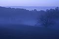
| 11/25/2003 12:38:29 AM | Blue Mist by Joan Severanceby fdpiechComment: Greetings from the Critique Club:
I think you've captured an excellent scene here. The composition is excellent.
I like the blue effect overall. But I think the image could use more contrast. Taking it into PS, I see that the black levels in the photograph are not at the end of the scale, as they should be. In addition, due to oversharpening, or due to using too big of a radius while sharpening, there are halos along the treeline.
Finally, the image has a bit of noise. Noise reduction, e.g., via Neatimage, would have addressed that easily.
All in all, a beautiful image, just needs a bit of attention in an image editor like PS!
Regards--Neil |
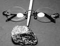
| 11/23/2003 09:41:05 PM | Harry Potter and the Sorcerer´s Stoneby cimarron98Comment: Greetings from the Critique Club!
I think you had a great idea here, and selected a good set of elements to give us the feel for the book. I also like the choice of B&W here.
On the technical side, there are a couple of things that can be improved here. I don't think the light reflection in the glasses is needed if done intentionally, and at best distracts a bit, especially because I can see some detail in it, i.e., the bulb.
The wand itself is the major problem I see here. It's overexposed, and I don't think it's placed optimally in the image. It's almost as if it's arranged to be the nose, the glasses the eyes, and the rock the mouth, making a face, which distracts a bit. I am not sure how I would arrange them without some playing, but I would think I might have tried the wand coming in from one corner, and the other objects symmetrical on the other diagnoal. But I would have to experiment to see what worked best. Some other suggestions:
1) A dark, nonreflective base and background would have given this some extra pop
2) A sheet over the light source and putting it back would have diffused the light and eliminated the reflection. A circular polarizer might have also been effective here.
Glad to see such a creative entry and I look forward to seeing more of your work. | | Photographer found comment helpful. |
| 11/23/2003 08:34:12 PM | | | Photographer found comment helpful. |
| 11/23/2003 08:25:54 PM | It's Like Money Down The Drainby CatherineComment: A very pretty capture and good idea. The literal phrase I know is "Like Pouring money down the drain", and that migh have been even better, to have a pitcher full of money and pouring them down the sink! I wish I had thought of that one earlier, I might have done it myself! | | Photographer found comment helpful. |
| 11/23/2003 08:25:32 PM | He Heard It Straight From The Horse's Mouthby ShannonComment: Good photo and idea. Some comments which really would have nailed it: I wish the wire fence weren' t int the pic at the bottom, but it understandably might have been difficult to avoid here. Having the horse's mouth open, e.g., feeding him something before this shot, would have nailed it! | | Photographer found comment helpful. |
| 11/23/2003 08:24:16 PM | | | Photographer found comment helpful. |
| 11/23/2003 08:23:56 PM | ain't the brightest crayon in the boxby ScantyNebulaComment: Not sure I ever heard that one (to my face at least), but it's a pretty good and literal interpretation. I would have lgked to see the black crayon somehow more contrasted against the background. The dark shadows in the box obscure part of the tip outline. | | Photographer found comment helpful. |
| 11/23/2003 08:23:27 PM | A dog´s lifeby AlexysComment: This is perhaps the most "chilling" literalism I've seen. May people like this gentleman don't even live as good as a dog. But it's also irony, since "A dogs life" is usually interpreted as meaning "A lazy, do nothing life". This person doesn't strike me as being there "voluntarily".
As to the picture itself, it seems a little unclear/unsharp, whether it be from resolution or focus. | | Photographer found comment helpful. |
|
Showing 3641 - 3650 of ~3845 |
Home -
Challenges -
Community -
League -
Photos -
Cameras -
Lenses -
Learn -
Help -
Terms of Use -
Privacy -
Top ^
DPChallenge, and website content and design, Copyright © 2001-2026 Challenging Technologies, LLC.
All digital photo copyrights belong to the photographers and may not be used without permission.
Current Server Time: 09/27/2026 08:53:41 PM EDT.
|