| Image |
Comment |
| 10/06/2004 09:01:40 PM |
Pansyby KellilouComment: Very nice! Perhaps oversharpened, though there seem to be more white dot artifacts than halos |
 Photographer found comment helpful. Photographer found comment helpful. |
| 10/06/2004 07:56:13 PM |
Goose Neck of Dreamsby fulgentComment: Good idea and shot. I think it would be better (though perhaps not as recognizable) cropped on the left just beyond the edge of the neck. |
| Photographer found comment helpful. |
| 10/06/2004 07:46:10 PM |
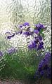
A Bit of a Paneby biggood53Comment: I really like this but I think the composition could be stronger. The dark bar to the right should be cropped out, and I think much of the bottom with the green background as well. The contrast between the purple flowers and the frosted/distored glass works very well as an abstract (and of course would even be more appropos for part). Hope to see more versions of this later! |
| Photographer found comment helpful. |
| 10/06/2004 07:22:10 PM |
Peacock tailfeathers in the breeze.by HeavyComment: The subject doesn't stand out here because it's so busy with the leaves. Maybe with less DOF it would work better, but the dynamic range issues and overexposed sky are also working against you! |
| Photographer found comment helpful. |
| 10/06/2004 07:18:24 PM |
Not so fluffy...by rathanasiouComment: Very good composition, great closeup, but has some oversharpening problem or added grain problem that lowers the clarity and impact, IMHO. |
| Photographer found comment helpful. |
| 10/06/2004 07:15:21 PM |
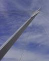
Wired Supportby Aussie_BlueyComment: This is a good idea and I like the composition. I think it needs to be leveled--the white clouds don't look white to me, and contrast is low. I think with some added contrast, this would score much higher.. Also, I think a wider (landscape) view might have been nice! |
| 10/06/2004 09:15:56 AM |
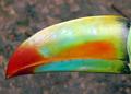
Half a Toucanby vaguiloComment: This is a good idea but it would have been better to crop off the little green part on the right. Also, the composition is somewhat non-dynamic (level, horizontal centering). You might have even rotated it 45 degrees, and cropped in much tigher (who needs the ground and that black diagonal edge upper right). |
| Photographer found comment helpful. |
| 10/06/2004 09:13:30 AM |
|
| Photographer found comment helpful. |
| 10/06/2004 09:12:00 AM |
Humpy flukeby chrism23Comment: Great scene! This would be a winner if it were sharp. I understand how conditions were wrong, but it's a shame because the shake or low resolution really hurts this. |
| Photographer found comment helpful. |
| 10/05/2004 11:06:10 PM |
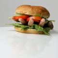
HandBurgerby arnitComment: Now that's what I call real finger foods! Nice job. |
| Photographer found comment helpful. |
Home -
Challenges -
Community -
League -
Photos -
Cameras -
Lenses -
Learn -
Help -
Terms of Use -
Privacy -
Top ^
DPChallenge, and website content and design, Copyright © 2001-2026 Challenging Technologies, LLC.
All digital photo copyrights belong to the photographers and may not be used without permission.
Current Server Time: 07/26/2026 10:49:24 AM EDT.