| Image |
Comment |
| 11/04/2004 04:29:24 PM |
Rockyby scrum8Comment: Good catch, and the water and light look good here. While the foreground serves to frame the racoon, it is also very distracting (because it's colorful and bright). Also using foreground for framing typically works better if it extends to the edge of the photo. |
 Photographer found comment helpful. Photographer found comment helpful. |
| 11/04/2004 04:27:07 PM |
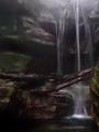
Fall's Starsby PatochComment: Nice composition and shot. It looks like this has not had its levels adjusted. That is, there are no blacks anywhere in the photo, even in the shadow areas. Also, the stem is overexposed. A photo with proper or even a little "too much" contrast stands out more and is pleasing to view. |
| Photographer found comment helpful. |
| 11/02/2004 10:29:46 PM |
|
| Photographer found comment helpful. |
| 11/02/2004 10:29:34 PM |
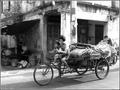
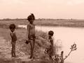
Family Affairby frumoazniculComment: A strong photo with good tones and interest. I am torn between poverty and boredom, but perhaps they go hand in hand. I am predicting a ribbon here. |
| Photographer found comment helpful. |
| 11/02/2004 10:26:28 PM |
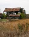
Abandonedby JCDeanComment: This is a good shot. Topically, it might suggest poverty, or neglect, or just moving on. I think it would have been good to use a polarizer to darken the sky a bit, or maybe you could have achieved that with levels. |
| Photographer found comment helpful. |
| 11/02/2004 10:24:57 PM |
Spirutual Seekerby tomsperdutoComment: Excellent shot. One of my top picks for the challenge. I think, however, it might have been better if you had limited the DOF to separate out the front person and downplay the headless people behind. |
| 11/02/2004 01:28:48 AM |
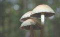
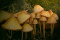
Secretsby rileyComment: Neat subject! The vignetting here is distracting to me however, as is the dominance of the foreground mushroom which is not the focal point. I do like the warm tones of the mushrooms in the sweet spot! |
| Photographer found comment helpful. |
| 11/02/2004 01:26:45 AM |
|
| 11/02/2004 01:25:01 AM |
Oneby jonrComment: Great shot. I love the tone and feel here. Personally, I feel there's too much negative space, and capping that off, there seems to be some fench colored poles back there that are distracting. You might consider later cropping just below the bottom of the one on the right. |
| Photographer found comment helpful. |
| 11/02/2004 01:16:12 AM |
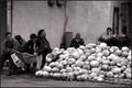
The pangs of povertyby kghoshalComment: Perfect for the challenge. I am not sure about the toning though--seems to be "rose" colored. I think this would be more effective in regular B&W. Other small distracting details are in the distant background but interact with the foreground elements: the white object that seems to be coming from one boys ear; the man walking in the background between two of the main characters.
Still, overall, a very good photo and in my top 10 for the challenge. The boy on the left is a strong photo just by himself. |
| Photographer found comment helpful. |
Home -
Challenges -
Community -
League -
Photos -
Cameras -
Lenses -
Learn -
Help -
Terms of Use -
Privacy -
Top ^
DPChallenge, and website content and design, Copyright © 2001-2026 Challenging Technologies, LLC.
All digital photo copyrights belong to the photographers and may not be used without permission.
Current Server Time: 07/26/2026 03:38:47 PM EDT.