| Image |
Comment |
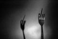
| 11/17/2004 10:43:24 PM |
fork youby muckpondComment: Love the background here; good crisp photo with good exposure. As funny as a rude gesture can be, but perhaps funnier because of the twisted literalism. But I hate to tell you--forks do not have a middle finger (or prong). You needed to find a 5 toothed fork. :) |
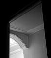
| 11/17/2004 10:41:03 PM |
A Path to Eternityby soheilComment: Good tones, and good lines. The one thing that doesn't work for me is the framing in the askew (because of angle) doorway and the large amount of negative space relative to the geometric pattern presented. |
 Photographer found comment helpful. Photographer found comment helpful. |
| 11/17/2004 10:39:54 PM |
contagious smileby whiteroomComment: Nice capture of what looks like candid emotion. However, IMHO, it needs to be crisper (sharper) and the exposure better controlled. Also, model has something on his front tooth--either food or an implant! |
| Photographer found comment helpful. |
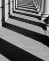
| 11/17/2004 10:37:55 PM |
Shadowsby RefocusedComment: Nice. You might also consider cropping the first two shadows at the bottom, making the pattern fully consistent. |
| Photographer found comment helpful. |
| 11/17/2004 12:39:18 PM |
chris/sonnieby daisy77Comment: Hi Margaret! Good pose and good tones. Some suggestions: crop the left side, which is a bit distracting, and that will get them out of the center. Also, try to recover data in the flash burned areas of their faces...copy the layer in PS and use multiply as the blend. If there's detail there, it will recover it. |
| Photographer found comment helpful. |
| 11/17/2004 12:56:29 AM |
Reflectionsby GallatinComment: Nice contrast and composition. Would have liked a little more sky, but overall, it works! |
| Photographer found comment helpful. |
| 11/17/2004 12:55:56 AM |
Mystifiedby TSaylorsComment: Very nice. Tthe exposure in the back seems perfect for this mood and setting but the front is a bit difficult to see. It may be ok, but I think a little more brightness there would have been good. |
| 11/15/2004 09:47:28 PM |
All at Seaby ImagineerComment: Jon, I like this very much--I'd perhaps like to see some contrast or other adjustments that brings the boat/sail out a bit more, but even then it may turn out that the somewhat high key nature also gives this its spark. |
| Photographer found comment helpful. |
| 11/15/2004 09:06:06 AM |
|
| Photographer found comment helpful. |
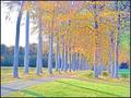
| 11/15/2004 08:59:38 AM |
Fall impressionsby rhipsterComment: I like the effect here in the leaves. The tree trunks, however, show up as light blue and you can't help but think--needs to be leveled.
Actually, if you crop the left side, eliminating all traces of the white sky, it get's bumped up a couple notches, and for some reason, the light blue trees don't bother me, and it becomes painterly.
Love to see more of your experiments in the thread. |
| Photographer found comment helpful. |
Home -
Challenges -
Community -
League -
Photos -
Cameras -
Lenses -
Learn -
Help -
Terms of Use -
Privacy -
Top ^
DPChallenge, and website content and design, Copyright © 2001-2026 Challenging Technologies, LLC.
All digital photo copyrights belong to the photographers and may not be used without permission.
Current Server Time: 07/26/2026 07:16:35 PM EDT.