| Image |
Comment |
| 12/15/2004 12:09:56 AM |
Red Hot Chanukahby maxjComment: Happy Hannukah. I was thinking the same thing tonight. Shot some of these, but haven't even looked at them yet because i was pretty determined not to enter this one. I like the way you've captured so few colors here. Gives it a nice graphic look. |
 Photographer found comment helpful. Photographer found comment helpful. |
| 12/14/2004 11:30:43 PM |
Raining umbrellasby Pug-HComment: My favorite shot on the whole site, perhaps is an umbrella shot. This was very clever and pretty well done. A couple of things hurt it. The exposure issues on the left umbrella, the movement blur as well (though if you look at my portfolio, you'll know I am generally a fan of movement blur). I think a faster shutter speed would have worked better. Also, the noise in the sky is a problem for this kind of shot. |
| Photographer found comment helpful. |
| 12/14/2004 11:26:45 PM |
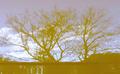
Mushroom Sunriseby labudsComment: This is very striking--I like the composition and the transitions and contrast. I think it would have been stronger if it were sharper--I am not a sharp nut, but this looks soft to me. Especially around the edges, particularly upper left and right. Also, I would like to have seen a tonal trend--light at the bottom "center" of the object, and getting darker towards the edges. It almost does that, but the pattern is broken upper left (particularly) and upper right. Maybe a crop would help, or maybe it needs a reshoot, but it's definitely a nice vision and worth doing. |
| 12/14/2004 11:24:34 PM |
Working Toward Yellowby prbettsComment: I like the concept here, but I think the problem is that it doesn't go "far" enough. The lines present some drama, along with the color, yet they are very soft and offer little contrast. The progression of the yellow is somewhat incomplete as well, being more centered rather than a gradient. I think if you could have made it sharper, with a bit more contrast and a true gradient look, it would be a strong abstract and strong contender. |
| Photographer found comment helpful. |
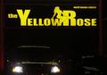
| 12/14/2004 11:22:05 PM |
Yellow Revisited: Texas Styleby HornOUBetComment: Nice colors, in focus. I actually think this would have made a wonderful geometric abstract by zooming into one or more letters (probably around the lady) of this pretty sign. Sort of what the person did with Toys R Us. I find the current composition less compelling; I am not sure why the car is included, with the headlights, at least in terms of artistic presentation. |
| Photographer found comment helpful. |
| 12/14/2004 11:18:27 PM |
autum fully Dressedby HalimComment: This looks like it may have been shot through glass as well, or perhaps it was reduced without sharpening, because it appears very soft.
Some suggestions: 1) make sure you use the full 640 in at least one direction, 2) use levels or brightness contrast to make sure your photo includes the full range of tones, whatever way you tone it; 3) use your softwares unsharp mask (which increases edge contrast) to sharpen to taste. |
| Photographer found comment helpful. |
| 12/14/2004 08:37:10 PM |
Up Up and Away!by gmelandComment: This is a classic view of a balloon--well done. I think it might have been improved though with more even lighting (strange as it sounds to say that!) |
| Photographer found comment helpful. |
| 12/14/2004 08:35:39 PM |
yellow is usby WobbleComment: It was hard at first to tell what this is, but that made it even more special. I think this works well as an abstract-it would be hard for someone without the title to see the word (I think!) One of my favorites from the challenge. Nice work. |
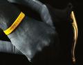
| 12/14/2004 08:34:22 PM |
By Exampleby soccerdadComment: Superb work! Good choice of subject, great desaturation work. I'd like to have seen it with the brake level desaturated too. My pick for the yellow ribbon (get it?) |
| Photographer found comment helpful. |
| 12/13/2004 09:18:23 PM |
|
| Photographer found comment helpful. |
Home -
Challenges -
Community -
League -
Photos -
Cameras -
Lenses -
Learn -
Help -
Terms of Use -
Privacy -
Top ^
DPChallenge, and website content and design, Copyright © 2001-2026 Challenging Technologies, LLC.
All digital photo copyrights belong to the photographers and may not be used without permission.
Current Server Time: 07/27/2026 05:24:25 AM EDT.


![Pride of London [option 2]](https://images.dpchallenge.com/images_portfolio/5000-9999/8860/120/Copyrighted_Image_Reuse_Prohibited_128184.jpg)