| Image |
Comment |
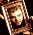
| 02/21/2005 12:35:47 AM |
Framedby parrotheadComment: Hmm, I thought I left you a comment. Congrats on your placement in this challenge. A good idea and a lot more photogenic than me ;) |
 Photographer found comment helpful. Photographer found comment helpful. |
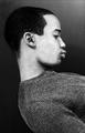
| 02/21/2005 12:32:12 AM |
blkby GeocideComment: Very nice--I really like the graphic feel, but the pose to me is a bit more awkward. |
| Photographer found comment helpful. |
| 02/21/2005 12:22:26 AM |
ME MYSELF & I'M WEIRDby fotodudeComment: Hey Brando, I liked this one. My favorite kind of shot. Excellent poses and nice time/multiple exposure. I mean REALLY. I don't even think I can make the face on the right!
To me the only thing that I could have seen improving is the "grayness" of it--I don't know if that was intentional. You might try to play with the levels on it--I can see this working in high key, which is what it might become with some playing.
Thanks for your comments on mine, and hey, you weren't far behind in score to me anyway (and you have a favorite!) See you around the site!
|
| Photographer found comment helpful. |
| 02/21/2005 12:13:28 AM |
My Picassoby NeilComment: Thanks for your comments everyone. I am not sure if the low score reflects people not getting it, or people just not liking it, or in particular the grain. But here's a link to the portrait I challenged myself to imitate:
Picasso's Self Portrait during the cubism period
Of course, this was harder under DPC rules, and it took me many takes. For those who still don't see, my profile and my front shots are there. Message edited by author 2005-02-21 00:14:31. |
| 02/20/2005 09:11:14 AM |
Splashby BudComment: Actually, looking at this again, I think it's quite nice! |
| Photographer found comment helpful. |
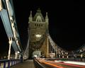
| 02/19/2005 05:40:25 PM |
Tower Bridgeby mmckennaComment: Very nice, I like the star effects and the motion blurred lights. Seems to be a slight tilt to the right you might want to adjust. |
| Photographer found comment helpful. |
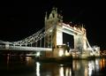
| 02/19/2005 05:30:07 PM |
Tower Bridgeby mmckennaComment: Very nice! I like this one very much, but you might want to burn in, or use layers and layer blend multiply, to work on the overexposed areas on the foreground tower. |
| Photographer found comment helpful. |
| 02/19/2005 05:23:30 PM |
The good / bad / ugly ???by RUEDISCHMUTZComment: Returning for comment. Love the lighing, and the wincing glaring look. The background is a bit distracting here and maybe not the right setting for the foreground "mood". But it's an excellent portrait, so on second review, bumping up. Now one of my top picks (though there are a lot of them up there now) |
| Photographer found comment helpful. |
| 02/19/2005 05:21:16 PM |
VERY Shy About Self-Portraitsby SandyPComment: Returning for comment. Love the pose and the smile, one major technical issue: for this type of shot, your face is out of focus slightly--looks like autofocus got your shoulder, and the DOF was just too small to get your face. Other minor issues are the light/flash glare on the earing, and possibly a small color balanace issue -- maybe from having different types of light sources (for example, the tones on your forehead are very different than the tones on your face.)
But getting back to the pose and smile, this is a very happy photo. A portrait tells us about someone: I suspect you are a very "happy" person in general, or at least that's what shows through here. So that part of this shot is a real winner. Bumping up on second review. |
| Photographer found comment helpful. |
| 02/19/2005 05:15:33 PM |
midnight in the gardenby grigrigirlComment: Very artistic take. The eyes are haunting and the overall glow is a nice finish. Bumping up!
Returning Again. This keeps haunting me from the thumnail. Ok, you win, bumping from 8 to 10. Please don't haunt me :-) Very nice.... |
| Photographer found comment helpful. |
Home -
Challenges -
Community -
League -
Photos -
Cameras -
Lenses -
Learn -
Help -
Terms of Use -
Privacy -
Top ^
DPChallenge, and website content and design, Copyright © 2001-2026 Challenging Technologies, LLC.
All digital photo copyrights belong to the photographers and may not be used without permission.
Current Server Time: 06/16/2026 03:41:41 PM EDT.