| Image |
Comment |
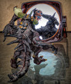
| 03/06/2026 02:36:12 AM |
What Monster?by jomariComment: Looks like I wasn't the only one who thought this might be Ken's. :-) That's a pretty big compliment, though. I smiled wide at this one. Nice work, Marion! Message edited by author 2026-03-06 02:36:47. |
 Photographer found comment helpful. Photographer found comment helpful. |
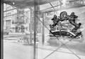
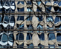
| 03/06/2026 02:34:49 AM |
East 3rd streetby mariucaComment: This one reads like a provocation, both visually and meta-textually. Not sure what it wants to say, but definitely sure it makes me think about more than just what I'm looking at in the frame. |
| 03/06/2026 02:30:24 AM |
Who Am I Inside?by lovemelvinComment: I fully expected to see this one on the front page. I find the angle and clean presentation make this something special--with a kind of melancholy that suits its noir-adjacent processing. |
| Photographer found comment helpful. |
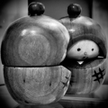
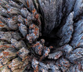
| 03/06/2026 02:25:14 AM |
So Prettyby glad2badadComment: This was my second favorite in the challenge. Clever placement notwithstanding, the way this shot makes that little figurine come to life by way of its own reflection (and "inner dialogue?") is quite a feat. |
| Photographer found comment helpful. |
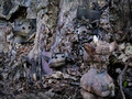
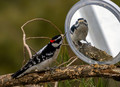
| 03/06/2026 02:22:30 AM |
"Mirror, Mirror, On The Tree" by RefocusedComment: I'm with Nancy on this one. I had a feeling it was you behind the camera, but I wondered how long this session took waiting for such an incredibly compelling shot. Congrats! |
| Photographer found comment helpful. |
| 03/06/2026 02:19:37 AM |
hi there. you look familiar. by kichuComment: This one was my challenge favorite. Such classic charm and fine art sensibility, combined with just enough novelty in presentation to make a cliche feel brand new. That's some real talent there. :-) |
| Photographer found comment helpful. |
| 03/05/2026 05:59:51 PM |
|
| 03/05/2026 05:59:21 PM |
|
| Photographer found comment helpful. |
| 03/05/2026 05:57:44 PM |
|
| Photographer found comment helpful. |
| 03/04/2026 10:35:48 AM |
|
| Photographer found comment helpful. |
Home -
Challenges -
Community -
League -
Photos -
Cameras -
Lenses -
Learn -
Help -
Terms of Use -
Privacy -
Top ^
DPChallenge, and website content and design, Copyright © 2001-2026 Challenging Technologies, LLC.
All digital photo copyrights belong to the photographers and may not be used without permission.
Current Server Time: 06/20/2026 06:34:20 PM EDT.