| Image |
Comment |
| 01/03/2007 02:18:31 PM |
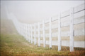
shadowsby arsenalComment: I think the one you submitted for the Free Study this week is more effective. I rated that one a 10, and I offer this one an 8. |
 Photographer found comment helpful. Photographer found comment helpful. |
| 01/03/2007 02:16:55 PM |
Blue Wireby gsalComment: Fabulous eye for composition on this one. One of my fav's this challenge. |
| Photographer found comment helpful. |
| 01/03/2007 02:16:19 PM |
|
| Photographer found comment helpful. |
| 01/03/2007 02:16:02 PM |
|
| 01/03/2007 02:15:00 PM |
Into The Mistby lcottermanComment: Wow...such beautiful composition. I would have like to see slightly bolder colors, but I think it definitely works as is. |
| 01/03/2007 02:14:07 PM |
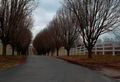
Grand Entranceby PurdyGComment: This is nice composition, but the colors are far too drab to make it a striking piece of work. A bit of saturation could bring out the greens and whites and blues a lot more. A tad of enhanced contrast might make those trees and the fences really "pop" out more, too. |
| Photographer found comment helpful. |
| 01/03/2007 02:12:08 PM |
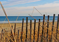
Weatheredby mjarski15Comment: Fabulous composition, and the colors are nice, but the foreground weeds (the blurry ones) are quite distracting. Should you attempt this shot again (or something similar), I would try making sure those big foreground weeds are not in the way of the lens. I offer a 5. |
| 01/03/2007 02:09:25 PM |
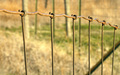
Wire Fenceby jseligmanComment: Had I entered this challenge, I would have attempted something very much like this. I like it very much, but I feel that it could use just a smidge more clarity on the foreground. I offer a 5. |
| Photographer found comment helpful. |
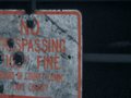
| 01/03/2007 02:08:24 PM |
Fenceby christinared118Comment: I am unpersuaded by this photo...it feels like an "accidental" shot that was supposed to capture more of the sign and didn't quite focus correctly. Nice try, of course! |
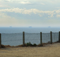
| 01/03/2007 02:06:48 PM |
I saw three shipsby BarkingMadComment: I like the composition but not the color. I think this one could be enhanced with saturation and contrast to make it a bit stronger. |
| Photographer found comment helpful. |
Home -
Challenges -
Community -
League -
Photos -
Cameras -
Lenses -
Learn -
Help -
Terms of Use -
Privacy -
Top ^
DPChallenge, and website content and design, Copyright © 2001-2026 Challenging Technologies, LLC.
All digital photo copyrights belong to the photographers and may not be used without permission.
Current Server Time: 06/10/2026 10:30:15 PM EDT.