| Image |
Comment |
| 11/17/2003 02:30:04 PM |
|
 Photographer found comment helpful. Photographer found comment helpful. |
| 11/17/2003 02:28:57 PM |
|
| Photographer found comment helpful. |
| 11/17/2003 02:26:55 PM |
|
| Photographer found comment helpful. |
| 11/17/2003 01:59:53 PM |
|
| Photographer found comment helpful. |
| 11/17/2003 01:58:46 PM |
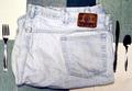
Eat My Shortsby ambakerComment: Cute idea, but poorly arranged photo. The plaid surface is ok - not the best. The silverware isn't laid down striaght, knife is on an angle. The jeans look dirty and gives the photo an unappealing look. |
| Photographer found comment helpful. |
| 11/17/2003 01:56:45 PM |
|
| 11/17/2003 01:52:44 PM |
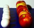
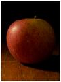
The Big Appleby tomlewis1980Comment: Looks dull, there is nothing that stands out in this picture. The matte ligthing isn't working, the wood surface is scratched and is making it look unappealing
I feel an apple should be bright, shiny and look delicious, its not working here |
| Photographer found comment helpful. |
| 11/17/2003 01:50:29 PM |
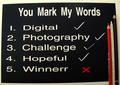
You Mark My Words!by trainComment: Very unique idea, I really like it! I like how the text matches the color of the background. The cropping isn't the same length of the top and bottom, would be nice if they equalled. It looks like the red X is pixellated, everything else seems so crisp but for some reason the red looks to be bleeding into the black |
| 11/17/2003 01:06:55 PM |
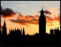
What's the Point?by KonadorComment: Awesome! Lovely sillhouette, and the colors in the sky are breathtaking. Wonderful job |
| Photographer found comment helpful. |
| 11/17/2003 01:06:20 PM |
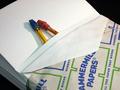
. . . between the sheetsby drydocComment: Very cute idea, I love how you have the "blanket" tucked back like that! haha
I would like to see a tighter crop in on the pencils, and more dramatic shadows |
| Photographer found comment helpful. |
Home -
Challenges -
Community -
League -
Photos -
Cameras -
Lenses -
Learn -
Help -
Terms of Use -
Privacy -
Top ^
DPChallenge, and website content and design, Copyright © 2001-2026 Challenging Technologies, LLC.
All digital photo copyrights belong to the photographers and may not be used without permission.
Current Server Time: 07/17/2026 05:12:03 PM EDT.