|
|
|
Showing 511 - 520 of ~1207 |
| Image |
Comment |
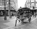
| 03/04/2005 09:24:26 PM | waiting for a fareby tomzinhoComment: Wonderful image!
I really like the choice of black and white for this photograph. It really gives the carriage a shine and makes it gleam out of the busy background.
The focus is fantastic, highlighting the important aspect of the photograph. There is some nice points with the driver adding his own bit of interest and I find the little shop on the right "The Spice Of Life" to be a quirky and fitting (and inadvertant?) subtitle of sorts.
A simple image with a lot of points of interest in it, fits the challenge well, the natural light is nice and even so nothing is hidden from view. Very well done. I gave a 7. |  Photographer found comment helpful. Photographer found comment helpful. |
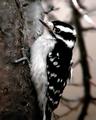
| 03/04/2005 09:20:58 PM | Bird Watchingby vtruanComment: Beautiful bird!
The black and white feathers really pop! The focus on the bird looks pretty good, seems a tad soft, but that could just be from compressing the photo to the needed size.
The natural looking background and light work well, I think the muted tones of the bark help make the bird stand out. I do wish the full bird were in the image, it looks as if the tail was cut off, maybe if the image wasn't so tight on the bird that would help the composition, plus give just a bit more environmental background to add some more interest.
Over all the image is quite nice, the only really distracting portion is in that upper right hand corner where the light is glinting. I gave a 5 | | Photographer found comment helpful. |
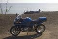
| 03/04/2005 09:13:56 PM | A Day At The Beachby fulgentComment: This is a decent shot that meets the challenge, I think there are some excellent points of interest shown as well.
That said, I find the tone and colors a bit lackluster. Maybe a filter of some kind may have helped, the tones are a bit washed out maybe from the natural light.
I think a shift (if possible) in the composition so that straggly bush wasn't in the picture at the left would help since it doesn't really add anything to the image. Also perhaps a different perspective could add some drama to the photo.
I do like the way the rider and the bike line up, I think that parallel look adds interest. I also think that the location is good, with richer colors in the water it might pop more especially because the bike would likely reflect the colors tying the image together nicely.
Overall it is a good shot, just needs a little extra something to it. I gave a 4. | | Photographer found comment helpful. |
| 03/04/2005 09:04:56 PM | Gettin' It Rightby spreadcomComment: I really enjoy the bold golden color of this image. The metal has a nice warm tone to it that really draws my eye.
There is also an interesting contrast to the image with the silent, unmoving cymbals versus the high energy of the hands. I'm not sure if this is a detriment or not, as I find the composition of the photo focused on the cymbals to have a very classy look, yet the action of the hands does draw my eyes away from that. Its a toss-up.
Fits the challenge perfectly. The border is nice, does give a feeling of keeping the eye in, it may be a little too thick though.
I think the lighting is good, again color and tone are good as well. I like just about every aspect of the image, but I am still a bit leery of the moving hands. Gave a 6. | | Photographer found comment helpful. |
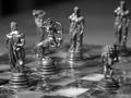
| 03/03/2005 08:54:38 PM | My favourite pastimeby mijakComment: Tone choice is nice, looks good in black and white.
I find the most compelling portion of the image to be the design of the chess pieces. To that end I think a DOF that showed all of the pieces in detail would be preferrable to the single chess piece. I catch myself straining to try and make out exactly what the other pieces look like. Perhaps if the focused piece were a bit more central it'd make a difference in my perspective.
Speaking of perspective, I do like the feeling that I'm inside the game with pieces all around, much better than if you'd simply gone for the full chess board shot that is done often.
Over all a fairly clean image, could use something to make it pop a bit more, though I'm not sure what. 6 | | Photographer found comment helpful. |
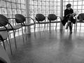
| 03/03/2005 08:51:21 PM | A Magazine in the Waiting Roomby Keith ManiacComment: Fantastic overall sharpness, tonality is great as well.
Very nice in black & white. Gives a boost to the starkness you typically find in a waiting room.
Light is wonderful, a bit bright over by the woman, but I think that helps focus your attention on her more than detracting.
Fits the subject very well. I really like the cleanliness of the image. 9. | | Photographer found comment helpful. |
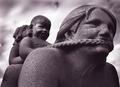
| 06/12/2004 09:09:04 PM | Terni Statuariusby terjeComment: Greetings from the Critique Club!
This is a very striking image. Let's dig a little deeper, shall we?
Focus: The focus on the first face is excellent, very nice textures and detailing shown. The ability to see the pitting really gives an added point of interest. That said, I find the limited focal range - specific only to the first figure - to draw away from the essence of three. The image of course does have three obvious subjects, but I think a deeper focus would pull the other two figures in more and highlight the three aspect to a greater degree.
Color: The color is wonderful. I love the cool, dark feeling of it. Gives a nice stone atmosphere, and the color reflected in the background adds a nice touch of melancholy to the picture. The darker tone really plays up the melodrama.
Composition: I like the composition, however I do agree with the previous commenter that it would be nice to see the third figure just a bit more. This also falls in line with my mention about spreading the focus out more. Other than that, the composition is excellent. Its uncluttered and free, really helps play up the color/tone usage and allows the eye to focus on the great detail you've put on display.
All in all this is a very solid entry and I'm surprised it didn't do higher than 5.3. I find it humorous and dramatic, it really caught my eye. Your work on the background is very nice and enhances the image rather than overshadowing or overpowering it.
Very well done. Thank you for such a pleasant image to critique!
- Sia | | Photographer found comment helpful. |
| 03/19/2004 08:59:19 PM | 45s and 90s - Beauty in the Anglesby TommyMoe21Comment: Greetings from the Critique Club!
Very nice image, has an instant visual impact and really fits the challenge well. It has a sort of surreal feel to it, almost like I'm looking at a rendition of some 'building of the future' ad. That said, let's take a closer look at a few things.
Color: I absolutely love the richness of color in the photo, the blues are very cool and help give a tech/science feel that is highly supported by the general shape and design of the building. It really contrasts well with the yellowy grass in the front too. Nice contrast there. I think the green of the trees could've worked well color-wise but their position really draws away from the positive they could bring.
Which leads us to the next point: Composition - the composition for the most part is wonderful. The natural lines, angles and curves are well represented by the photo, well centered and shot, however.. those trees really do kill it. I find myself wondering how the building would look without them in the way. Particularly since you can see a hint of something behind the trees. It may not have been feasible to compose the image the way you wanted without getting the trees in the shot but if that option is available I'd suggest a reshoot just to see the difference.
Lighting: The lighting is excellent. Obviously natural light was used which can be tricky, but there isn't any distracting glare or oddly lit areas which is a nice achievement. With all of the glass and metal, the lighting could have been (might have been?) a nightmare, but it was handled very well. Kudos.
Focus: The focus is perfect. It has a nice crispness to it which plays off the rigidity of the lines and angles shown, yet it isn't overly sharpened which would have made the nice curves of the dish too harsh and lost some of the surreal quality in the clouds.
I do notice a bit of the pixelation others mentioned in the top right corner, which isn't too bad but does detract from the photo.
All in all it is a marvelous photograph and well suited for the challenge. Nearly all aspects look to be thought out and manifested in the best way possible with my only real detractant being the trees in the foreground. Well done!
- Sia |
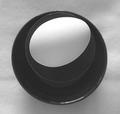
| 12/20/2003 01:07:18 AM | contrastby EmerauldeComment: Hello from the Critique Club!
I think this is a great abstract image. Its nature fits the challenge quite well and I really like how its look was achieved.
Lighting: I like the lighting here, it really helps highlight the egg, which in turn plays off the black cup & saucer and creates that optical illusion/abstract image. I do wish the light was sourced more in the top area so the shadow would fall on the cup/saucer at the bottom helping them to meld together and further that illusion. I also think if the white of the background matched that of the egg more, possibly done with more light, the correlation between the two would be smoother and trick the eyes even better.
Composition: I love the ingenuity here. I don't know if this image had a reference from a similar shot or not, but it has been pulled off very well. I love the use of everyday items to make this very abstract look which has such a nice visual impact. The color coordination is good - the black & white's innate starkness really helps further the image along.
I do wonder if the egg was positioned just a little bit more to the left so it didn't eclipse the side of the cup, whether that would make the visual impact a little more dramatic since it would play up the current illusion of an oddly shaped black stone or circle with a hole in it.
Focus: The focus is where I have a little bit of trouble. There is nice sharp focus on the egg and the top of the cup, but that seems to give the curves a sharpness that looks a little unnatural and detracts from the abstract illusion. I also think because the rest of the image then falls into a soft focus (macrostyle) this lends itself to a 'dirtying' of the image where it should be crisp and clean. I agree with a previous commenter that this would have much more pop if the white & black transitions were smooth and add in that a crispness of focus may help that happen.
Over all I think this is a well-thought out image and I like the abstract nature coupled with the interesting way you brought it out via your composition. Well done. |
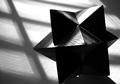
| 12/19/2003 05:48:22 PM | Trianglesby WILDBLUEComment: Hello from the Critique Club!
This is a wonderful interpretation of the challenge. It is clearly a perfect fit, so I'll dwell on the mechanics instead.
Composition: I find the composition excellent. The subject choice is blatantly shape driven, which in itself has a point of interest. The use of the shadows to further the shape representation is what I think really brings this photo its extra depth. It gives a nice variated background with the play of light and dark, as well as continuing the shape trend. Nicely visioned.
I also like the object placement in the corner and up close. I think further away there would still be some dynamics but the close view really gives us a sense of the figure's strong structure. I do think though the bottom crop is too close, if a few centimeters more were given so it matched the distance on the right, it would give a nice sense of balance.
Lighting: This looks to be natural lighting to me and it was well used. I believe the light has that harsh tone that natural light can have and its duality in the very deep shadows works perfectly. This usage makes the linear and rigid triangular shapes really come out. I think a softer, more flattering light as the primary light source would have eroded the inherent strength shown.
That said, I do believe a soft, faint light positioned in the bottom right hand corner would both enhance the rest of the figure, bringing out the lost triangular nature behind those shadows, and still allow that rigid aspect of the photo to flourish. I think the way the shadows are hiding that bottom half breaks the triangle focus in that area - this is the only major 'flaw' that I can see however.
Focus: The focus is great. I think its sharpness on the front two triangles really shows the viewer what the intent of the photo is. I can still see the other various shapes in the image, but with the focus as it is, that triangular theme is what hits me first and foremost. Very well done.
Finally, the use of black & white was an excellent choice. Its stark and dramatic nature really lends itself to this composition. I think it highlights the great contrasts between the light and shadowed areas which I believe would have been lost - to the detriment of the photo - had this been in color.
Over all, this was well envisioned, very well taken and has a very powerful feeling to it.
Excellent work. :)
| | Photographer found comment helpful. |
|
Showing 511 - 520 of ~1207 |
Home -
Challenges -
Community -
League -
Photos -
Cameras -
Lenses -
Learn -
Help -
Terms of Use -
Privacy -
Top ^
DPChallenge, and website content and design, Copyright © 2001-2026 Challenging Technologies, LLC.
All digital photo copyrights belong to the photographers and may not be used without permission.
Current Server Time: 07/21/2026 02:12:47 PM EDT.
|