|
|
|
Showing 481 - 490 of ~1207 |
| Image |
Comment |
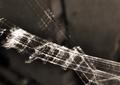
| 06/15/2005 07:18:18 PM | Finding hidden treasuresby TitiaComment: I'm not sure if the fuzzy nature of this image is intentional but I love the abstract aspect of it. I think the title fits the image in general and works for the challenge and I like the black/white look. It does strain my eyes a bit because of the blur, but overall I really enjoy it. It possibly will be voted down by many but I think there's a good crispness (despite the subject appearing blurry) and nice tones, the abstract nature really gives it oomph, so I'm giving a 6. |  Photographer found comment helpful. Photographer found comment helpful. |
| 05/31/2005 02:33:11 PM | beautifully romanticby buzzmomComment: You have some very rich red colors here, which are great, but I think the candlelight created some problems for you. I have never been able to capture candlelight sufficiently so I can commiserate. I like the composition and the idea you have, the focus looks a bit off, but that could be an effect of the candlelight. I'm not sure how to combat the flame issue, but if there was a way to control the light from the candles I think it would give the image a nice crispness and tone down some of the flare a bit. I gave a 4 | | Photographer found comment helpful. |
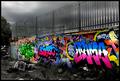
| 05/31/2005 02:28:53 PM | There's Nothing Quite As Beautiful As The Correct Use Of Gramaby mrmorrisComment: Talk about vivid. Love the use of desaturation to bring out the colors of the tagging. Focus is wonderful, as is the composition. I think I'd have cropped it right along the line of the wall though, as the tree at the end doesn't seem crucial to the image. The title is a bit bulky though humorous. Very well done and out of the norm. I gave a 7 | | Photographer found comment helpful. |
| 05/31/2005 02:25:36 PM | TOME BEAUTIESby joansuzyComment: I love the color. The use of the different colored books was wonderful, and I do find it a beautiful collection. I also like the idea of something different than the usual nature/model image. I think the lighting however is a detriment. You definitely need good lighting to let all these rich colors pop through but the shine/glare that is reflecting off of them is very distracting and does harm the look I think you were going for. I think the focus is decent but could be better - its possible that the glare from the books is affecting this though. Finally, the only other thing I'd suggest changing would be a slight rotation so the books didn't appear to be leaning to the right, rather would be straight up and down. Other than those things I really like this entry and again I love the color shown! I gave a 6. |
| 05/31/2005 02:22:32 PM | And She Loves ME!by toddheadComment: Lovely model here, great coloring and nice smile. The outdoor setting really brings out the highlights in her hair and gives the image a simplicity that's furthered by her casual look, shirt and jeans with no shoes. The focus is pretty nice, it looks as if it is centering more on the crown of her head than her face though. I like how the sun is highlighting her hair, giving it a glow, but I think a light to add some brightness to her face would have given the image just a bit more of a kick, she's too pretty to be shaded even just a little bit! Finally, this is just a strange personal preference, but I think since you can seen nearly her whole body, it would be better to have that area of her leg that was cut off, in the picture. While the focus is on her face, I do find my eye wandering to the left hand side of the image and seeing the cut off knee, etc. Not a huge deal though. Very nice strong image, wonderful portrait. I gave a 7 | | Photographer found comment helpful. |
| 05/31/2005 02:18:04 PM | Early morning Blues by XileboComment: Here's an animal that is nearly always beautiful. The subject choice is fantastic. I love the fact that they are running, it really gives the eye many areas to look, plus a horse's body in motion is a beautiful thing as well.
The colors are a bit dulled, but that could be because of the light. If it was possible I'd suggest a capture that had the lead horse (which is wonderfully focused) in the sun so it was basking in the light so to speak, particularly because it is the lead horse - its a shame that it is shadowed. I like how the colors of the horses flow with that of their surroundings, the white matching the white-ish walls and the brown horse matching the ground. I think if the colors were a little richer (not sure if a polarizer was used or if that might help) the image would be even better.
Great focus, nice action, lovely subject and a good composition. Very nice. 6 | | Photographer found comment helpful. |
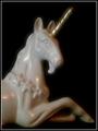
| 05/31/2005 02:12:58 PM | Mystical Beautyby muggle_girlComment: I think the composition of this image is decent, but there are a few things I'd suggest if you decide to try it again. Right now the burden is on the details of the figurine to portray the beauty you're trying to show. I would suggest something to give the image more of a mystical sense (it has a blurred aspect to it which I am guessing was intentional) as well as spice the image up. Perhaps a light source covered in cardboard with pinpricks in it to give random drops of light on the unicorn or a slightly different hue of light (colored cellophane?), perhaps use of smoke to create a mist of sorts.. I'm not sure. The use of a plain black background is great, gives the ability for clean delination of the subject. Border helps pull the image inward so they eyes don't stray. Positioning of the unicorn is excellent. Fills the space very nicely. The horn has a strange smudgy halo around it, I'm not sure if this is due to camera-shake, a post-editing blur application or what.. its slightly distracting but also still sort of works with the idea of mysticism. While the image did not make me sit up and say "Oh beautiful" I can see the potential. I gave a 4. | | Photographer found comment helpful. |
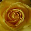
| 05/31/2005 02:02:12 PM | Golden Anniversuryby thsullivComment: Flowers, in general, always have an inherent beauty to them and this one is no different. I like the choice of the yellow rather than the typical red/pink. The straight-on view is nice, it gives the image some further interest with the detailing of all the folds and turns from the petals. That said, the lighting is a bit off - the lower left hand corner has some nice lighting aspects, but I think the shadowing on the rest of the flower detracts from what you're trying to show. The title "Golden Anniversary" brings to mind a richness of color (due to the gold) and unfortunately the color is a bit dulled in this picture. I think experimenting with different light sources and additional fill lights might help this out! It also looks as if a gaussian blur was applied maybe? I'm not sure if that effect helps the image - I think crisp images when macroesque shots are created are the best bet - this is definitely just my opinion though. I gave a 4. |
| 03/05/2005 08:51:04 PM | Tuned Inby librodoComment: Lovely model there.
I like the simplicity of this image, it has some complex aspects like the glow of the skin, the contrasting colors and the feeling of being lost in the music it evokes, and yet at the same time it is clean and fairly crisp.
I think the area by the hand on the right is a bit soft in focus, perhaps too much light over on that side, or maybe some post processing? The focus on the face is good, the tone of the skin is wonderful in my opinion. Composition is great for the most part, though I do find my eye wandering between the girl's face and that curtain of white right next to it.
Still very nicely envisioned and carried out. I gave a 6. | | Photographer found comment helpful. |
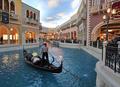
| 03/05/2005 08:46:50 PM | gondola rideby BeetleComment: That water looks much too clean.. is this in Vegas?
I like the variety of color in this image, I also enjoy seeing a different type of activity! The use of the available light is nice, though I wish there was more light in the foreground so details of the riders were a bit easier to see, the focus is pretty decent as well.
The composition is good for the most part but I think you could crop off a fair chunk of the right side, maybe right before the little spouting water area and have the focus be completely on the gondola and its riders. The people looking on the side are not necessary to the image and dilute the power of it in my opinion.
A very nice shot, with an original subject. Fits the challenge easily. Well done. I gave a 6 | | Photographer found comment helpful. |
|
Showing 481 - 490 of ~1207 |
Home -
Challenges -
Community -
League -
Photos -
Cameras -
Lenses -
Learn -
Help -
Terms of Use -
Privacy -
Top ^
DPChallenge, and website content and design, Copyright © 2001-2026 Challenging Technologies, LLC.
All digital photo copyrights belong to the photographers and may not be used without permission.
Current Server Time: 07/19/2026 03:57:41 PM EDT.
|