| Image |
Comment |
| 06/16/2005 07:21:08 PM |
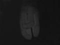
Then God Said: "Let there be Light!"by kashyapaComment: Well.. I'm not exactly sure what it is I'm seeing here. Is it a part of wall that is being highlighted by a flashlight? Or a figure of some sort? I can see the darkness connection, without it there is no light and light helps accentuate darkness but if this is what you're trying to portray (which I could be mistaken in assuming!) the manner it was done was a bit uninspiring and flat. Going with my assumption, I might suggest a different composition, particularly with the title you've used. Maybe a globe that is bathed mostly in darkness with a small bit of light being shone upon it, thus giving an impression of a heavenly light? Again, I could be way off base with what you're trying to convey so my comments may be quite unhelpful. With the my limited ability to understand what you were going for I can only go by what I see and I'm not sure what it is, so I gave a 2. |
| 06/16/2005 07:15:36 PM |
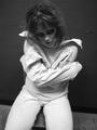
And in the dark she dancedby GoldBerryComment: I think I just lost the huge comment I left about your image by making it a favorite! Boo! Alright here we go again. I'm not seeing a connection to darkness other than the title, so I'm not sure what aspect you're trying to portray. Perhaps she's a dream girl? So someone you see dancing while you're asleep? That's the best I can come up with, but its likely not the interpretation you were looking for. That said, I really enjoy this image. It has a wonderful sultry look to it, which the use of the red and the model's expression helps boost. My one suggestion would be to crop a bit off the left side. While I think the red there does make for some interesting negative space, it just seems a bit too much, a bit too unbalanced. Perhaps cropping right where that dark triangle at the bottom left begins to form.. that way you still have an expanse of red but it isn't quite as much or as overpowering. So all in all I'm giving a 7, but I would've given a point higher if I was able to understand your darkness connection from what I was seeing. Still, very well done, thank you! |
 Photographer found comment helpful. Photographer found comment helpful. |
| 06/15/2005 08:14:37 PM |
Insanity... Darkness Withinby tmorninglory96Comment: Very gritty, love the black and white. Expression is excellent, she not only looks insane but she looks dangerous and.. well.. kind of zombie-ish. Focus and lighting look good though the focus seems a skosh soft in areas, composition is great. I gave a 6. |
| Photographer found comment helpful. |
| 06/15/2005 08:12:47 PM |
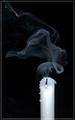
Candle in the windby digitalComment: I think this is beautiful. The only tiiiiny things I don't like about it, is the seemingly small bit off blown out white near the wick of the candle and the border.. not sure why but the image continuing on past the border just makes me wonder why the border is there at all and my eyes are consistently drawn down there. Heh. But those are minor things, I gave an 8. |
| Photographer found comment helpful. |
| 06/15/2005 08:11:10 PM |
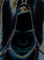
Darkness Awakensby jtstreetComment: I really like how different this looks. Great colors and the texture showing with the way the colors are manifested is wonderful. Has a very spooky feeling to it. I gave a 6. |
| Photographer found comment helpful. |
| 06/15/2005 08:09:24 PM |
Imminent... Darknessby ourwebstopComment: Other than the candle feeling a bit too cropped off at the bottom I think this is fantastic! Well.. actually if there was any way to highlight just the smoke with a strategically placed light source I think that'd be the only other thing that'd make the image better. Even though the darkness is what is being portrayed a smidge more light (on the smoke) would give just a nice highlight I think. I gave a 7 |
| Photographer found comment helpful. |
| 06/15/2005 08:05:51 PM |
Blavk & Whiteby brummieontourComment: Hahaha. Nice. Not sure if everyone else will find this as amusing as I do, but I enjoyed it. The lettering is a bit soft on focus and I think for the best impact it should be bold and bright. Good times. I gave a 5. |
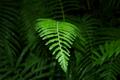
| 06/15/2005 08:04:42 PM |
seeking lightby dasein06Comment: I see the correlation to darkness and I think the idea is a great one. I'm not sure the composition pulls it off however. As a suggestion to try, I would go from a different angle, so the fern left is perpendicular to you --| it'd be sticking out that way instead of towards you, then if possible have most of it blending into a black background and use some placed light sources to shine down on the end of the fern so you see how it is in fact trying to reach the light, even better might be to have the light source shining at a spot just beyond the fern's reach to give the struggle a bit more oomph. As it is, the image has some lovely rich color but the focus is just a bit soft and I think the impact is soft too based on the title/idea it appears you're trying to convey. I gave a 4. |
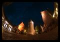
| 06/15/2005 07:59:59 PM |
Surrounded by the Dark Agesby janbruderComment: Nice perspective, great colors, great focus/clarity. I love the tones, its got a nice richness and I of course love the textures surrounding the whole picture. The only nitpick I have would be to crop it a bit more on the left to get rid of what looks like a glare spot in the bottom left. Nicely done. I gave a 7. |
| Photographer found comment helpful. |
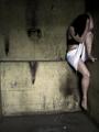
| 06/15/2005 07:58:10 PM |
Cornered and Aloneby mesmerajComment: Nice dank image. I like the emotion behind it and the title. I enjoy the atmosphere where its created. There are a couple of things I'd suggest trying differently if you've a mind to: Shifting the focus of the image just a smidge to the right so you cut out the beginning of the wall on the left where it triangles out and changing the color of your models skirt. The pristine nature of the white seems very out of place in the environment and with what she's wearing. I'm not sure why. It DOES pull your attention TO the model but just something about its extreme contrast to the surroundings seems a bit off. Maybe if it was dirtier or a more muted color.. not sure. Oh.. maybe if just a hint of the model's face was visible, that might be an idea, maybe just seeing one eye peeking through her hair.. not a huge deal really though. I think this is a great image over all, I gave a 6. |
| Photographer found comment helpful. |
Home -
Challenges -
Community -
League -
Photos -
Cameras -
Lenses -
Learn -
Help -
Terms of Use -
Privacy -
Top ^
DPChallenge, and website content and design, Copyright © 2001-2026 Challenging Technologies, LLC.
All digital photo copyrights belong to the photographers and may not be used without permission.
Current Server Time: 07/19/2026 03:57:42 PM EDT.