| Image |
Comment |
| 09/25/2005 11:31:05 AM |
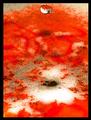
Blood IS thicker than waterby TroutbearComment: Very rich colors, interesting textures showing. The lighting is good but the blown out white is a bit distracting. I like the water droplet but I wish it was a bit closer to where all the interesting action is.. that mess of bubbly crunchy looking stuff at the bottom of the image. Focus looks pretty good. I gave a 6. |
 Photographer found comment helpful. Photographer found comment helpful. |
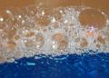
| 09/25/2005 11:29:13 AM |
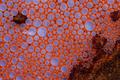
Islandby DiscraftComment: Wow, this has so many interesting features. I love the contrast in color and materials. The bubbles are perfect and interesting and the focus looks good. I think this could have been SO much better though if there was just more light. Enough to capture and let that orange color glow and get those bubbles glistening. The dull nature of the lighting really lets this image down. I gave a 5 for its potential and meeting the challenge but if the lighting were different and the whole image more vibrant I probably would've given a 7. |
| Photographer found comment helpful. |
| 09/25/2005 11:27:22 AM |
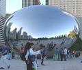
What Bubble?by zapgrafxComment: Heh the elephant in the room sort of situation eh?. Good focus, decent light, though it is a bit shadowed in the foreground. It feels a bit snapshot-ish, but that could just be all the people milling about with no real purpose. I like the interest the bubble itself brings, from the curvature of the buildings along the side and the reflected people. Feels almost "Where's Waldo"-like. I also like the use of a different sort of bubble. I gave a 5. |
| Photographer found comment helpful. |
| 09/25/2005 11:25:28 AM |
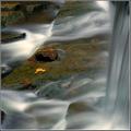
Effervescenceby JeileenComment: Very pretty. I always like waterfall images such as this. The focus and light usage is great. The bubble aspect, not so much. I realize that rushing water typically is chock full of bubbles but they have been smoothed into oblivion in this image. There are also a few (very small) areas where it looks like the lens got droplets on it. Tiny but once noticed they start to detract. I can't tell if this was taken specifically for this challenge or if it was sort of shoehorned in. I wish some bubbles (in their bubbly form) were visible but that's just me. All the same, I gave a 6. |
| Photographer found comment helpful. |
| 09/25/2005 11:20:25 AM |
Where it all beginsby TammerComment: I love the neon color. Bubbles are present, composition is interesting - nice use of negative space. There is good focus, but it seems a bit soft on the outer edge of the glass, wish it was a little crisper throughout. Overall a nice image. I gave a 6 |
| Photographer found comment helpful. |
| 09/25/2005 11:14:24 AM |
The Crest Waveby xlr8tnComment: Nice title! I love the blue and the composition is okay. The image is a bit flat in an inspiration sort of way, there's no pop that might be there from a crisp, sharp focus. The whole bottom section has lost some detail due to lack of focus, I would've probably cropped that out. The light usage is good. I think this could've been way better if a sharper focus was available. I gave a 4 |
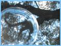
| 09/25/2005 11:12:00 AM |
the bubble and the treeby liahComment: Interesting idea. Meets the challenge and has two potentially great subjects. The composition is a bit off to me. Perhaps if you'd used the bubble like a lens so we could only see the tree through the bubble, that'd add another layer of interest. Also the focus is just not there.. Looks as though you were moving when the image was taken? Perhaps this is intentional but I don't think it does the image justice. The use of natural light is okay, its a little hard to tell since many of the details are blurred out. I like the idea behind it, I like the execution in general but the technical aspects are lacking. I think the border is a bit too much for this image too, nearly dominates. I gave a 4. |
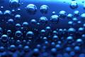
| 09/25/2005 11:09:07 AM |
Under the Seaby wcjyaoComment: I love the bubbles! Great use of light and there's a very nice feeling of weightlessness and floating. The color is very nice. The composition is good but.. all of the out of focus bubbles seem to impact the image much more than the in focuse bubbles, drawing my eyes downward. I had a similar problem with my image and thought keeping some out of focus items would give a nice contrast but intsead it just seems distracting as they are here. The only other area that seems a bit off is the very hot white/blue up in the right hand corner. I gave a 6. |
| 09/25/2005 11:06:06 AM |
Fountain At Sunsetby SunnieeComment: There are certainly bubbles and so it meets the challenge, the focus is also great. Use of natural light is okay.. I'd suggest some kind of additional light source to help highlight what should be the focus of the image, the bubbles.. unless you were going for the verb usage of bubble in which the water bubbling out of the top is in focus so that would work. I find the composition a bit lax, the main image is cut off and the unfocus rim right at the foreground of the photograph is very distracting. The title references a sunset but the colors are very washed out and also in the soft focused background due to the portraitish nature of the image. Since the sunset has been called to attention by the title, I think its effects should be more visible.. maybe more rays of colored sun playing over the water something like that. I think it was a good idea, but there are some things that need altering to give it more pop. I gave a 5. |
| Photographer found comment helpful. |
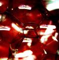
| 09/25/2005 11:01:23 AM |
Rubleby jasonarmComment: Meets the challenge and has some interesting colors but other than that the image does not inspire any emotion or interest in me. Some may not appreciate the sort of rougher look to the image, but I think its fine, whether it was intentional or not. I'm not too fond of the hot whites throughout the image though. Over all the image just doesn't have enough elements to interest me. I gave a 4. |
Home -
Challenges -
Community -
League -
Photos -
Cameras -
Lenses -
Learn -
Help -
Terms of Use -
Privacy -
Top ^
DPChallenge, and website content and design, Copyright © 2001-2026 Challenging Technologies, LLC.
All digital photo copyrights belong to the photographers and may not be used without permission.
Current Server Time: 07/18/2026 02:20:37 PM EDT.