| Image |
Comment |
| 04/03/2006 12:43:10 AM |
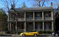
CLASH!by rayg544Comment: It looks slightly tilted to me. I do like the contrast of flashy colorful car to old, stately colorless house. 5. |
 Photographer found comment helpful. Photographer found comment helpful. |
| 04/03/2006 12:42:09 AM |
|
| Photographer found comment helpful. |
| 03/16/2006 07:40:48 PM |
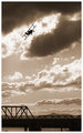
DPC2719.jpgby mpetersComment: I like the tones in this image, as well as how the light on the clouds help to give the sky a nice dramatic flair. I do find my attention drawn to both silhouettes (bridge vs bi-plane) and I think it would be a stronger piece if the bridge portion weren't there. The play between the bi-plane silhouette and those wonderful clouds is excellent, the bridge just ends up drawing my attention away from the action up above. |
| Photographer found comment helpful. |
| 03/14/2006 11:52:03 PM |
IMG_9834.jpgby strangeghostComment: Wow, this has such warmth to it. All those vibrant colors though very "fall foliage" actually make me think of summer because of the warm tones. Almost gets me to forget how darn cold it is right now! I'd love to have the opportunity to walk in a brilliant, crayola-land such as this. Very lovely. |
| Photographer found comment helpful. |
| 03/14/2006 11:48:28 PM |
Gorgeus eyesby DogAngelComment: Agreed on all accounts with the previous commenters! There is a very soulful quality to this image, and its all there in the eyes. The composition is good and I like the simplicity of it, the way the boy's face is turned slightly really offsets the eyes and gives them an even bigger impact AND I think it highlights the curve of his cheek and chin, hinting at a certain vulnerability. Excellent capture. I'm definitely adding it as a favorite. |
| Photographer found comment helpful. |
| 03/03/2006 12:06:18 PM |
Aeonby RikkiComment: Very nice. While looking almost unrealistically smoothed, she also has a very striking resemblance to Angelina Jolie. Beautiful. |
| Photographer found comment helpful. |
| 02/26/2006 02:05:10 PM |
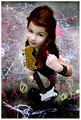
Rebel Yell by jaxedComment: Simply a great image. The attitude, the lighting, the focus, the background, the outfit, and that lovely face with a definite sassy rebel look. The POV you chose is different and excellent too. One of my few favorites. Brilliant. I gave a 10. |
| Photographer found comment helpful. |
| 02/26/2006 02:00:59 PM |
1983 - Relax (don't do it)by KHoltComment: Heh, poor cube. I like the idea, especially when coupled with that Relax song (Tommy TuTone?). The colors are a little bland and the lighting is a bit harsh.. making that odd yellowy undertone on the background. The focus on the front items is pretty good but I'm finding the background cubes to be more distracting than adding interest - possibly because they are out of focus due to the shallow DOF and they are such a large object in relation to the front cubes. Also there are some odd bits on the back cube clump that draw my eye. I'm not sure if that's glue or compression artificats or what. I do like the image and the idea behind it, just a few things (as mentioned above) that I'd suggest changing (if possible!) if you were to reshoot. I gave a 4. |
| Photographer found comment helpful. |
| 02/26/2006 01:53:32 PM |
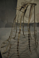
Radical 1880's Ladies Under Garment Support (iso800@1/20)by benhurComment: Its an interesting take on the challenge, and the subject itself has a certain interest and grace. Unfortunately I think the image suffers from a lack of adequate lighting and poor composition. It appears it may be part of a museum display which if that's the case, its easy to understand how lighting and what not couldn't be adjusted. The focus is pretty good but the lighting flattens everything and the great shadows/lines of the subject are lost. Also the edge on the left and the piece of material in the background do not add to the image so instead they end up taking away from it. I don't have any suggestions on how to make it better if you were to reshoot I'm afraid, since it does look like it was part of a display. Tough capture! I gave a 3 |
| Photographer found comment helpful. |
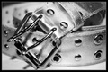
| 02/26/2006 01:47:21 PM |
The beltby marvinComment: Great image! I love the tones, the metallic nature is captured wonderfully and the whole image shimmers. THe lighting is great to me, a few minor hot spots but nothing overwhelmingly bad. The focus is good, but I do find the bit that's out of focus on the left a tad distracting, especially when the rest of the image is in such good focus. I don't know whether people understand the connection to the 80's so I hope you aren't suffering from DNMC comments. I think its great. Nicely rendered! I gave a 7. |
| Photographer found comment helpful. |
Home -
Challenges -
Community -
League -
Photos -
Cameras -
Lenses -
Learn -
Help -
Terms of Use -
Privacy -
Top ^
DPChallenge, and website content and design, Copyright © 2001-2026 Challenging Technologies, LLC.
All digital photo copyrights belong to the photographers and may not be used without permission.
Current Server Time: 07/18/2026 05:37:13 AM EDT.