| Image |
Comment |
| 04/03/2006 01:30:38 PM |
Gold Coastby GermaineComment: Great hues. Like the silhouettes, though I do wish one or two of the boats were a bit closer thus giving more detailed silhouetting. The focus looks good but it seems a bit hazy out. Could just be the yellowy nature of the image blotting out details but I wish it was crisper. Very nice. 5 |
| 04/03/2006 01:28:18 PM |
Dandilion Princessby smilebig4me1xComment: Lovely portrait. The lighting for the most part is wonderful (there's that hotspot on the left shoulder that draws my eye) and the focus is good too. Nice color pop with the dandilion. The one thing I don't like about this is the background. The grass and green/browns just isn't doing it for me. I think its because the earthy tones are making her brown hair blend too much into the background. Still a nice portrait overall. 5 |
 Photographer found comment helpful. Photographer found comment helpful. |
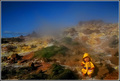
| 04/03/2006 01:25:11 PM |
Dasy the Doll at the Hot Springby StructorComment: Kill me but I think this is cute. I love the colors, that blue is out of this world. The contrast between the sky and the rust and green of the ground is great. Plus little Dasy the doll in her adorable rain slicker, I can totally see this as one of those kids' news things they do on tv shows. The steam gives the photo an extra interesting element (though it does obscure some nice features as well) and it helps to show off how wonderfully crisp the image is overall. Very nice. 7. |
| Photographer found comment helpful. |
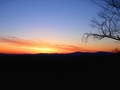
| 04/03/2006 01:23:01 PM |
Sunrise Dublin NHby lahernComment: This is a nice simple sunrise with some lovely colors. The tree silhouette is more of a drawback for me since its taking my attention away from the sunrise but it does give the image another element. I'm not sure what is missing from the photo for me though, after the initial "oh that's pretty" there is nothing here that is keeping me engaged. 4 |
| Photographer found comment helpful. |
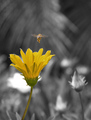
| 04/03/2006 01:20:09 PM |
See spot runby DustDevilComment: Quite a cute title. Lovely lighting, nice focus. The contrast between the ladybug and the flower works perfectly. The somewhat softer portion of the flower on the right side is a tad distracting, but cropping it out would lose the nice balance the image has. Well done. 6 |
| Photographer found comment helpful. |
| 04/03/2006 01:13:54 PM |
Bizzzy Beeby climbin2thetopComment: A fun image! I like the dynamic of the image, the lighting and composition is good. The focus seems a bit weird, or maybe its been overly sharpened or something.. some haloing of artifacts around the yellow flower. Nice photo 5. |
| Photographer found comment helpful. |
| 04/03/2006 01:11:30 PM |
Illuminationby BalkoComment: I love about half of this image. The shade for the lamp is gorgeous, has wonderful colors and a great pattern that is picked up by the wall behind it. So from where that lovely yellow glass shade starts and up, I love. Everything below it, I hate. If you were to reshoot it, I would suggest taping up a black piece of cloth or paper along the shadow-line of the wall to give it a richer black coloring than the lamp will allow, reshoot and crop it right at where the lampshade starts up from the base. If it worked right I think it would give a great sense of color contrast with the deep black and the yellow/red and add a bit of punch. I wouldn't extend the material higher than the natural shadowline only because it would probably look unnatural and obviously material-ish with the direct light on it, instead of melding as it *should* into the shadows beneath. Just an idea. As is I like the potential of the image but not its current presentation. 4 |
| 04/03/2006 01:06:06 PM |
Yellowby cbonsallComment: Certainly meets the challenge, has some nice action and movement. The colors are a bit disappointing though. There's no richness. Feels very hazy and flat. Perhaps a polarizer may help more? If you did use one then I don't know what could help! Looks like the Gorge here in Oregon, a nice action shot but it doesn't really grab me. 4 |
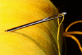
| 04/03/2006 01:02:32 PM |
A stitch in timeby KaizerComment: Excellent image choice. I like the composition, the color for the most part is very vibrant. The lighting is a bit harsh on the left and I wish there was some sort of fill on the right to bring out the yellow in the thread over there (its gone to an orangey color). It may help give more definition and added texture. The focus is good but not pin sharp, which I think brings some of the POP out of the image. Overall a nice photo. 5. |
| Photographer found comment helpful. |
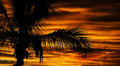
| 04/03/2006 12:34:09 PM |
wheres my cocktail?by jun180Comment: Beautiful colors, nice silhouette. I don't like the balance of the image though. I'm not sure if a shift of position so just that branch on the right was being silhouetted and the rest of the palm was either forming a dark left-hand border or not in the image at all would be possible or better. While the focus is good there does seem to be something missing from the image, the POP isn't there. I'm not sure if that's a focus issue or something else though. 5 |
| Photographer found comment helpful. |
Home -
Challenges -
Community -
League -
Photos -
Cameras -
Lenses -
Learn -
Help -
Terms of Use -
Privacy -
Top ^
DPChallenge, and website content and design, Copyright © 2001-2026 Challenging Technologies, LLC.
All digital photo copyrights belong to the photographers and may not be used without permission.
Current Server Time: 07/17/2026 10:16:29 PM EDT.