| Image |
Comment |
| 07/11/2006 01:58:06 AM |
Gooaaaaal!by BoltiComment: Great image. Has a very surreal feel to it. The colors are very vibrant and the lighting in the front is interesting. The cloud background has a lot of interest to it which adds to the surreal effect for me. I wish the man was a bit more in focus, or at least the 10 on the shirt was more in focus or highlighted by the light to really give it prominence. Overall I think its a good image. 6. |
 Photographer found comment helpful. Photographer found comment helpful. |
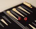
| 07/11/2006 01:56:01 AM |
Come on! Six and a four! Six and a four!by TonyTComment: Nice contrasting colors and simple composition. I wish the lighting were a little brighter. The tones - though the red does stand out - seem very muted and sort of drab. I wish it was a nice sharp black/white to help make that red pop out even more. Focus is decent but seems sharpest on the board where the black token thingies are rather than on the dice where I'd expect it. There is also a slight yellow haze to the image in the main portion of the image which might be due to lighting issues. Still I like the image, I think its fun and it works well for the challenge. 5. |
| Photographer found comment helpful. |
| 07/11/2006 01:52:51 AM |
one too manyby saintaugustComment: Good lines and perspective useage. I like the way the colors work together but I'm not sure I like the shadowed tone of the table/counter so maybe an additional fill light would be better or going through the beer bottles to give an amber glow. Focus is a little soft too. I'm not sure if the appropriate white balance has been used (the color of the white/offwhite seems a tad strange). Composition is interesting but there isn't anything that really draws me in, no pop or wow factor for me. 4. |
| Photographer found comment helpful. |
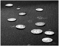
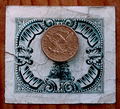
| 07/11/2006 01:48:43 AM |
10 Dollarsby rasdubComment: Great title. Wonderful black & white image. I love its simplicity and the tone range is excellent. Lighting looks great - not sure if its all natural or augmented but it works well. I wish the focus was uniform throughout and the image seems a bit oversharpened to me. Still its a wonderful photograph. 7 |
| Photographer found comment helpful. |
| 07/11/2006 01:44:11 AM |
1010 (10 in Binary)by md8speedComment: Very nice rendition of the challenge. I like the cool, metallic tones, it really reinforces the technological nature of the image. Simple but still has points of interest for the eye to linger on. Lighting looks good though I'd like to see the left side of the image just a bit brighter. Also, I do not like the border, too thick IMO. 6. |
| Photographer found comment helpful. |
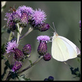
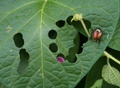
| 07/11/2006 01:38:06 AM |
Ripe Buds on the Stemby cloudsmeComment: Lovely pale colors, they really look wonderful together. I like the cool tones. Lighting is nice, the butterfly is heading towards blow out but you've reigned it in well. Composition is nice, though the right side looks a smidge cramped (possibly because cropping was needed to lose some thistle buds). The focus looks pretty good but not tack sharp. Very nice submission. 5 |
| Photographer found comment helpful. |
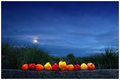
| 07/11/2006 01:24:14 AM |
Moonrise, Habaneros, Nantucket Soundby Bear_MusicComment: Love the contrasting colors, I like how the habaneros seem to glow. I wish that was played up just a bit more so they'd really pop even more. Nice mixture of landscape and still life. I'm not sure I like the color of the border, the light color is drawing my eye away from the main portions of the photo. 6 |
| Photographer found comment helpful. |
| 07/11/2006 01:19:49 AM |
The Big One-Oh!by scalvertComment: Very nice emotive photo. I like the burst of color from the cake, the use of the candle light is excellent, doesn't have that typical overly brown/yellow cast I seem to get when I use it. Clarity is good on the 10 which of course meets the challenge. I think just a little bit of a fill light on the girl's face to bring out more detail and perhaps around the bottom of the cake plate to help the white of the frosting pop a little more would make it more visually interesting to me. 5 |
| Photographer found comment helpful. |
| 07/11/2006 01:17:05 AM |
Not what it used to be...by RasaiComment: I really like how the different colors play off each other and the mixture of textures, wrinkled paper and worn dime(?). The color on the dime looks a bit odd to me though, not the typical silver but more copper.. so maybe its a 10 dollar coin. I wish the coin had just a bit more detail pulled from it, as it is a main subject to the image. The lighting looks good though slightly muted. I think the composition could be better to add some drama - perhaps some interesting way of folding the paper beneath the coin or creative use of light to play up the word "ten" on the coin. As it is, its pretty static and flat and needs more dimension. 4 |
| Photographer found comment helpful. |
| 07/10/2006 01:41:59 AM |
10by mandyturnerComment: Very cute! I love the beetle, its gorgeous. I wish it was a bit more prominant with all its colorful interest. The concept is great, fits the challenge very nicely. Lighting is well done. It lakes just a little something that would give it a nice finished look, but I think it is just great. 6 |
| Photographer found comment helpful. |
Home -
Challenges -
Community -
League -
Photos -
Cameras -
Lenses -
Learn -
Help -
Terms of Use -
Privacy -
Top ^
DPChallenge, and website content and design, Copyright © 2001-2026 Challenging Technologies, LLC.
All digital photo copyrights belong to the photographers and may not be used without permission.
Current Server Time: 07/17/2026 01:42:28 PM EDT.