| Image |
Comment |
| 08/11/2006 05:57:35 AM |
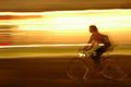
Transportation @ Speed of Lightby names_amitComment: Interesting capture. I like what you tried to do, though I don't know if you succeeded since I'm not sure what you were going for. I like the abstract nature of the bright light trails and the colors are lovely. In fact I could see an image that was simply made up of the yellow portion of the image as a print (or painting for that matter) on someone's wall. The section with the bike not so much. I think it offers an interestingish place for my eye to explore but after a glance I lose interest - though sitting here looking at the image while I give my comment I am growing to like it better, bike included. I think the lighting is good and the composition works. Meets the challenge of course. I am bumping this up from a 4 to a 5 as I'm still not in love with the bike portion, sorry! Probably would be a six without the bike for me (I love abstracts). |
 Photographer found comment helpful. Photographer found comment helpful. |
| 08/11/2006 05:54:09 AM |
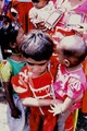
First Modeby aditiComment: Cute kids and I can see the relationship to the challenge here. I think the harsh light isn't an asset to this image - the blownout whites are very distracting - and I'm not sure if it was a purposeful post processing move or a random result but the image seems overly contrasty. You have some great colors but the contrasty thing is manifesting them in an unattractive way to me. I like the action in this image, it feels very alive with all the people crowded into the shot but I do wish we could see at least one of the two children in the front, their faces that is. I gave a 4 |
| 08/11/2006 05:48:44 AM |
Looking back in time...by MelGilliganComment: I like the concept but the execution loses some impact in great part to the lighting. The low light is giving the image a sort of dirty haze to my eye and might be affecting the focus (which seems a little soft). Since the subject is the car in the mirror, the surrounding stuff in the background isn't really adding to the image, imo. I would suggest revisiting the shot and try putting a length of black velvet behind the mirror so you have a nice black background to contrast the mirrored image against. Or simply crop the image to 1/2 inch above the top of the mirror and see if that changes the dynamic any. I gave a 4 |
| Photographer found comment helpful. |
| 08/11/2006 05:38:36 AM |
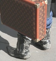
These boots aer made for walking....by SergePComment: Technically the elements are mostly there. Decent focus, could be a bit sharper, okay use of natural light - your whites aren't blown out but the light is flat. The composition is a bit iffy for me. I think there are too many busy things here. The boots seem to be the subject and I can see why the suitcase was added to give a bit more to the story but the design competes with the design on the shoes and the color looks brighter in comparison so its taking my attention away from your subject as named in the title. Overall it doesn't hold my interest. I gave a 4 |
| Photographer found comment helpful. |
| 08/11/2006 05:35:32 AM |
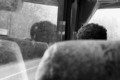
Road Trippin'by swedishchefComment: Certainly meets the challenge. Focus on the person's hair is very nice but I'm not sure that what is captured here displays enough to be associated with a roadtrip by the casual viewer. The size is a bit small, but I do like how you can see through the window - which helps emphasize the subject. I do wish there was more to see here though as it is, the image doesn't hold my attention. Greater contrasts might help bring the b&w nature to a higher potential. I gave a 4 |
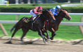
| 08/09/2006 04:17:02 PM |
Acadiana by a noseby CVetteComment: Had I voted I probably would've given this a 6. I think there's some great motion here, and that bodes well for an "action" challenge. There are a few hot spots that distract the eye, the blue jockey's hat and a bit of the rail on the inside section of the track. I also tried 'cropping' the image myself by adjusting the screen size and I liked it better with that blurry reddish/pink area on the right cropped out. I found it made the image feel a bit more open and almost as if they could be close to the finish line - for some reason the addition of the reddish area made it feel closed up and less dramatic to me. I'm just weird that way I guess. Sharp focus can almost always be better but I think you did a good job here, especially when panning. |
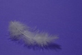
| 08/06/2006 09:32:35 PM |
Floating in a Sea of Blueby karmatComment: I like the thought behind this image and I think it can definitely represent a zen feel. Unfortunately I think the lighting doesn't do the textures of the feather justice and instead give it a flat boring feel. Perhaps a single light source with a very directed beam of light highlighting from the side perpendicular to where the camera is pointing might work to bring out the feather details and add some depth and interest to the image? The focus is a bit off as well, it should be a bit sharper IMO so you still retain the softness of floating but are able to see the details the feather has to offer - the lighting is probably affecting this to some extent as well. I think the color choice for the background definitely works, helps promote a feeling of calm. There are some other technical issues with this photo but I think the biggest culprit here is the lighting. I gave a 4 |
| Photographer found comment helpful. |
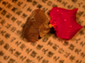
| 08/06/2006 09:28:13 PM |
Samsara (a cycle of death and rebirth)by cislanderComment: I like the idea behind this image, and the balance it represents. Unfortunately I think it suffers a bit from technical issues. The focus on the dried portion looks okay, though more centered on the edge of the petal? when it really should encompass both petals as a whole since they are your main subject. the addition of the droplets is nice, helps further the idea of freshness and life but with the focus problems the drops actually accentuate the blurring. I like the character background but I'm not sure that it doesn't make the image too busy. I'm not sure if it would help, but if you can manage it, try puting the petals on a glass plate and place that about 6-8 inches above the character paper/background then fix your lights to ensure no distracting shadows and see if that helps separate your subject from its background, it *might* help contain the focus on the subjects where it belongs too. Just something I saw in my research but haven't tried yet, so I can't be 100% sure if it'd work out! I gave a 4 |
| Photographer found comment helpful. |
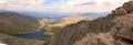
| 08/06/2006 09:23:46 PM |
Serenity Summitby ChrissysueComment: This is a nice landscape. I can see how it may be viewed as serene and thus it meets the challenge. I don't find much zen in it though on a personal level. I like the way the expanse folds out. Normally I'd find the ridge on the right distracting and wish I could see the view beyond it, but I find it is pointing my attention down to the valley and lake which is nice. The natural light is a little flat so the colors don't pop and really grab the attention, it feels as though a haze is over the image. I also wish the DOF was a bit deeper than it is, but obviously it can't go ALL the way into the valley. I'd also suggest a bit more of a crop along the bottom to get rid of the white in the corner. I'm not sure if boosting the saturation up a little would get those blues and greens to pop a bit more and possibly pull some of the pink out from the sky or not. Could be worth a shot? I gave a 4 |
| Photographer found comment helpful. |
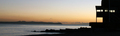
| 08/06/2006 09:20:28 PM |
Early start at the Yacht clubby julesskiComment: Certainly meets the challenge. There's some nice color in the horizon and the silhouetting is good, I really like that aspect and how the more cubical form works with the organic forms of the rocks and sea. I wish the colors were a bit more vibrant, even though its a sunrise as they feel a bit on the flat side to me. The overall focus looks kind of soft, not sure if that's due to the low lighting or not. I gave a 4 |
| Photographer found comment helpful. |
Home -
Challenges -
Community -
League -
Photos -
Cameras -
Lenses -
Learn -
Help -
Terms of Use -
Privacy -
Top ^
DPChallenge, and website content and design, Copyright © 2001-2026 Challenging Technologies, LLC.
All digital photo copyrights belong to the photographers and may not be used without permission.
Current Server Time: 07/18/2026 02:04:29 PM EDT.