| Image |
Comment |
| 10/13/2003 12:55:54 PM |
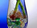
Roots...exposedby neenee1999Comment: The lighting looks very harsh inside the vase, either that or too much sharpening or contrast added in post editing. Still a bit of soft focus on the roots, but I do like the blue and white background and the colored stones. Definitely fits the challenge. 5 |
 Photographer found comment helpful. Photographer found comment helpful. |
| 10/13/2003 12:51:59 PM |
An Impacted Wisdom Toothby RefocusedComment: Fits the challenge. The color contrast is ok, its a bit dark to me though. Also, I normally do not like photos of x-rays or the like, but this one has the added element of the gloved hand which helps immensely in adding interest and giving it more of a composition than a straight x-ray photo would have. 5 |
| Photographer found comment helpful. |
| 10/13/2003 12:47:55 PM |
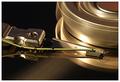
Inside my video tapeby heidaComment: Fits the challenge, though I think having the tape itself out would've added to the 'exposure' concept. Lighting looks good but the colors seem a bit flat and the photo didn't hold my interest very well. 5 |
| Photographer found comment helpful. |
| 10/13/2003 12:38:55 PM |
Accessing my databy agwrightComment: Nice crisp photo, good lighting. Curves vs the angular part of the piece is a nice contrast. I started with a 6 on this photo but after looking again it is starting to draw me in. revised vote to 8 |
| Photographer found comment helpful. |
| 10/13/2003 12:36:30 PM |
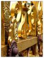
Peeling Paintby KonadorComment: I think the nature of the subject is good, the paint peel is in nice sharp focus. I would prefer a closer crop, as the length of gate/fence in the background is distracting with its soft focus. I think the thick white border also distracts a bit, perhaps if it were black and thinner. The lighting is great, gives the piece shine in just the right places. 6 |
| Photographer found comment helpful. |
| 10/13/2003 12:32:05 PM |
|
| Photographer found comment helpful. |
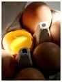
| 10/13/2003 12:28:54 PM |
My morning sunshineby jonpinkComment: Great idea! I love the lighting direction, but it does seem a little harsh up in the corner - not too bad though. The yolk vs the brown eggshells is great. I would've liked a bit more space on the left side, giving the accent of the piece room to breathe a bit, I think the crop is a little too tight on that side. A sound photo. 6 |
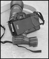
| 10/13/2003 12:24:01 PM |
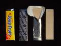
Exposedby JasonComment: Nice photo, fits the challenge well. I like the background, but I find the black & white aspect a bit flat. Would've liked all of the camera parts in the shot. Good focus on the camera. 5 |
| Photographer found comment helpful. |
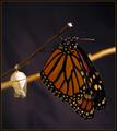
| 10/13/2003 12:21:29 PM |
Metamorphosis: Newly Eclosed Monarch by indigo997Comment: Nice photo, I wish the colors were a little more vivid, with the light coming through the wings more or something similar. Just a bit darker than I like. The butterfly and the broken cocoon tell a story and fit the challenge well. 6 |
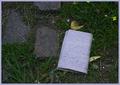
| 10/13/2003 12:09:51 PM |
Travel diary, lost en routeby johnmkComment: I like the concept, but I find the picture to be a tad dark. IMO, it would add to the interest if the journal was buried a bit (either by leaves or in ground partially) and if the shot was a bit closer so you could read some of the wording clearly. |
| Photographer found comment helpful. |
Home -
Challenges -
Community -
League -
Photos -
Cameras -
Lenses -
Learn -
Help -
Terms of Use -
Privacy -
Top ^
DPChallenge, and website content and design, Copyright © 2001-2026 Challenging Technologies, LLC.
All digital photo copyrights belong to the photographers and may not be used without permission.
Current Server Time: 07/18/2026 07:53:15 AM EDT.