| Image |
Comment |
| 08/26/2014 08:02:49 AM |
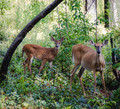
Spotted!by KMcCComment: Critique Club Review:
Color Saturation and Hue: Colors are not realistic, but do work very well with this composition.
Brightness and contrast: seems the highlights have been pulled way down and there is a lack of contrast
Focus and depth of field: the deer appear a bit soft but that could be part of the processing
overall its a nice image, its doens't overly appeal to my tastes but you captured a nice moment. |
 Photographer found comment helpful. Photographer found comment helpful. |
| 08/26/2014 08:00:01 AM |
frogbabyby posthumousComment: critique club:
nice colors, i can make out the tadpole easy enough. not sure im big on the blown highlights as they tend to draw my eye away from the subject but knowing you that might be the intent :) |
| Photographer found comment helpful. |
| 08/26/2014 07:57:23 AM |
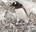
Protector by Ja-9Comment: critique club:
you got second place so you know its a good image, i cant find much to dislike except maybe its a bit over sharpened for my tastes.
great details, composition and colors. |
| Photographer found comment helpful. |
| 08/26/2014 07:54:17 AM |
Mom + 1.5 Babiesby Dr.ConfuserComment: critique club:
i'm not fond of this image, the subjects seem awkward and they lack that "cuteness" one expects from this moment. its not like you can pose them, though :)
the colors and details all seem to blend together and the background bleeds into the subject so there is isn't enough isolation of the subject to any appeal either. |
| 08/26/2014 07:50:46 AM |
Humpty Dumpty from Hellby PinkellaComment: critique club:
blacks are too black, the subject pops off the page nicely, the background is too busy to isolate the subject however and really adds a lot of unnecessary detail. |
| 08/26/2014 07:48:44 AM |
|
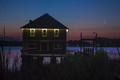
| 08/26/2014 07:46:48 AM |
Good....morning sliver moonby billyfredhuffComment: critique club:
the horizon is crooked (or the house is). the color are nice, exposure could have been a bit longer to pick up the sky colors. Ultimately the image is too busy with a foreground that is too dark and busy.
take a bit more time and walk around to find a better composition or perspective. |
| 08/25/2014 09:57:26 PM |
|
| Photographer found comment helpful. |
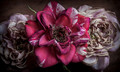
| 08/25/2014 09:49:15 PM |
~ faded rose from days gone by ~by KMcCComment: critique club:
really nice shot, clean, sharp, nice subdued colors, you could print this out and hang it on a wall. i dont have any advice on improving it... sorry :) |
| Photographer found comment helpful. |
| 08/25/2014 09:45:32 PM |
Fleeing Neutrinosby SkipComment: critique club:
this is an awesome firework shot. the colors are so not what you would expect from fireworks,its clean, sharp and the blacks are black. i'd maybe like to to see the center of the burst on the upper third point intersection but that's a minor picky complaint. |
| Photographer found comment helpful. |
Home -
Challenges -
Community -
League -
Photos -
Cameras -
Lenses -
Learn -
Help -
Terms of Use -
Privacy -
Top ^
DPChallenge, and website content and design, Copyright © 2001-2026 Challenging Technologies, LLC.
All digital photo copyrights belong to the photographers and may not be used without permission.
Current Server Time: 07/16/2026 05:46:29 PM EDT.