| Image |
Comment |
| 08/26/2014 09:44:03 AM |
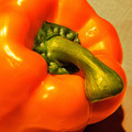
I ♥ Orangeby FraksterComment: critique club:
colors and saturation: color are very realistic even if subdued a bit, they complement each other nicely
focus and depth of field: if the hole and cutout were in focus this image would be much better
composition: nice off center composition that doesn't detract from the image
overall: the depth of field is nice and adds interest but lack of a sharp focal point really takes away from experiencing a nice setup. |
 Photographer found comment helpful. Photographer found comment helpful. |
| 08/26/2014 09:41:19 AM |
Jimmy Durante Pepperby Dr.ConfuserComment: critique club:
colors and saturation: color appear over saturated
focus and depth of field: image is in focus
overall: noisy and over sharpened as seen on the right edge of the pepper. the image is just a close crop of a stem of a pepper. the perspective and composition doesn't really add any appeal to an otherwise uninteresting subject. |
| 08/26/2014 09:38:23 AM |
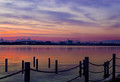
A New Day Risingby KMcCComment: critique club:
colors and saturation: color are very realistic
focus and depth of field: sharp clean focus
composition: try to move the horizon down or up third part of the image so the image favors either the sky or ground usually results in more appealing images.
overall: the sky is very noisy and there is a lot of color artifacting going on. otherwise great colors and atmosphere. |
| Photographer found comment helpful. |
| 08/26/2014 08:19:05 AM |
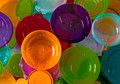
Colorful Festivalby clickodakComment: Critique Club Review:
Color Saturation and Hue: Colors are realistic
Brightness and contrast: image needs better lighting, lighting from below as well as on top may have been good option
Focus and depth of field: clean and sharp
its needs better lighting really make it pop but a great attempt otherwise. |
| Photographer found comment helpful. |
| 08/26/2014 08:17:29 AM |
Whooooo Drank My Coffeeby Ja-9Comment: Critique Club Review:
Color Saturation and Hue: not sure color wouldn't have been a better choice
Brightness and contrast: image is mostly well lit, the eye are a bit bright compare to the rest of the image
Focus and depth of field: clean and sharp
nice clean sharp image, not much to critique negatively, its well done. |
| Photographer found comment helpful. |
| 08/26/2014 08:16:09 AM |
Coffee and Friendshipby clickodakComment: Critique Club Review:
Color Saturation and Hue: Colors are unrealistic and muddy
Brightness and contrast: image is a bit dark and uneven.
Focus and depth of field: you got some camera shake and at 1/15 shutter im not surprised.
nice concept that wasn't executed properly. you probably could have nailed a ribbon with this entry if it was sharp centered better during cropping and taken from a lower angle to accentuate the heart shape |
| Photographer found comment helpful. |
| 08/26/2014 08:13:29 AM |
~ Morning Sunshine ~by KMcCComment: Critique Club Review:
Color Saturation and Hue: Colors are realistic
Brightness and contrast: image is mostly well lit, love the spot lighting on the subjects
Focus and depth of field: clean and sharp
nice clean sharp image, not much to critique negatively, its well done. |
| Photographer found comment helpful. |
| 08/26/2014 08:11:11 AM |
belle petit-déjeuner by Dr.ConfuserComment: Critique Club Review:
Color Saturation and Hue: Colors are realistic
Brightness and contrast: image is mostly well lit, the lights on the croissant are a bit hot.
Focus and depth of field: clean and sharp
nice clean sharp image, the crop could be adjusted to center the plate perfectly inside the border.its a nice setup up against a nice backdrop. |
| 08/26/2014 08:08:30 AM |
Because you'd like to remember what happened?by KMcCComment: Critique Club Review:
Color Saturation and Hue: Colors are realistic
Brightness and contrast: the image is a bit dark
Focus and depth of field: the image is clean and sharp
im not sure i get the message (is that a ring) the distortion is a nice touch but the image overall suffer from a unclear message. |
| Photographer found comment helpful. |
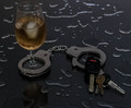
| 08/26/2014 08:05:38 AM |
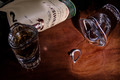
Drinking and driving...can change your life foreverby clickodakComment: Critique Club Review:
Color Saturation and Hue: Colors look natural
Brightness and contrast: the image is very dark, maybe you monitor needs to be calibrated and it too bright, there are no black detail in the keys
Focus and depth of field: the image is clear and sharp
overall its a nice image and message, better lighting would have gone a long way here and maybe even a slightly lower perspective to see more reflection |
| Photographer found comment helpful. |
Home -
Challenges -
Community -
League -
Photos -
Cameras -
Lenses -
Learn -
Help -
Terms of Use -
Privacy -
Top ^
DPChallenge, and website content and design, Copyright © 2001-2026 Challenging Technologies, LLC.
All digital photo copyrights belong to the photographers and may not be used without permission.
Current Server Time: 07/17/2026 02:57:31 AM EDT.