| Image |
Comment |
| 06/30/2004 09:57:58 AM |
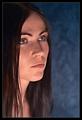
Troyby MickComment: good shot, lots of color and texture, but I'd like the light from his left to be less harsh and a different balance (less chair and more subject, maybe cropped just below his waistline), also the top of his head blends into the background too closely and loses definition |
 Photographer found comment helpful. Photographer found comment helpful. |
| 06/30/2004 09:44:09 AM |
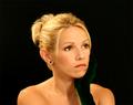
Dreamerby NazgulComment: I like the way the lighting and the title work together but I think this needs a bit more depth of field, the sharpness in focus falls off from one side of her face to the other, her right cheek and eye are pretty sharp but the outline of her left cheek where it meets the hair is softer, enough difference that it detours my attention |
| Photographer found comment helpful. |
| 06/30/2004 09:31:18 AM |
My Love...by toddheadComment: good shot, lovely woman, but it may have looked better if her glove were not so close in color to the background, you almost can't see it at all, a lighter colored clove, a neutral background, or maybe just some additional light on it to bring out the green more |
| Photographer found comment helpful. |
| 06/30/2004 09:10:15 AM |
Marakiby AlexysComment: this is a very interesting pic, I like the texture in the cloth and the color in her headband, but it needs softer lighting to eliminate the reflections from her lips, nose and forehead, and to bring the necklace out of shadow |
| Photographer found comment helpful. |
| 06/29/2004 11:37:42 AM |
|
| 06/28/2004 05:53:51 PM |
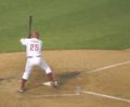
Power Forwardby epeterandersonComment: very good capture, action stopped and backgroung blurred nicely, but would be better with a little more at the bottom, to see all of shoes and a bit more down there |
| 06/28/2004 11:56:20 AM |
We Are The Champions!by eikidigiComment: very well executed capture but it looks more like a fight is about to break out than a celebration; I doubt a newspaper would run this, at least not under the title you have used, maybe something like "Captain demands respect from undisciplined players" would have been perceived by the voters as more appropriate to the photo |
| 06/28/2004 11:05:45 AM |
|
| 06/25/2004 06:03:09 PM |
Lugwormby sjonniComment: great shot but too dark, there is a lot of solid black |
| 06/25/2004 04:48:01 PM |
The Dreamby flip89Comment: like the concept but it the softness looks less like dreamy than just plain out-of-focus to me |
Home -
Challenges -
Community -
League -
Photos -
Cameras -
Lenses -
Learn -
Help -
Terms of Use -
Privacy -
Top ^
DPChallenge, and website content and design, Copyright © 2001-2026 Challenging Technologies, LLC.
All digital photo copyrights belong to the photographers and may not be used without permission.
Current Server Time: 05/03/2026 11:29:26 AM EDT.