| Image |
Comment |
| 05/28/2006 09:39:18 PM |
Invasion of Privacyby tngrndreamComment: Trading post...
I like the pose. It seems you have the same problem I had with my last entry. Not enough sharpness. The motion blur on the hand is good, but the rest looks grainy or slightly OOF. A lower ISO would probably help. |
 Photographer found comment helpful. Photographer found comment helpful. |
| 05/28/2006 09:34:39 PM |
Man in a Panama Hatby chaliceComment: Trading post...
Very nice shot. This has great lighting. The hat adds interest. I can't actually tell you any way to improve this unless you turned into Brad Pitt and shot yourself nude, LOL (just kidding ya know!). Maybe a little sharper around the eyes. |
| Photographer found comment helpful. |
| 05/24/2006 09:34:07 PM |
Cannon Coverby MelethiaComment: Trading post...
This is adorable. I didn't vote in this challenge but I would have given this a 10. Great lighting and DOF. The concept is just too cute. |
| Photographer found comment helpful. |
| 05/24/2006 09:27:54 PM |
Baited and Readyby ericwooComment: Trading post...
Top 10 again! Woohoo! Dude, you're hot. I gave this a 10 in voting. I loved the colors and composition. The lighting is fantastic. Since I gave you a 10 I didn't see anything that could be improved. |
| Photographer found comment helpful. |
| 05/24/2006 09:25:36 PM |
Mmmmmmmmm - Still Lifeby timfythetooComment: Trading post...
I was greatly amused by this. Cool idea. I gave this a 7 in voting. The lighting was great, your background color was great. I really don't remember why I didn't vote this higher. |
| Photographer found comment helpful. |
| 05/24/2006 09:18:27 PM |
Ha! Ha! You Lose!by tngrndreamComment: Trading post...
I thought the concept of this was great. I gave this a 5 in voting for creativity. The background is a little distracting since you can see the division so well, plus the wrinkles on the white side are so obvious. It also seems to be just a tad OOF. |
| Photographer found comment helpful. |
| 05/24/2006 09:14:53 PM |
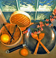
Asian Contemporary Still Lifeby chaliceComment: Trading post...
I thought this was a great shot. I gave it a 7 in voting. The colors and arrangement are fantastic. What I wasn't crazy about was the perspective. I think this would have done better at a lower angle. The top row of windows is very distracting. |
| Photographer found comment helpful. |
| 05/22/2006 08:33:11 AM |
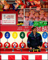
Keeper of the Gameby timfythetooComment: Trading post...
I voted this a 7 in the challenge. The title is excellent. The colors are vivid and the details are great. The thing that would have made this better is having him look at the camera. There were a lot in this challenge that didn't and I think they were scored down because a portrait is supposed to be posed. |
| Photographer found comment helpful. |
| 05/22/2006 08:26:13 AM |
happy fishermanby DanSigComment: Trading post...
I like the square crop. I voted this an 8 in the challenge. I felt it fit the challenge well. It would have been nicer if he had been looking at the camera, but I didn't deduct for that like other voters. I'm not sure what the color version was like, but it might have done better as this is just a tad flat. |
| Photographer found comment helpful. |
| 05/17/2006 05:51:20 PM |
Mission San Jose, founded 1720by MelethiaComment: Trading post...
WOW! Excellent angles! This really seems to draw you in. The colors are excellent and I love the softness that comes from the dark contrast to the light. The only thing I could think of to improve this would be maybe taking one step further in to eliminate that small light spot in the top right corner (my right looking in). |
| Photographer found comment helpful. |
Home -
Challenges -
Community -
League -
Photos -
Cameras -
Lenses -
Learn -
Help -
Terms of Use -
Privacy -
Top ^
DPChallenge, and website content and design, Copyright © 2001-2026 Challenging Technologies, LLC.
All digital photo copyrights belong to the photographers and may not be used without permission.
Current Server Time: 08/17/2026 06:32:32 PM EDT.