| Image |
Comment |
| 07/13/2011 12:29:12 PM |
|
 Photographer found comment helpful. Photographer found comment helpful. |
| 07/13/2011 11:51:45 AM |
Dream #8by bvyComment: Ghosts fading from dreams into forgetfulness. Unrecognisable faces, unremembered scenes and distant landscapes. This image is the definition of dreaming. Title also conveys so much. Not that I number dreams but that all I can remember most of the time is that I had one.
Wonderful. Have a favourite. |
| Photographer found comment helpful. |
| 07/13/2011 05:04:04 AM |
|
| Photographer found comment helpful. |
| 07/12/2011 11:17:10 AM |
|
| Photographer found comment helpful. |
| 07/06/2011 04:39:59 AM |
|
| Photographer found comment helpful. |
| 07/06/2011 04:30:53 AM |
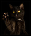
Reeseby hopperComment: Really cute photo! :-) High key works very well for this. |
| Photographer found comment helpful. |
| 07/05/2011 06:12:31 AM |
|
| Photographer found comment helpful. |
| 07/04/2011 06:04:33 AM |
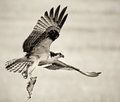
The Catch of the Dayby vawendyComment: Very surprised this didn't hit the top ten. Maybe they (and who're they? Us!) are tired of your ospreys. Great capture regardless. |
| Photographer found comment helpful. |
| 07/04/2011 05:24:37 AM |
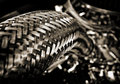
V8by Yo_SpiffComment: Would not have pegged this as yours. Gave this a 7. Liked it a lot. |
| Photographer found comment helpful. |
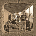
| 07/04/2011 05:15:56 AM |
dugoutby FourPointXComment: Really liked the framing of this, and gave it an 8. I'd've really liked it a bit more contrasty with a narrower DOF. Though at 2.8 maybe it couldn't have gotten smaller. |
| Photographer found comment helpful. |
Home -
Challenges -
Community -
League -
Photos -
Cameras -
Lenses -
Learn -
Help -
Terms of Use -
Privacy -
Top ^
DPChallenge, and website content and design, Copyright © 2001-2026 Challenging Technologies, LLC.
All digital photo copyrights belong to the photographers and may not be used without permission.
Current Server Time: 07/16/2026 07:59:09 PM EDT.