| Image |
Comment |
| 12/09/2002 12:56:56 AM |
Music Box Ballerinaby SquiffyeitherjagComment: I think this was a good idea tho I don't really understand the blur being all over the place. I thought these girls usually just go around in circles. I'd like to see her more clearly. Did you try to use a flash to stop her motion and then leave the shutter open to catch the motion trail? |
 Photographer found comment helpful. Photographer found comment helpful. |
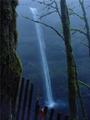
| 12/09/2002 12:53:54 AM |
Foggy Mistby MarlaComment: Lovely composition. The fence is a great help in breaking up the vertical lines. Did you try using an even slower shutter speed? This is a great waterfall for photography! You're lucky if you live near enough to go back. One of my favorites in this composition. ~indigo997 |
| 12/09/2002 12:39:51 AM |
A Melancholy Songby indigo997Comment: Just a few thoughts on my photo: I knew when I entered it that it had some problems, but I just liked the overall feeling of it better than any of my other choices. My first problem was that I only had the model for an hour which didn't leave a lot of time for set up. I did throw the sheets in the dryer for a few minutes but didn't have time for ironing.
This was my first attempt at "painting with light". I set the focus with the light on and then turned it off and used the remote to take the shot. When the shutter opened, I moved a flashlight over her quickly. She did fairly well at holding still for a 6-year-old, but with the six second exposure there was some movement of her arm & hand.
The composition is "off" because the camera was knocked after I turned the light off, and I didn't realize that it had moved so far until I went to set up for the next shot.
The "hot pixels" are actually glitter that she wanted to wear.
Unfortunately, I did this shoot late Sunday and didn't have time to reshoot for the challenge. I do plan on going back and trying again only this time I will iron the sheet, not let her use glitter, and double check the framing before each shot. I like the lighting effect, but I obviously need some practice with it. |
| 11/26/2002 01:12:06 PM |
Royal Blueby MarklaneComment: Unlike a lot of ppl, I tend to like technical shots more than emotional ones. This is very nice. I like the idea and the execution. It's grown on me since the first time I viewed it. |
| Photographer found comment helpful. |
| 11/29/2002 08:26:23 PM |
Reaching the Fractalsby paganiniComment: Gorgeous purple/blue color. This didn't turn out to be an original idea, but I like your execution the best. Very pretty. |
| 12/01/2002 09:20:51 PM |
Blue Sky, Blue Spruce, White Snowby alanfreedComment: The snow looks overexposed which gives the illusion that the photo just has a white border along the bottom. I think a foreground subject would help - something just left of the middle maybe. A snowman, footprints, a sled....I dunno. |
| Photographer found comment helpful. |
| 12/01/2002 09:23:17 AM |
Bubblesby JamieWillmottComment: This reminds me of my macro shot. I love the color. It seems too dark tho, and doesn't really have a "subject" so my eye keeps searching around with nowhere to land. |
| Photographer found comment helpful. |
| 12/01/2002 09:45:14 PM |
Soaring on Blueby gradbertComment: Very nice composition. I like the lines/angle. The wing blends in a little too well with the sky. |
| 11/26/2002 05:21:56 AM |
Dumb Nurseby derekleungComment: Very good idea. Points for originality and humor. Very good technically. I'm afraid that the subject, no matter how well done, just isn't going to make a pretty picture which is what seems to get points around here. |
| 12/01/2002 02:40:13 PM |
Outstandingby crabappl3Comment: This is cute. I'm not sure that I agree with your decision not to make this a landscape. I do like the layers created by the 3 vertical areas, but I think that you could show it just as well without so much empty space. It's also a tad off center with more space on the right. If you're going to make a symmetrical shot then you probably want to watch that. |
| Photographer found comment helpful. |
Home -
Challenges -
Community -
League -
Photos -
Cameras -
Lenses -
Learn -
Help -
Terms of Use -
Privacy -
Top ^
DPChallenge, and website content and design, Copyright © 2001-2026 Challenging Technologies, LLC.
All digital photo copyrights belong to the photographers and may not be used without permission.
Current Server Time: 07/19/2026 02:27:48 AM EDT.