DPChallenge: A Digital Photography Contest You are not logged in. (log in or register
 
Browse Settings
Currently viewing:
Registered Userindigo997

Show comments:

Per page:

Order:

Comments:


Comments Made by indigo997
Pages:   ... ... [100]
Showing 221 - 230 of ~991
Image Comment
Preheat to 450°, bake 10-15 mins = instant artwork
03/24/2003 09:03:29 PM
Preheat to 450°, bake 10-15 mins = instant artwork
by xertion

Comment:
I think you took a bit of a different approach to this topic than most did. Creativity can be really good, but the tricky part is to come up with a good shot that's creative. First and foremost, if the shot isn't appealing then it often doesn't really matter how unusual or creative it is. Sometimes I'll spend all week trying to come up with something creative and then just give up and shoot a cliche, typical picture that'll score really well.
I think that if you look at the other submissions then you'll see that most people used this topic to show beauty and art that already exists in the kitchen. A big part of photography is being able to show mundane, everyday objects in an appealing way. This was a good opportunity to do that.
Technically, your picture isn't all that bad. Maybe more dof would've helped with the focus, but the biggest problem is the composition and subject. It doesn't make a lot of sense, and just doesn't have a lot going for it aesthetically. Regardless of the topic, I think that a good goal is to try taking pictures that are visually appealing - something that someone would want to print. IMO, if it isn't a good picture outside of the challenge then you haven't accomplished much.
Photographer found comment helpful.
Little Stepper
03/24/2003 12:41:29 AM
Little Stepper
by Sonifo

Comment:
You have to frame this one. It's just too cute - my favorite for the challenge.
Photographer found comment helpful.
Guess where!!!
03/24/2003 12:40:00 AM
Guess where!!!
by lumbus

Comment:
Nice finish! That's actually pretty good focus for a 1/10 second handheld. It looks warmer than it felt, and I think that pond looks like a shoe. :)
Photographer found comment helpful.
Frigid Reflection
03/24/2003 12:36:27 AM
Frigid Reflection
by indigo997

Comment:
I took this as the sun was setting off the Stockholm archipelago. There was actually a lot more ice in the water, but I looked for a clear spot so that the boat would be visible. I would have placed the large piece of ice off center if possible, but it doesn't bother me too much since it is at an opposing diagonal to the boat. I was happy to get the reflection in focus since it was handheld with a slow shutter speed and two VERY cold hands.
Walk-thru
03/21/2003 11:03:22 PM
Walk-thru
by Velocity

Comment:
I wrote a really long critique that got lost somehow *sigh* so here I am trying to remember it.
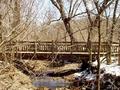
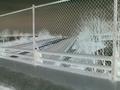
First off. Always make sure that you meet the challenge because voters are very picky about that and will mark you way down. With this one, yes you have a bridge.
Secondly, composition is very important. Simplicity is usually best. You want to show the subject without a lot of distractions. Using elements such as strong color or strong leading lines (perhaps a nice diagonal to lead the eye into the shot) or using the "rule of thirds" to place the subject... all of these are good to keep in mind when composing the picture. With this picture, the dominant color is brown (not usually very appealing but typical of the season). The bridge gets lost in all the branches. The eye doesn't really know where to go. It also doesn't help that the bridge goes directly across the middle of the picture. Showing the entire subject at a straight-on angle is usually not the best way to shoot. Also, if color isn't really adding anything to the picture then you can always try it in black and white for a different effect. If you use photoshop, you can check out the different color channels to see how different it can look. Increasing the contrast with a black and white shot can also make it more dramatic and add a different look.
The lighting in this picture isn't the best. Shooting early in the morning or late in the day is the best. Middle afternoon shots are rarely as good.
I don't know if it is the lighting, but it looks oversharpened. Anything with a lot of small lines (like animal fur or these branches) will look oversharpened very easily. If you use PS, use the unsharp mask and a radius of 1. Then slowly raise the amount. Rarely will I go above 70% with any picture.
For now, just learn to compose strong photos. Creativity is very important. Being able to show an ordinary subject in an appealing and interesting way is tricky.
If you really wanted to use this bridge and didn't have a better option then you would want to find a different, more appealing way to shoot it. Maybe a shot from on top... looking across to the other side. You could use repetition - the repeating boards along the railing with the top rail used as a diagonal leading into the shot.
Look at the bridge pictures that you like and try to figure out whats appealing about them. Think about where the subject is placed, where the lines go, whether or not color is being used, etc. Eventually you'll start thinking about all of that when you take a picture of your own.
Good luck! Just take pictures that you like and don't be too concerned with the score or comments. There will always be those who are better and those who are worse.
Highway bridge
03/20/2003 04:29:50 PM
Highway bridge
by Allen

Comment:
I think that the score here reflects a few things. First, this photo isn't really OF a bridge. The title says that it is, but mainly I see a fence and some trees though I could probably guess that it was taken from on top of a bridge. Secondly, it just isn't too interesting. I can appreciate that the effect added some interest, but probably hurt it even more since many people do not like that sort of post processing manipulation. The diagonals created by the fence and the road below are nice lines, but there's little else going on. Overall, nice effort.
Walk-thru
03/20/2003 04:22:18 PM
Walk-thru
by Velocity

Comment:
I dont think that the subject stands out enough because it is the same color as all of the trees. It is also too centered in the frame. Please respond to my email if you would like a more detailed comment.
Touch The Sky
03/17/2003 05:34:09 AM
Touch The Sky
by bobgaither

Comment:
Beautiful shot. I just don't think you shot this from a point ABOVE the subject so it's gonna hurt your overall score. :(
Photographer found comment helpful.
Dark Side of the Egg
03/16/2003 07:33:50 PM
Dark Side of the Egg
by Budweezer

Comment:
This is a really great shot. It deserved the good score.
Having the bright white area doesn't bother me since that is what it's really like with the moon - tough to take shots without blowing out some areas. The detail in the area between the light and shadow is great. Good focus and lighting.
What really makes the photo is the stone in the background. I've seen this idea done before, but you made it your own very successfully. I wouldn't mind seeing even a little more of the earth if possible *maybe having the light coming a little more from the front instead of the side or something*. Good use of dof. Sorry that I can't really make more suggestions, but I think you did about as well with this shot as anyone could.
Good Luck!
Photographer found comment helpful.
A Potentially 'Cracking' Shot
03/13/2003 11:27:01 AM
A Potentially 'Cracking' Shot
by Konador

Comment:
HEY!
OK. It has en egg so meeting the challenge is out of the way.
I'm guessing it didn't help much that several other people had this idea. I do remember during voting that I liked the selective desaturation. I also like the dof. Showing the side of the table and pocket in the distance helps. I have to agree with your other comments about the stamp on the egg and the reflections on the balls though. They're distracting.
It might've also helped if you were actually lining up a real shot toward a pocket. You'd have to change the camera angle of this rather than just shooting for a different ball b/c I do like the having the stick (? I don't play obviously) at an angle rather than straight on. That would also help move the eye across the shot more.. if there were something else in line with the stick, egg, and ball. As is, it sort of gets stuck in the middle since all the color and interest is there.
Quality is very good. No real technical problems. It's just a tad boring when viewed with a couple hundred other eggs.. maybe that's why I never made it through all the shots during voting. It's really hard to make an interesting shot of an egg. Originality obviously did well in this challenge. ;P
Good luck!
Photographer found comment helpful.
Pages:   ... ... [100]
Showing 221 - 230 of ~991


Home - Challenges - Community - League - Photos - Cameras - Lenses - Learn - Help - Terms of Use - Privacy - Top ^
DPChallenge, and website content and design, Copyright © 2001-2025 Challenging Technologies, LLC.
All digital photo copyrights belong to the photographers and may not be used without permission.
Current Server Time: 09/05/2025 08:46:21 PM EDT.