| Image |
Comment |
| 06/07/2003 02:01:11 PM |
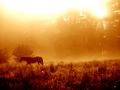
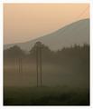
Headed Homeby drdab99Comment: lol. I like reading comments. This is a hill isn't it? It doesn't scream "tilted shot" to me, but apparently people like the ground to be straight across all the time even if it isn't that way in reality.
I really like the tones you chose. This is one example of where I think a decision to go duotone really helped the shot, but I'm not sure that I'd think of it normally.
That white area at the top still bothers me. I'd prefer a crop to just below the brightest white areas personally. It was obviously a tough shot to expose, and I thik you did a pretty good job getting the scene exposed well so the sky had to suffer a little.
"Proper photography" guidelines would dictate that the subject always be moving into the frame instead of out of it so that the eye moves around inside the shot and isn't directed away. I actually like this one the way it is though. It goes well with the title. The horse isn't exactly going out somewhere... it is going home so the day and the space are behind it.
Little girls love horses :) I think the subject and softness are very appealing to many people. It just has a nice, happy feel to it while also being calming.
Nice work. |
| 06/07/2003 01:53:10 PM |
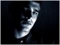
Pensiveby AaronComment: Hmmm... My main issue with this picture was the lighting, but your other comments suggest that atleast those who commented mostly liked it. I don't like blown out areas. They just draw the eye and distract from the rest of the shot. Perhaps you did it on purpose, but did you try diffusing the light with some cloth or bouncing it off something so that it wouldn't be so harsh in those places?
Other than that.. I like this shot. I like the crop and composition. I like how there's more space on one side than the other. I like how the darkness envelopes the subject. A tad more light on that one eye would be nice.
I also don't like the white button, but it isn't a big deal.
Overall it's a strong picture that went up against some very great shots. I personally think that it would've done better without the hot spots. Focus looks pretty good to me. The most important thing with portraits is to have the eyes in focus and they seem to be.
|
 Photographer found comment helpful. Photographer found comment helpful. |
| 06/06/2003 12:48:42 AM |
|
| Photographer found comment helpful. |
| 06/06/2003 12:45:15 AM |
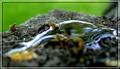
Dairy Queen by crabappl3Comment: I really like the light and dark curves along the top. Nice composition. Near perfect capture (tiny bit soft on the focus maybe). I'd get rid of that bright white spot post challenge. The reflection is really cool too. |
| Photographer found comment helpful. |
| 06/05/2003 12:49:21 PM |
What water must seeby GiusoundComment: cool sort of abstract shot but i doubt anyone will look at this and say its a picture of a liquid so i'm sure your score is gonna suffer for it :( gotta shoot for those literal minded voters if you care about the score.. otherwise you can shoot for the rest of us.. i think the focus is off which adds to the abstract quality but i'd rather see it in focus |
| 06/05/2003 12:45:00 PM |
Oiledby jjimComment: nice limited dof pic. i'm guessing that most voters are gonna mark this down because the picture isnt actually OF a liquid... sure it has a liquid in the shot but I doubt anyone would look at this and say it's a picture of a liquid |
| 06/05/2003 12:13:02 PM |
|
| Photographer found comment helpful. |
| 06/04/2003 01:49:03 AM |
...They Will Comeby mindyparkerComment: the part in focus is really cool .. i think it should be closer to the viewer and get rid of that out-of-focus \"what the heck IS that\" right in the middle of the bottom :) |
| Photographer found comment helpful. |
| 06/04/2003 01:34:59 AM |
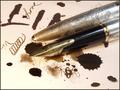
Ink Blotby justineComment: good idea. i think a different composition would be nice.. something cleaner.. with maybe some writing and one good "blot"... also only need one pen and shouldnt place it right in the middle.. maybe off to the side |
| Photographer found comment helpful. |
| 06/04/2003 12:42:45 AM |
My Heart Is Bleedingby MonaComment: i really like this pic. i wish i didnt have to subtract one for not having any liquid in the shot but i thought this topic was pretty straightforward. |
| Photographer found comment helpful. |
Home -
Challenges -
Community -
League -
Photos -
Cameras -
Lenses -
Learn -
Help -
Terms of Use -
Privacy -
Top ^
DPChallenge, and website content and design, Copyright © 2001-2026 Challenging Technologies, LLC.
All digital photo copyrights belong to the photographers and may not be used without permission.
Current Server Time: 07/16/2026 04:25:30 PM EDT.