| Image |
Comment |
| 02/15/2017 02:00:01 PM |
|
| 02/15/2017 01:58:38 PM |
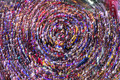
Care for a Lollipopby gintayComment: I like this except for that care sign. If the concentric circles were in the upper right as well, I would have given this 2 points higher. |
 Photographer found comment helpful. Photographer found comment helpful. |
| 02/15/2017 01:57:44 PM |
|
| Photographer found comment helpful. |
| 02/15/2017 01:57:26 PM |
steadyby tvsometimeComment: You seemed to have captured the vantage point of a stalker... |
| Photographer found comment helpful. |
| 02/15/2017 01:57:02 PM |
|
| Photographer found comment helpful. |
| 02/15/2017 01:54:06 PM |
|
| Photographer found comment helpful. |
| 02/15/2017 01:53:51 PM |
|
| Photographer found comment helpful. |
| 02/15/2017 01:53:26 PM |
Austin Blurginsby torl0311Comment: This is an image that doesn't provide any sort of positive response from me. Why is it rotated? Just looks out of focus. |
| 02/15/2017 01:50:59 PM |
The Gift of Lifeby jjstudiosphiladelphiaComment: A constructive criticisms for your image.
1. Why is there so much space in the foreground? That doesn't add anything to your photo. Your subject is obviously the people, but with so much foreground space, they become less of a subject than the building. Crop just under the feet for a stronger image.
2. The sky showing through the windows is unnaturally greyish. Keep it more natural, even if that means it's a bit blown out. |
| Photographer found comment helpful. |
| 02/15/2017 01:48:43 PM |
Sunset Over Miamiby phinbobComment: The water is great. The horizon is great. The sky is so over contrasted that it looks terrible (sorry). |
Home -
Challenges -
Community -
League -
Photos -
Cameras -
Lenses -
Learn -
Help -
Terms of Use -
Privacy -
Top ^
DPChallenge, and website content and design, Copyright © 2001-2026 Challenging Technologies, LLC.
All digital photo copyrights belong to the photographers and may not be used without permission.
Current Server Time: 07/17/2026 12:09:04 AM EDT.