| Image |
Comment |
| 09/21/2011 05:04:12 PM |
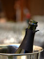
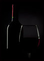
the bottle?by mitalapoComment: I somehow feel this could have been more powerful with the cork pushed back in a bit. |
 Photographer found comment helpful. Photographer found comment helpful. |
| 09/21/2011 05:03:25 PM |
|
| Photographer found comment helpful. |
| 09/21/2011 05:01:58 PM |
|
| Photographer found comment helpful. |
| 09/21/2011 05:00:30 PM |
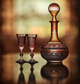
Fine Tawny Portby BrinComment: Very cool bottle and glasses. I really like how you softly lit this and used depth of field to your advantage. |
| Photographer found comment helpful. |
| 09/21/2011 04:59:55 PM |
|
| Photographer found comment helpful. |
| 09/21/2011 04:56:37 PM |
|
| Photographer found comment helpful. |
| 09/21/2011 04:55:34 PM |
|
| Photographer found comment helpful. |
| 09/21/2011 04:54:36 PM |
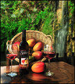
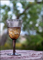
Roughing itby tuffyComment: That's my type of roughing it. :)
Is that ice in your wine? |
| 09/21/2011 04:53:46 PM |
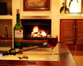
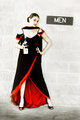
The Men's Roomby loveComment: Cool use of grain and color tones. I would suggest maybe using a white wine for this photo. On my display, the wine bottle and the dress are the same color, which makes the bottle blend in too much (in my opinion). |
| Photographer found comment helpful. |
| 09/21/2011 04:52:22 PM |
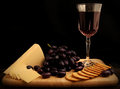
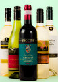
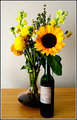
A Fine Bouquetby DanaSComment: Interesting that you chose to show the back of the bottle. That's much less appealing than the front label. Couple that with the uninspiring background and you have an underwhelming image in my opinion. I hope these comments help you to improve. |
Home -
Challenges -
Community -
League -
Photos -
Cameras -
Lenses -
Learn -
Help -
Terms of Use -
Privacy -
Top ^
DPChallenge, and website content and design, Copyright © 2001-2026 Challenging Technologies, LLC.
All digital photo copyrights belong to the photographers and may not be used without permission.
Current Server Time: 06/11/2026 05:46:56 PM EDT.