|
|
|
Showing 1601 - 1610 of ~2013 |
| Image |
Comment |
| 02/26/2010 11:05:13 AM | From Blaauwbergby LonnieDComment: Greetings from the Critique Club
First Impressions:
Is that it is very, very grainy.
Technical (Comp, lighting, color, focus, Processing):
Your composition is fine and I like how you framed everything. The lighting is ok but really all I keep seeing is all the noise. It makes it very difficult to appreciate anything else within the shot. I honestly think the problem began when you chose to use an iso of 1400. I would suggest dropping that way down and lowering your f-stop to compensate. If you wanted to really have stop motion then I would say to come back later when you have more daylight to use then you could use a higher f-stop to have more of the image in focus, you could lower the iso since there is more natural light and you could even use a slightly faster shutter speed.
Now if you wanted to get the dawn sky then I would suggest a tripod, lower shutter speed, lower iso and a higher f-stop. This would give a beautiful motion blur on the ocean and then bring out the colors in the sky.
Challenge:
Meets the challenge
Artistic/Emotion:
N/A
Summary:
You chose a beautiful subject but all the good was lost in the noise. Most voters make their initial decision on a photo based on first impressions. If it is a decent shot that doesn’t grab their attention it will probably get a 5 or 6. If it grabs their attention then they will likely spend a bit more time on it and that is when the 7+ votes come in. In your case I think most voters just saw a very noisy photo and hit the 1-4 key and moved on. Keep at it and continue to enter the challenges and you will grow. You already have some nice shots in your portfolio. I also recommend reading a bit on iso, aperture and shutter speed and their relation to each other. Keep on shooting.
|  Photographer found comment helpful. Photographer found comment helpful. |
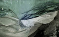
| 02/25/2010 12:24:10 PM | Nebulaby olbolComment: Greetings from the Critique Club
First Impressions:
This is a cool looking abstract but I don’t know what I am looking at.
Technical (Comp, lighting, color, focus, Processing):
The composition works well for this shot and I like how you have different shapes and colors going on throughout the image.
The lighting seems a bit weird, not bad but I am guessing this is just the natural light on the subject. I would like to see a bit more lighting to give this image some pop and a bit of contrast.
The colors are nice sea tones but they could use a little boost to really grab my attention, nothing over the top just maybe a bit of saturation.
I don’t really see any issues with the focus at all. As for your processing it doesn’t look like you really did much. All I would suggest is to try and bring out the colors a touch and get more contrast in the shot.
Challenge:
Meets the challenge but I think some voters didn’t get what they were looking at and I don’t think your title really helped much.
Artistic/Emotion:
This was a nice abstract and a different take on the subject. It is always nice seeing different views on a challenge.
Summary:
This shot was pretty well done but it could use a boost to grab the voter’s attention. In a challenge with so many vibrant landscapes this, sadly, is just lost in the mix. You got a few good votes I am guessing from voters who appreciate the abstract. In the end this finished about where I would expect it to on DPC. A solid 5 to me is a good shot that just lacks impact or a shot that doesn’t fit in the DPC mold. I encourage you to keep up with the different views on the challenge and just work a bit on some technical issues.
| | Photographer found comment helpful. |
| 02/25/2010 10:10:56 AM | Every good architect knows direction is everything.by CallistoComment: Greetings from the Critique Club
First Impressions:
WHITE. My eyes are immediately drawn to the bright white area on the upper left.
Technical (Comp, lighting, color, focus, Processing):
The composition seems quite cluttered, the price to pay for shooting in the forest I suppose. The problem I see is that your main subject is one of the last things I get to as my eyes are drawn away from it at first. Perhaps a different angle on this would work better, something that really draws my eyes to the main subject.
The lighting on the snow and sky is beautiful. You can still see all of the branches and it has an almost dreamy feel to it. The problem is the lighting on your main subject is dull and you loose a lot of detail in the shadows. Being a basic editing challenge I’m not sure what you could do to change that. If it was advanced I would suggest shooting 2 separate exposures so you can keep the nice light on the snow but also bring out the detail on the tree.
The focus seems quite soft, which I personally like on the snow but I would like the tree to be a bit sharper. Perhaps lowering your f-stop to sharpen the tree more and blur the background more. This would sharpen the tree and also draw my eyes to it more and the background would not compete as much for my attention.
Challenge:
Meets the challenge well and I like your creative take on the subject.
Artistic/Emotion:
Good creative take on the challenge.
Summary:
I like your view on this and with a few improvements this could be a good shot. The majority of your votes came in at a 5 and to me that says that it was a decent shot with a few technical errors but it just didn’t really leave much of an impact on the voters. Stick with it and continue to submit to challenges, you have a good eye for it and you will continue to improve.
|
| 02/25/2010 07:25:17 AM | Tube manby jmespigaComment: Greetings from the Critique Club
First Impressions:
Is that this is a very dull and flat shot. Nothing really grabs my attention except for the uniqueness of the subject. I am just ready to go on to the next photo as there doesn’t seem to be anything here to hold my attention.
Technical (Comp, lighting, color, focus, Processing):
The composition on this really doesn’t work well, I would like to see more of an angle perhaps or maybe not cropping it in so tight and adding something else to the shot to give this some perspective. As it is I don’t know if this subject is 2 inches tall or 10 feet tall.
The lighting is quite poor as well but it doesn’t look like you used your on camera flash which was wise as that would have likely just cast a harsh light and likely a lot of glare. If possible I would have liked to see side lighting on this. Best investment that can be made for a new photographer is off camera lighting. Just starting with a bounce flash that you can take off the camera and position where you want it can really work wonders.
The color on this is quite bland but I think the bigger issue is that there is no real contrast at all as some of the commenter mentioned. The focus also seems just a bit soft. Either try and get the whole thing tack sharp or if you want to focus on just one area use a low f-stop and make that area sharp with the rest intentionally blurred. As is it just seems slightly blurred.
Not sure if you really did any post processing on this except for resize. As mentioned by  Yo_Spiff Yo_Spiff levels, curves, saturation, contrast, sharpening etc. would likely enhance this shot.
Challenge:
This meets the challenge and you were very creative in your choice of subject which likely got you a few higher votes.
Artistic/Emotion:
As mentioned your subject choice was creative and it is nice to see out of the ordinary subjects.
Summary:
This was a good idea but it just fell flat. Keep up with your creative eye and just work on the technical and you will continue to grow as an artist. Also if you enjoy the comments you are receiving it is helpful to mark the comments as helpful. This shows those leaving the comments that you are thankful for them and they will likely leave more.
|
| 02/24/2010 07:52:20 PM | Bridge Over Not So Troubled Waterby TerComment: Greetings from the Critique Club
First Impressions:
Pretty looking snapshot of a city.
Technical (Comp, lighting, color, focus):
While the rule of thirds is a guideline that should be broken at times, this is not one of those times. I think this shot would greatly benefit from aligning the group of buildings on one of the thirds. I do like how the railing and arch lead my eyes to the buildings though.
Great lighting on this and it all seems well lit with nothing blown out and the colors are cool and clear. Your focus also seems well done.
Challenge:
This meets the challenge so I don’t think any voters knocked your score down for that.
Artistic/Emotion:
With a slightly different composition I think this would have more of an artistic feel to it, as is it seems more like an unplanned snapshot that was lucky to have the railing to lead the eyes.
Summary:
I think this was an ok shot with parts of it well thought out and others just more like a snap shot. It didn’t deserve sub 4 votes but such is the nature of DPC. I would say this is a solid 5 shot with potential to be much better. The focus, lighting and colors are all very nice but I feel as though your composition hurt this more then anything. Your processing was done very well and you take some great shots so just keep at it.
| | Photographer found comment helpful. |
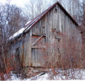
| 02/24/2010 07:08:01 PM | Still Standingby patchesComment: Greetings from the Critique Club
First Impressions:
Is that it is just a shot of an old building, nothing special to see here and I am ready to go on to the next shot.
Technical (Comp, lighting, color, focus):
The building is framed well but it is cluttered with a lot of brush. I agree with the commenter that I would have cropped out the thin line of snow at the bottom.
The lighting is ok and you captured some nice detail on the subject but the top left is a bit blown out. The color is pretty bland and some of the red/bronze hues are not that pleasant to look at. I think this shot would look nice as a Black and White.
Focus seems just a tad off. The whole scene is soft and I’m not sure that is the best route to take with this type of photo.
Challenge:
This meets the challenge well and I like the route you took with it.
Artistic/Emotion:
I’m not really getting much of either on this shot.
Summary:
This shot just doesn’t grab your attention and I think many voters quickly voted and moved on to the next one. You got quite a few 6’s and a handful of 7’s and 8’s so there was an audience that appreciated this shot. I think a tad sharper photo with a dramatic Black and white tone would bump you up several spots.
Keep at it and enter more challenges and you will continue to grow and get better.
| | Photographer found comment helpful. |
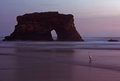
| 02/24/2010 06:44:31 PM | California Naturl Bridgesby DigiFotoBuddyComment: Greetings from the Critique Club
First Impressions:
Gorgeous scene with a nice soft feel that makes me want to go there.
Technical (Comp, lighting, color, focus):
A very well composed shot. You placed the objects in pleasing locations and somehow got the bird to stand on a perfect focal point ☺
The color is serene, excellent choice shooting this at dusk, or is it dawn? The soft pastel colors really work well in this shot and just gives it an overall peaceful feeling. As far as the noise in the sky, which some commented about, I don’t really feel it is a problem in this particular shot and if anything adds to it. I am guessing the noise is from a slower shutter speed to blur the water, good choice imho.
Challenge:
Definitely meets the challenge in multiple ways.
Artistic/Emotion:
This is a beautiful artistic shot that just makes me feel happy.
Summary:
Excellent finish and great score, you probably got docked a few points by people who want rich vibrant photos but your comments showed that you definitely reached a select target audience that really appreciated this shot. Keep up the excellent work. You have a great eye and know how to use your camera.
| | Photographer found comment helpful. |
| 02/24/2010 06:00:39 PM | Nature's Valentine Giftby RevMikeComment: Greetings from the Critique Club
First Impressions:
This is a beautiful shot and very colorful, the colors really grab my attention.
Technical (Comp, lighting, color, focus):
Your composition is pretty good; the only thing I would nitpick at is that there is more space above the roses then below. If you are going to center the subject you may want to make it uniformed all around, also maybe switch the order so it goes small to large or vice versa, again this is just nitpicking. As mentioned in the comments the leaf showing is a bit out of place and it would be nice if it were gone.
The lighting is well done and the colors are rich and vibrant. They do not look over saturated on my monitor at all. The whole shot is nice and clear with great focus and the reflections are excellent.
Challenge:
Meets the challenge as roses are definitely made in nature :)
Artistic/Emotion:
Not an emotional shot but the colors and reflection is nice and artistic.
Summary:
A well done shot all around but in the end it is a shot of flowers and it doesn't really bring anything new to the scene. I think this scored around where it should, maybe it should have been a bit higher but I think many voters are just bored of flowers (those 1's, 2's and 3's are likely from those voters who never want to see another flower shot.
Excellent score for your 4th entry and congrats on a new personal best. You have talent and I will be looking forward to what you show us in the future, keep it up.
| | Photographer found comment helpful. |
| 02/24/2010 03:10:13 PM | | | Photographer found comment helpful. |
| 02/24/2010 02:49:32 PM | Soviet Union Memoriesby CJinCAComment: It looks like you put in a bit of thought for this one and it is well composed. Everything seems to be well done on this but it seems to lack something, a lasting memory I guess. It is good but I quess easily forgotten. At least you didn't use the typical Cowboy hat like I did though lol, you definitely get points for originality. | | Photographer found comment helpful. |
|
Showing 1601 - 1610 of ~2013 |
Home -
Challenges -
Community -
League -
Photos -
Cameras -
Lenses -
Learn -
Help -
Terms of Use -
Privacy -
Top ^
DPChallenge, and website content and design, Copyright © 2001-2026 Challenging Technologies, LLC.
All digital photo copyrights belong to the photographers and may not be used without permission.
Current Server Time: 06/20/2026 01:43:48 AM EDT.
|