| Image |
Comment |
| 03/11/2010 01:47:36 PM |
Contemporary Hair Styleby BrianRComment: Sorry but for me this really just seems like a portrait with nothing special and, imho, no Fine Art quality. May just be my opinion and the great, terrible, funny, crazy, stressful, interesting thing with art is our varying definitions. Good Luck. |
 Photographer found comment helpful. Photographer found comment helpful. |
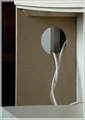
| 03/11/2010 01:45:59 PM |
no titleby Keith_WComment: Originally this was a low vote from me but now that I have revisited it I like how it seems to be coming out of my screen and hanging down. A pretty cool effect. I also like the use of negative space. Bumping this vote up a bit now. |
| Photographer found comment helpful. |
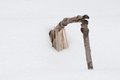
| 03/11/2010 01:44:07 PM |
The Tears of Medium Density Fibreboardby raishComment: This really doesn't seem to be Fine Art, imho. Alas that is the curious thing about art, all of our definitions could vary drastically from one viewer to the next. Good luck. |
| Photographer found comment helpful. |
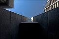
| 03/11/2010 01:38:48 PM |
negative space in a vertical worldby chaliceComment: Art is a funny thing in that while it has definitions, those definitions are different for each person either creating or viewing the art. I am sure you probably see this as an excellent interpetation as Fine Art but for me it doesn't convey my feeling or thought of what Fine Art is. Because of that I scored this low even though it is a well done photo. |
| Photographer found comment helpful. |
| 03/11/2010 01:36:12 PM |
To dawn, Eos greets Helios.by wingyisleedsComment: Originally this was a 2 from me. I am bumping it up because I actually though about entering something like a white canvas with a simple red line through it. This is something, imho, that you could run across in a modern art gallery. I am not giving it one of my top scores but it is going up quite a bit from the original 2. Good luck. |
| Photographer found comment helpful. |
| 03/11/2010 01:34:06 PM |
Two Facesby whiterookComment: Sorry but for me this doesn't say Fine art and the mattress is a bit of a distracting element, perhaps using a solid color sheet would help. Also the lighting seems a bit off as well and doesn't really flow. |
| 03/11/2010 01:32:50 PM |
Rural Poetryby AmmieComment: For me this doesnt say Fine Art, or at least what I think of as fine art. |
| Photographer found comment helpful. |
| 03/11/2010 01:32:04 PM |
wish you were hereby libertyComment: I did not score this shot high and felt it only fair to tell you why. It is a very pretty picture and well composed but to me it doesn't convey fine art (of course I am speaking of my definition of fine art). So I think you took a very nice photo but I am just not getting FA from it. Good luck. |
| Photographer found comment helpful. |
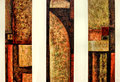
| 03/11/2010 01:26:49 PM |
the first day [photage]by zeuszenComment: Great patterns on this. This is one that you can look at and start seeing different objects, kind of like looking at cloud formations. Great job. Voted earlier. |
| Photographer found comment helpful. |
| 03/11/2010 01:25:54 PM |
Trinityby dtremainComment: Very cool, I could see this hanging in a gallery, even in my place if I had a spot for it. Love the patterns and color. Nice job. Voted earlier. |
| Photographer found comment helpful. |
Home -
Challenges -
Community -
League -
Photos -
Cameras -
Lenses -
Learn -
Help -
Terms of Use -
Privacy -
Top ^
DPChallenge, and website content and design, Copyright © 2001-2026 Challenging Technologies, LLC.
All digital photo copyrights belong to the photographers and may not be used without permission.
Current Server Time: 06/20/2026 01:36:12 PM EDT.


![the first day [photage]](https://images.dpchallenge.com/images_challenge/1000-1999/1177/120/Copyrighted_Image_Reuse_Prohibited_859029.jpg)