| Image |
Comment |
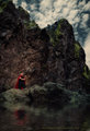
| 07/21/2013 01:58:03 PM |
DSC_1087c5by cginoComment: This look great. Awesome idea with the water, wouldn't have thought of that! |
 Photographer found comment helpful. Photographer found comment helpful. |
| 07/19/2013 10:02:22 PM |
|
| Photographer found comment helpful. |
| 07/14/2013 03:50:34 AM |
|
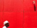
| 07/13/2013 09:23:52 PM |
blues by PennyStreetComment: Very nice, very nice indeed. Would have gone higher if the man was sharper. (looks a little blurred for some reason)
I think this really is one of the best here, in terms of subject and composition (potential).
I really wish you had managed to correct the perspective here, as it does hurt what is otherwise just excellent work. |
| Photographer found comment helpful. |
| 07/13/2013 09:20:07 PM |
Lime Hingedby giantmikeComment: Top rated shot for me. Seriously wonderful - really love the texture of that wood. |
| Photographer found comment helpful. |
| 07/13/2013 09:19:26 PM |
Endless Summer by CNovackComment: Very different - I was almost tempted to score this lower, because it's decidedly different from the entire point of "New Happiness" (to show happiness in poverty, and these are clearly not from the impoverished!)
With that being said - this is an insanely striking photograph. You would have gotten one of my rare 10's if only those boards weren't tilted wonky. |
| Photographer found comment helpful. |
| 07/13/2013 09:19:24 PM |
Ascending Joyby mefnjComment: That texture is extraordinary. The color and shapes are also really nice.
I'm sad that you either didn't crop the bottom blue one a bit more, or that you didn't crop the top yellow one less. |
| Photographer found comment helpful. |
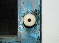
| 07/13/2013 09:19:16 PM |
Door to Happinessby npaselComment: I'm voting this higher than I should - the DOF is way too shallow - nothing but the knob is in critical focus.
Still, wow, great image - I'll step back from the technicals and just give you a 7 for a really good image! |
| Photographer found comment helpful. |
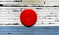
| 07/13/2013 09:19:13 PM |
The red spotby NeatComment: I think, after looking at this one a dozen times now, I would have liked diffused light much better overall, since he showed a strong preference for soft light in the Happiness collection.
I think the two biggest distractions here are the slightly off-kilter perspective, and the shadow - how it intersects with the blue area. I do think you've centered it well on that line, intentionally or not, so that's at least as well as it can be placed, if you wanted it to split the white and blue area. I know I would have preferred this if the red spot had been on a rule of thirds line, or had at least been moved to a slightly more compositionally friendly location.
Of course, with all that being said, perhaps this wasn't something you could move.
Still, this is really nice, the processing was perfectly done to bring out the colors and textures, and the shadow is the perfect shade, even if I don't like where it is. |
| Photographer found comment helpful. |
| 07/13/2013 07:50:28 PM |
You Name It!by blacjackComment: Death of a Spheresman
Am I right in thinking this is a lightbulb?
Very cool image |
| Photographer found comment helpful. |
Home -
Challenges -
Community -
League -
Photos -
Cameras -
Lenses -
Learn -
Help -
Terms of Use -
Privacy -
Top ^
DPChallenge, and website content and design, Copyright © 2001-2026 Challenging Technologies, LLC.
All digital photo copyrights belong to the photographers and may not be used without permission.
Current Server Time: 07/18/2026 03:43:20 AM EDT.